Tag: graph

Play Your Charts Right: Tips for Effective Data Visualization – by Geckoboard

Play Your Charts Right: Tips for Effective Data Visualization – by Geckoboard

In a world where data really matters, we all want to create effective charts. But data visualization is rarely taught in schools, or covered in on-the-job training. Most of us learn as we go along, and therefore we often make choices or mistakes that confuse and disorient our audience.
From overcomplicating or overdressing our charts, to conveying an entirely inaccurate message, there are common design pitfalls that can easily be avoided. We’ve put together these pointers to help you create simpler charts that effectively get across the meaning of your data.

Geckoboard

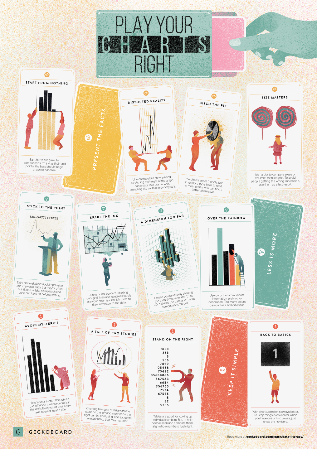
Based on work by experts such as Stephen Few, Dona Wong, Albert Cairo, Cole Nussbaumer Knaflic, and Andy Kirk, the authors at Geckoboard wrote down a list of recommendations which I summarize below:

Present the facts

  • Start your axis at zero whenever possible, to prevent misinterpretation. Particularly bar charts.
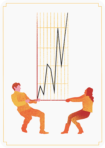
  • The width and height of line and scatter plots influence its messages.
  • Area and size are hard to interpret. Hence, there’s often a better alternative to the pie chart. Read also this.
Less is more

  • Use colors for communication, not decoration.
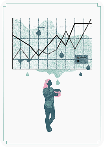
  • Diminish non-data ink, to draw attention to that which matters.
  • Do not use the third dimension, unless you are plotting it.
  • Avoid overselling numerical accuracy with precise decimal values.

Keep it simple

  • Annotate your plots; include titles, labels or scales.
  • Avoid squeezing too much information in a small space. For example, avoid a second x- or y-axis whenever possible.
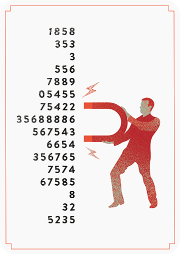
  • Align your numbers right, literally.
  • Don’t go for fancy; go for clear. If you have few values, just display the values.

Infographic summary

Tidy Missing Data Handling

Tidy Missing Data Handling

A recent open access paper by Nicholas Tierney and Dianne Cook — professors at Monash University — deals with simpler handling, exploring, and imputation of missing values in data.They present new methodology building upon tidy data principles, with a goal to integrating missing value handling as an integral part of data analysis workflows. New data structures are defined (like the nabular) along with new functions to perform common operations (like gg_miss_case).

These new methods have bundled among others in the R packages naniar and visdat, which I highly recommend you check out. To put in the author’s own words:

The naniar and visdat packages build on existing tidy tools and strike a compromise between automation and control that makes analysis efficient, readable, but not overly complex. Each tool has clear intent and effects – plotting or generating data or augmenting data in some way. This reduces repetition and typing for the user, making exploration of missing values easier as they follow consistent rules with a declarative interface.

The below showcases some of the highly informational visuals you can easily generate with naniar‘s nabulars and the associated functionalities.

For instance, these heatmap visualizations of missing data for the airquality dataset. (A) represents the default output and (B) is ordered by clustering on rows and columns. You can see there are only missings in ozone and solar radiation, and there appears to be some structure to their missingness.

a.JPG

Another example is this upset plot of the patterns of missingness in the airquality dataset. Only Ozone and Solar.R have missing values, and Ozone has the most missing values. There are 2 cases where both Solar.R and Ozone have missing values.b.JPG

You can also generate a histogram using nabular data in order to show the values and missings in Ozone. Values are imputed below the range to show the number of missings in Ozone and colored according to missingness of ozone (‘Ozone_NA‘). This displays directly that there are approximately 35-40 missings in Ozone.

c.JPGAlternatively, scatterplots can be easily generated. Displaying missings at 10 percent below the minimum of the airquality dataset. Scatterplots of ozone and solar radiation (A), and ozone and temperature (B). These plots demonstrate that there are missings in ozone and solar radiation, but not in temperature.d.JPG

Finally, this parallel coordinate plot displays the missing values imputed 10% below range for the oceanbuoys dataset. Values are colored by missingness of humidity. Humidity is missing for low air and sea temperatures, and is missing for one year and one location.

e.JPG

Please do check out the original open access paper and the CRAN vignettes associated with the packages!


Evolving Floorplans – by Joel Simon

Evolving Floorplans – by Joel Simon

Joel Simon is the genius behind an experimental project exploring optimized school blueprints. Joel used graph-contraction and ant-colony pathing algorithms as growth processes, which could generate elementary school designs optimized for all kinds of characteristics: walking time, hallway usage, outdoor views, and escape routes just to name a few.

Two generated designs, minimizing the traffic flow (left) as well as escape routes (right) [original]
Other designs tried to maximize the number of windows, resulting in seemingly random open courtyards [original]
 

The original floor plan [original]
Definitely check out the original write-up if you are interested in the details behind the generation process! Or have a look at some of Joel’s other projects.

Interactive Explanation of Network and Graph Principles

Interactive Explanation of Network and Graph Principles

Why do groups of people act smart, dumb, kind, or cruel? People behave in strange ways, particularly when they are able to influence one another. Both good and bad things can happen when people interact and behave in network structures. On the bright side, you must be familiar with the wisdom of the crowd, where the aggregated knowledge of a group is more valuable than its sum? Ensemble algorithms – like random forest analysis – rely on this positive principle.

On the dark side, are you familiar with the phenomenon called the tragedy of the commons, where shared resource-systems collapse because individuals behave in their self-interest? Or psychological phenomena such as groupthink, where groups of people make irrational decisions due to social issues? The recent spread of fake news and misinformation is also stimulated by network interactions. In these cases, we could speak of the madness of the crowd.

Nicky Case made a great interactive walkthrough explaining why and when networks of people become wise or mad. You are tasked to change and simulate network interactions while Nicky explains concepts such as (complex) contagion, the majority illusion paradox, bonding and bridging, and small world networks. In the references, Nicky provides links to scientific papers explaining these concepts in more detail. I highly suggest you check out her website here.


example.png
Screenshot of one of the explanations/simulations Nicky offers.


The Dataviz Project: Find just the right visualization

The Dataviz Project: Find just the right visualization

Do you have a bunch of data but you can’t seem to figure out how to display it? Or looking for that one specific visualization of which you can’t remember the name?

www.datavizproject.com provides a most comprehensive overview of all the different ways to visualize your data. You can sort all options by Family, Input, Function, and Shape to find that one dataviz that best conveys your message.

datavizproject overview

Update: look at some of these other repositories here or here.