Tag: programming

Functional programming and why not to “grow” vectors in R

Functional programming and why not to “grow” vectors in R

For fresh R programmers, vectorization can sound awfully complicated. Consider two math problems, one vectorized, and one not:

math_operations.png
Two ways of doing the same computations in R

Why on earth should R spend more time calculating one over the other? In both cases there are the same three addition operations to perform, so why the difference? This is what we will try to illustrate in this post, which is inspired on work by Naom Ross and the University of Auckland.

R behind the scenes:

R is a high-levelinterpreted computer language. This means that R takes care of a lot of basic computer tasks for you. For instance, when you type i <- 5.0 you don’t have to tell R:

  • That 5.0 is a floating-point number
  • That i should store numeric-type data
  • To find a place in memory for to put 5
  • To register i as a pointer to that place in memory

You also don’t have to convert i <- 5.0 to binary code. That’s done automatically when you hit Enter. Although you are probably not aware of this, many R functions are just wrapping your input and passing it to functions of other, compiled computer languages, like C, C++, or FORTRAN, in the back end.

Now here’s the crux: If you need to run a function over a set of values, you can either pass in a vector of these values through the R function to the compiled code (math example 1), or you could call the R function repeatedly for each value separately (math example 2). If you do the latter, R has to do stuff (figuring out the above bullet points and translating the codeeach time, repeatedly. However, if you call the function with a vector instead, this figuring out part only happens once. For instance, R vectors are constricted to a single data type (e.g., numeric, character) and when you use a vector instead of seperate values, R only needs to determine the input data type once, which saves time. In short, there’s no advantage to NOT organizing your data as vector.

For-loops and functional programming (*ply)

One example of how new R programmers frequently waste computing time is via memory allocation. Take the below for loop, for instance:

iterations = 10000000
 
 system.time({
   j = c()
   for(i in 1:iterations){
     j[i] <- i
   }
 })
##    user  system elapsed 
##    3.71    0.23    3.94

Here, vector j starts out with length 1, but for each iteration in the for loop, R has to re-size the vector and re-allocate memory. Recursively, R has to find the vector in its memory, create a new vector that will fit more data, copy the old data over, insert the new data, and erase the old vector. This process gets very slow as vectors get big. Nevertheless, it is often how programmers store the results of their iterative processes. Tremendous computing power can be saved by pre-allocating vectors to fit all the values beforehand, so that R does not have to do unnecessary actions:

system.time({
   j = rep(NA, iterations)
   for(i in 1:iterations){
     j[i] <- i
   }
 })
##    user  system elapsed 
##    0.88    0.01    0.89

More advanced R users tend to further optimize via functionals. This family of functions takes in vectors (or matrices, or lists) of values and applies other functions to each. Examples are apply or plyr::*ply functions, which speed up R code mainly because the for loops they have inside them automatically do things like pre-allocating vector size. Functionals additionally prevent side effects: unwanted changes to your working environment, such as the remaining i after for(i in 1:10). Although this does not necessarily improve computing time, it is regarded best practice due to preventing consequent coding errors.

Conclusions

There are cases when you should use for loops. For example, the performance penalty for using a for loop instead a vector will be small if the number of iterations is relatively small, and the functions called inside your for loop are slow. Here, looping and overhead from function calls make up a small fraction of your computational time and for loops may be more intuitive or easier to read for you. Additionally, there are cases where for loops make more sense than vectorized functions: (1) when the functions you seek to apply don’t take vector arguments and (2) when each iteration is dependent on the results of previous iterations.

Another general rule: fast R code is short. If you can express what you want to do in R in a line or two, with just a few function calls that are actually calling compiled code, it’ll be more efficient than if you write long program, with the added overhead of many function calls.

Finally, there is a saying that “premature optimization is the root of all evil”. What this means is that you should not re-write your R code unless the computing time you are going to save is worth the time invested. Nevertheless, if you understand how vectorization and functional programming work, you will be able to write more faster, safer, and more transparent (short & simple) programs.


Python resources (free courses, books, & cheat sheets)

Python resources (free courses, books, & cheat sheets)

Find more comprehensive Python repositories:
Vinta’s awesome Python Github repository, the easy Python docs, the Python Wiki Beginners Guide, or CourseDuck’s overview of free Python courses!

My list of Python resources is still quite short so if you have additions, please comment below or contact me! There are separate overviews for Data Science, Machine Learning, & Statistics resources in general, and for R resources and SQL resources in specific.

LAST UPDATED: 11-11-2018

Cheat sheets:

Courses:

Books:

Visualizing Neural Networks in Processing

Visualizing Neural Networks in Processing

Coding Train is a Youtube channel by Daniel Shiffman that covers anything from the basics of programming languages like JavaScript (with p5.js) and Java (with Processing) to generative algorithms like physics simulation, computer vision, and data visualization. In particular, these latter topics, which Shiffman bundles under the label “the Nature of Code”, draw me to the channel.

In a recent series, Daniel draws from his free e-book to create his seven-video playlist where he elaborates on the inner workings of neural networks, visualizing the entire process as he programs the algorithm from scratch in Processing (Java). I recommend the two videos below consisting of the actual programming, especially for beginners who want to get an intuitive sense of how a neural network works.

PS. I tend to watch them on double speed.

Part 1:

Part 2:


Networks Among #rstats Twitterers

Networks Among #rstats Twitterers

Reposted from Kasia Kulma’s github with minor modifications.

Have you ever wondered whether the most active/popular R-twitterers are virtual friends? 🙂 And by friends here I simply mean mutual followers on Twitter. In this post, I score and pick top 30 #rstats twitter users and analyse their Twitter network. You’ll see a lot of applications of rtweet and ggraph packages, as well as a very useful twist using purrr library, so let’s begin!


IMPORTING #RSTATS USERS

After loading my precious packages…

library(rtweet)
library(dplyr)
library(purrr)
library(igraph)
library(ggraph)

… I searched for Twitter users that have rstats termin their profile description. It definitely doesn’t include ALL active and popular R – users, but it’s a pretty reliable way of picking R – fans.

r_users <- search_users("#rstats", n = 1000)

It’s important to say, that in rtweet::search_users() even if you specify 1000 users to be extracted, you end up with quite a few duplicates and the actual number of users I got was much smaller: 564

r_users %>% summarise(n_users = n_distinct(screen_name))
##   n_users
## 1     564

Funnily enough, even though my profile description contains #rstats I was not included in the search results (@KKulma), sic! Were you? 🙂

SCORING AND CHOOSING TOP #RSTATS USERS

Now, let’s extract some useful information about those users:

r_users_info <- lookup_users(r_users$screen_name)

You’ll notice, that created data frame holds information about the number of followers, friends (users they follow), lists they belong to, the number of tweets (statuses) or how many times were they marked favourite.

r_users_info %>% select(dplyr::contains("count")) %>% head()
##   followers_count friends_count listed_count favourites_count
## 1            8311           366          580             9325
## 2           44474            11         1298                3
## 3           11106           524          467            18495
## 4           12481           431          542             7222
## 5           15345          1872          680            27971
## 6            5122           700          549             2796
##   statuses_count
## 1          66117
## 2           1700
## 3           8853
## 4           6388
## 5          22194
## 6          10010

And these variables that I used for building my ‘top score’: I simply calculate a percentile for each of those variables and sum it all together for each user. Given that each variable’s percentile will give me a value between 0 and 1, The final score can have a maximum value of 5.

r_users_ranking <- r_users_info %>%
  filter(protected == FALSE) %>% 
  select(screen_name, dplyr::contains("count")) %>% 
  unique() %>% 
  mutate(followers_percentile = ecdf(followers_count)(followers_count),
         friends_percentile = ecdf(friends_count)(friends_count),
         listed_percentile = ecdf(listed_count)(listed_count),
         favourites_percentile = ecdf(favourites_count)(favourites_count),
         statuses_percentile = ecdf(statuses_count)(statuses_count)
         ) %>% 
  group_by(screen_name) %>% 
  summarise(top_score = followers_percentile + friends_percentile + listed_percentile + favourites_percentile + statuses_percentile) %>% 
  ungroup() %>% 
  mutate(ranking = rank(-top_score))

Finally, I picked top 30 users based on the score I calculated. Tada!

top_30 <- r_users_ranking %>% arrange(desc(top_score)) %>% head(30) %>% arrange(desc(top_score))
top_30 
## # A tibble: 30 x 3
##        screen_name top_score ranking
##              <chr>     <dbl>   <dbl>
##  1          hspter  4.877005       1
##  2    RallidaeRule  4.839572       2
##  3         DEJPett  4.771836       3
##  4 modernscientist  4.752228       4
##  5 nicoleradziwill  4.700535       5
##  6      tomhouslay  4.684492       6
##  7    ChetanChawla  4.639929       7
##  8   TheSmartJokes  4.627451       8
##  9   Physical_Prep  4.625668       9
## 10       Cataranea  4.602496      10
## # ... with 20 more rows

I must say I’m incredibly impressed by these scores: @hpster, THE top R – twitterer managed to obtain a score of nearly 4.9 out of 5! WOW!

Anyway! To add some more depth to my list, I tried to identify top users’ gender, to see how many of them are women. I had to do it manually (ekhem!), as the Twitter API’s data doesn’t provide this, AFAIK. Let me know if you spot any mistakes!

top30_lookup <- r_users_info %>%
  filter(screen_name %in% top_30$screen_name) %>% 
  select(screen_name, user_id)

top30_lookup$gender <- c("M", "F", "F", "F", "F",
                         "M", "M", "M", "F", "F", 
                         "F", "M", "M", "M", "F", 
                         "F", "M", "M", "M", "M", 
                         "M", "M", "M", "F", "M",
                         "M", "M", "M", "M", "M")

table(top30_lookup$gender)
## 
##  F  M 
## 10 20

It looks like a third of all top users are women, but in the top 10 users, there are 6 women. Better than I expected, to be honest. So, well done, ladies!

GETTING FRIENDS NETWORK

Now, this was the trickiest part of this project: extracting top users’ friends list and putting it all in one data frame. As you may be aware, Twitter API allows you to download information only on 15 accounts in 15 minutes. So for my list, I had to break it up into 2 steps, 15 users each and then I named each list according to the top user they refer to:

top_30_usernames <- top30_lookup$screen_name

friends_top30a <-   map(top_30_usernames[1:15 ], get_friends)
names(friends_top30a) <- top_30_usernames[1:15]

# 15 minutes later....
friends_top30b <- map(top_30_usernames[16:30], get_friends)

After this I end up with two lists, each containing all friends’ IDs for top and bottom 15 users respectively. So what I need to do now is i) append the two lists, ii) create a variable stating top users’ name in each of those lists and iii) turn lists into data frames. All this can be done in 3 lines of code. And brace yourself: here comes the purrr trick I’ve been going on about! Simply using purrr:::map2_df I can take a single list of lists, create a name variable in each of those lists based on the list name (twitter_top_user) and convert the result into the data frame. BRILLIANT!!

# turning lists into data frames and putting them together
friends_top30 <- append(friends_top30a, friends_top30b)
names(friends_top30) <- top_30_usernames

# purrr - trick I've been banging on about!
friends_top <- map2_df(friends_top30, names(friends_top30), ~ mutate(.x, twitter_top_user = .y)) %>% 
  rename(friend_id = user_id) %>% select(twitter_top_user, friend_id)

Here’s the last bit that I need to correct before we move on to plotting the friends networks: for some reason, using purrr::map() with rtweet:::get_friends() gives me max only 5000 friends, but in case of @TheSmartJokes the true value is over 8000. As it’s the only top user with more than 5000 friends, I’ll download his friends separately…

# getting a full list of friends
SJ1 <- get_friends("TheSmartJokes")
SJ2 <- get_friends("TheSmartJokes", page = next_cursor(SJ1))

# putting the data frames together 
SJ_friends <-rbind(SJ1, SJ2) %>%  
  rename(friend_id = user_id) %>% 
  mutate(twitter_top_user = "TheSmartJokes") %>% 
  select(twitter_top_user, friend_id)

# the final results - over 8000 friends, rather than 5000
str(SJ_friends) 
## 'data.frame':    8611 obs. of  2 variables:
##  $ twitter_top_user: chr  "TheSmartJokes" "TheSmartJokes" "TheSmartJokes" "TheSmartJokes" ...
##  $ friend_id       : chr  "390877754" "6085962" "88540151" "108186743" ...

… and use it to replace those friends that are already in the final friends list.

friends_top30 <- friends_top %>% 
  filter(twitter_top_user != "TheSmartJokes") %>% 
  rbind(SJ_friends) 

Finally, let me do some last data cleaning: filtering out friends that are not among the top 30 R – users, replacing their IDs with twitter names and adding gender for top users and their friends… Tam, tam, tam: here we are! Here’s the final data frame we’ll use for visualising the friend networks!

# select friends that are top30 users
final_friends_top30 <- friends_top  %>% 
  filter(friend_id %in% top30_lookup$user_id)

# add friends' screen_name
final_friends_top30$friend_name <- top30_lookup$screen_name[match(final_friends_top30$friend_id, top30_lookup$user_id)]

# add users' and friends' gender
final_friends_top30$user_gender <- top30_lookup$gender[match(final_friends_top30$twitter_top_user, top30_lookup$screen_name)]
final_friends_top30$friend_gender <- top30_lookup$gender[match(final_friends_top30$friend_name, top30_lookup$screen_name)]

## final product!!!
final <- final_friends_top30 %>% select(-friend_id)

head(final)
##   twitter_top_user     friend_name user_gender friend_gender
## 1         hrbrmstr nicoleradziwill           M             F
## 2         hrbrmstr        kara_woo           M             F
## 3         hrbrmstr      juliasilge           M             F
## 4         hrbrmstr        noamross           M             M
## 5         hrbrmstr      JennyBryan           M             F
## 6         hrbrmstr     thosjleeper           M             M

VISUALIZING FRIENDS NETWORKS

After turning our data frame into something more usable by igraph and ggraph

f1 <- graph_from_data_frame(final, directed = TRUE, vertices = NULL)
V(f1)$Popularity <- degree(f1, mode = 'in')

… let’s have a quick overview of all the connections:

ggraph(f1, layout='kk') + 
  geom_edge_fan(aes(alpha = ..index..), show.legend = FALSE) +
  geom_node_point(aes(size = Popularity)) +
  theme_graph( fg_text_colour = 'black') 

generic_pure

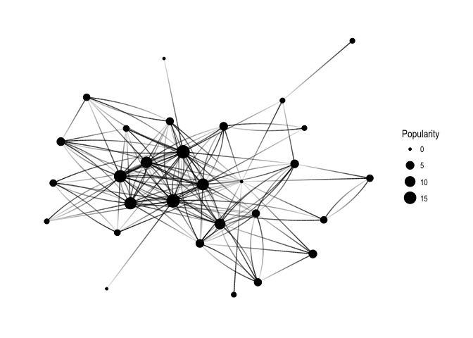
Keep in mind that Popularity – defined as the number of edges that go into the node – determines node size. It’s all very pretty, but I’d like to see how nodes correspond to Twitter users’ names:

ggraph(f1, layout='kk') + 
  geom_edge_fan(aes(alpha = ..index..), show.legend = FALSE) +
  geom_node_point(aes(size = Popularity)) +
  geom_node_text(aes(label = name, fontface='bold'), 
                 color = 'white', size = 3) +
  theme_graph(background = 'dimgray', text_colour = 'white',title_size = 30) 

generic_names

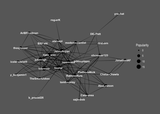
So interesting! You can see the core of the graph consists mainly of female users: @hpster, @JennyBryan, @juliasilge, @karawoo, but also a couple of male R – users: @hrbrmstr and @noamross. Who do they follow? Men or women?

ggraph(f1, layout='kk') + 
  geom_edge_fan(aes(alpha = ..index..), show.legend = FALSE) +
  geom_node_point(aes(size = Popularity)) +
  theme_graph( fg_text_colour = 'black') +
  geom_edge_link(aes(colour = friend_gender)) +
  scale_edge_color_brewer(palette = 'Set1') + 
  labs(title='Top 30 #rstats users and gender of their friends')

generic_with_gender

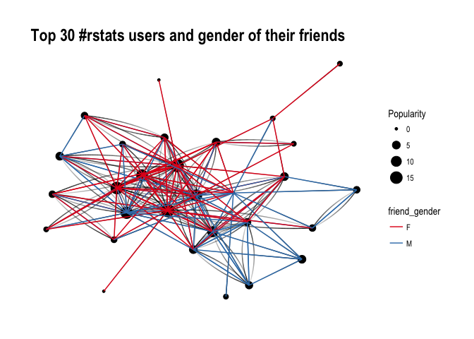
It’s difficult to say definitely, but superficially I see A LOT of red, suggesting that our top R – users often follow female top twitterers. Let’s have a closer look and split graphs by user gender and see if there’s any difference in the gender of users they follow:

ggraph(f1, layout='kk') + 
  geom_edge_fan(aes(alpha = ..index..), show.legend = FALSE) +
  geom_node_point(aes(size = Popularity)) +
  theme_graph( fg_text_colour = 'black') +
  facet_edges(~user_gender) +
  geom_edge_link(aes(colour = friend_gender)) +
  scale_edge_color_brewer(palette = 'Set1') +
  labs(title='Top 30 #rstats users and gender of their friends', subtitle='Graphs are separated by top user gender, edge colour indicates their friend gender' )

gender_with_gender

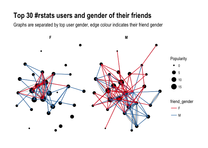
Ha! look at this! Obviously, female users’ graph will be less dense as there are fewer of them in the dataset, however, you can see that they tend to follow male users more often than male top users do. Is that impression supported by raw numbers?

final %>% 
  group_by(user_gender, friend_gender) %>% 
  summarize(n = n()) %>% 
  group_by(user_gender) %>% 
  mutate(sum = sum(n),
         percent = round(n/sum, 2)) 
## # A tibble: 4 x 5
## # Groups:   user_gender [2]
##   user_gender friend_gender     n   sum percent
##         <chr>         <chr> <int> <int>   <dbl>
## 1           F             F    26    57    0.46
## 2           F             M    31    57    0.54
## 3           M             F    55   101    0.54
## 4           M             M    46   101    0.46

It seems so, although to the lesser extent than suggested by the network graphs: Female top users follow other female top users 46% of the time, whereas male top users follow female top user 54% of the time. So what do you have to say about that?

About the author:

Kasia Kulma states she’s an overall, enthusiastic science enthusiast. Formally, a doctor in evolutionary biology, professionally, a data scientist, and, privately, a soppy mum and outdoors lover.

t-SNE, the Ultimate Drum Machine and more

t-SNE, the Ultimate Drum Machine and more

This blog explains t-Distributed Stochastic Neighbor Embedding (t-SNE) by a story of programmers joining forces with musicians to create the ultimate drum machine (if you are here just for the fun, you may start playing right away).

Kyle McDonald, Manny Tan, and Yotam Mann experienced difficulties in pinpointing to what extent sounds are similar (ding, dong) and others are not (ding, beep) and they wanted to examine how we, humans, determine and experience this similarity among sounds. They teamed up with some friends at Google’s Creative Lab and the London Philharmonia to realize what they have named “the Infinite Drum Machine” turning the most random set of sounds into a musical instrument.

Drum Machine.png

The project team wanted to include as many different sounds as they could, but had less appetite to compare, contrast and arrange all sounds into musical accords themselves. Instead, they imagined that a computer could perform such a laborious task. To determine the similarities among their dataset of sounds – which literally includes a thousand different sounds from the ngaaarh of a photocopier to the zing of an anvil – they used a fairly novel unsupervised machine learning technique called t-Distributed Stochastic Neighbor Embedding, or t-SNE in short (t-SNE Wiki; developer: Laurens van der Maaten). t-SNE specializes in dimensionality reduction for visualization purposes as it transforms highly-dimensional data into a two- or three-dimensional space. For a rapid introduction to highly-dimensional data and t-SNE by some smart Googlers, please watch the video below.

As the video explains, t-SNE maps complex data to a two- or three-dimensional space and was therefore really useful to compare and group similar sounds. Sounds are super highly-dimensional as they are essentially a very elaborate sequence of waves, each with a pitch, a duration, a frequency, a bass, an overall length, etcetera (clearly I am no musician). You would need a lot of information to describe a specific sound accurately. The project team compared sound to fingerprints, as there is an immense amount of data in a single padamtss.

t-SNE takes into account all this information of a sound and compares all sounds in the dataset. Next, it creates 2 or 3 new dimensions and assigns each sound values on these new dimensions in such a way that sounds which were previously similar (on the highly-dimensional data) are also similar on the new 2 – 3 dimensions. You could say that t-SNE summarizes (most of) the information that was stored in the previous complex data. This is what dimensionality reduction techniques do: they reduce the number of dimensions you need to describe data (sufficiently). Fortunately, techniques such as t-SNE are unsupervised, meaning that the project team did not have to tag or describe the sounds in their dataset manually but could just let the computer do the heavy lifting.

The result of this project is fantastic and righteously bears the name of Infinite Drum Machine (click to play)!  You can use the two-dimensional map to explore similar sounds and you can even make beats using the sequencing tool. The below video summarizes the creation process.

Amazed by this application, I wanted to know how t-SNE is being used in other projects. I have found a tremendous amount of applications that demonstrate how to implement t-SNE in Python, R, and even JS whereas the method also seems popular in academia.

Luke Metz argues implementation in Python is fairly easy and Analytics Vidhya and a visualized blog by O’Reilly back this claim. Superstar Andrej Karpathy has an interactive t-SNE demo which allows you to compare the similarity among top Twitter users using t-SNE (I think in JavaScript). A Kaggle user and Data Science Heroes have demonstrated how to apply t-SNE in R and have compared the method to other unsupervised methods, for instance to PCA.

indico_features_img_callout_small-1024x973[1].jpg
Clusters of similar cats/dogs in Luke Metz’ application of t-SNE.
Cho et al., 2014 have used t-SNE in their natural language processing projects as it allows for an easy examination of the similarity among words and phrases. Mnih and colleagues (2015) have used t-SNE to examine how neural networks were playing video games.

t-SNE video games
Two-dimensional t-SNE visualization of the hidden layer activity of neural network playing Space Invaders (Mnih et al., 2015)

On a final note, while acknowledging its potential, this blog warns for the inaccuracies in t-SNE due to the aesthetical adjustments it often seems to make. They have some lovely interactive visualizations to back up their claim. They conclude that it’s incredible flexibility allows t-SNE to find structure where other methods cannot. Unfortunately, this makes it tricky to interpret t-SNE results as the algorithm makes all sorts of untransparent adjustments to tidy its visualizations and make the complex information fit on just 2-3 dimensions.

R resources (free courses, books, tutorials, & cheat sheets)

R resources (free courses, books, tutorials, & cheat sheets)

Help yourself to these free books, tutorials, packages, cheat sheets, and many more materials for R programming. There’s a separate overview for handy R programming tricks. If you have additions, please comment below or contact me!


Join 385 other subscribers

LAST UPDATED: 2021-09-24


Table of Contents (clickable)

Completely new to R? → Start learning here!


Introductory R

Introductory Books

Online Courses

Style Guides

BACK TO TABLE OF CONTENTS


Advanced R

Package Development

Non-standard Evaluation

Functional Programming

BACK TO TABLE OF CONTENTS

Cheat Sheets

Many of the above cheat sheets are hosted in the official RStudio cheat sheet overview.


Data Manipulation


Data Visualization

Colors

Interactive / HTML / JavaScript widgets

ggplot2

ggplot2 extensions

Miscellaneous

  • coefplot – visualizes model statistics
  • circlize – circular visualizations for categorical data
  • clustree – visualize clustering analysis
  • quantmod – candlestick financial charts
  • dabestr– Data Analysis using Bootstrap-Coupled ESTimation
  • devoutsvg – an SVG graphics device (with pattern fills)
  • devoutpdf – an PDF graphics device
  • cartography – create and integrate maps in your R workflow
  • colorspace – HSL based color palettes
  • viridis – Matplotlib viridis color pallete for R
  • munsell – Munsell color palettes for R
  • Cairo – high-quality display output
  • igraph – Network Analysis and Visualization
  • graphlayouts – new layout algorithms for network visualization
  • lattice – Trellis graphics
  • tmap – thematic maps
  • trelliscopejs – interactive alternative for facet_wrap
  • rgl – interactive 3D plots
  • corrplot – graphical display of a correlation matrix
  • googleVis – Google Charts API
  • plotROC – interactive ROC plots
  • extrafont – fonts in R graphics
  • rvg – produces Vector Graphics that allow further editing in PowerPoint or Excel
  • showtext – text using system fonts
  • animation – animated graphics using ImageMagick.
  • misc3d – 3d plots, isosurfaces, etc.
  • xkcd – xkcd style graphics
  • imager – CImg library to work with images
  • ungeviz – tools for visualize uncertainty
  • waffle – square pie charts a.k.a. waffle charts
  • Creating spectograms in R with hht, warbleR, soundgen, signal, seewave, or phonTools

BACK TO TABLE OF CONTENTS


Shiny, Dashboards, & Apps


Markdown & Other Output Formats

  • tidystats – automating updating of model statistics
  • papaja – preparing APA journal articles
  • blogdown – build websites with Markdown & Hugo
  • huxtable – create Excel, html, & LaTeX tables
  • xaringan – make slideshows via remark.js and markdown
  • summarytools – produces neat, quick data summary tables
  • citr – RStudio Addin to Insert Markdown Citations

Cloud, Server, & Database

BACK TO TABLE OF CONTENTS


Statistical Modeling & Machine Learning

Books

Courses

Cheat sheets

Time series

Survival analysis

Bayesian

Miscellaneous

  • corrr – easier correlation matrix management and exploration

BACK TO TABLE OF CONTENTS


Natural Language Processing & Text Mining

Regular Expressions

BACK TO TABLE OF CONTENTS


Geographic & Spatial mapping


Bioinformatics & Computational Biology

BACK TO TABLE OF CONTENTS


Integrated Development Environments (IDEs) &
Graphical User Inferfaces (GUIs)

Descriptions mostly taken from their own websites:

  • RStudio*** – Open source and enterprise ready professional software
  • Jupyter Notebook*** – open-source web application that allows you to create and share documents that contain live code, equations, visualizations and narrative text across dozens of programming languages.
  • Microsoft R tools for Visual Studio – turn Visual Studio into a powerful R IDE
  • R Plugins for Vim, Emax, and Atom editors
  • Rattle*** – GUI for data mining
  • equisse – RStudio add-in to interactively explore and visualize data
  • R Analytic Flow – data flow diagram-based IDE
  • RKWard – easy to use and easily extensible IDE and GUI
  • Eclipse StatET – Eclipse-based IDE
  • OpenAnalytics Architect – Eclipse-based IDE
  • TinnR – open source GUI and IDE
  • DisplayR – cloud-based GUI
  • BlueSkyStatistics – GUI designed to look like SPSS and SAS 
  • ducer – GUI for everyone
  • R commander (Rcmdr) – easy and intuitive GUI
  • JGR – Java-based GUI for R
  • jamovi & jmv – free and open statistical software to bridge the gap between researcher and statistician
  • Exploratory.io – cloud-based data science focused GUI
  • Stagraph – GUI for ggplot2 that allows you to visualize and connect to databases and/or basic file types
  • ggraptr – GUI for visualization (Rapid And Pretty Things in R)
  • ML Studio – interactive Shiny platform for data visualization, statistical modeling and machine learning

R & other software and languages

R & Excel

R & Python

R & SQL

  • sqldf – running SQL statements on R data frames

BACK TO TABLE OF CONTENTS


Join 385 other subscribers

R Help, Connect, & Inspiration


R Blogs


R Conferences, Events, & Meetups

R Jobs

BACK TO TABLE OF CONTENTS