One of their GIFs I particularly liked, copied below. Using the OpenSci syn package they looked up synonyms for cool and printed those in some nice colors.
On GitHub, you can find the original code for this project. However, I didn’t get it working on my machine — due to recent updates to the gganimate package — so I had to create my own version, which you find below.
devtools::install_github("ropenscilabs/syn") # only needed for first-time install devtools::install_github('thomasp85/gganimate') # install the most recent version of gganimate
synonyms <- syn("great") # store synonyms for your word of chosing
n = 15 # number of synonyms to sample time = 3 # their position in the plot as well as the duration of their display
# generate dataframe with random synonyms sentences and assigned locations sentences_df <- data_frame( sentence = paste("#rstats ==", sample(synonyms, n), "!!") , x = time , y = seq(time, time * n, time) )
# generate the actual plot ggplot(sentences_df, aes(x, -y, label = sentence, group = sentence, fill = sentence)) + geom_label(size = 10, colour = "white", label.size = 0.3) + transition_components(id = sentence, time = y, enter_length = n * time + time , exit_length = n * time + time) + scale_fill_viridis_d() + theme_void() + theme(legend.position = "none") -> plot1
# animate the plot animate(plot1, nframes = n * time + time)
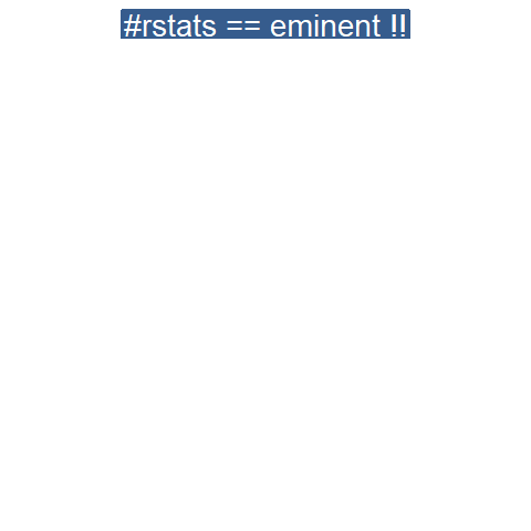
This code renders the following GIF:
Try to play around with the code to change the GIF:
Change the set.seed argument to get different synonyms in there,
Change the n to include more or less words,
Change the x and y variables to position the labels differently,
Change the size, colour, and fill of the geom_label function to change the label design,
Or change the transition_components arguments to change the display timing.
Moreover, you could change the sentence variable to something to motivate yourself. For instnace, in the following code, I changed it to include my name, and synonyms for the word good. Moreover, I picked a different gganimate function — transition_time — to display the labels according to a different pattern.
set.seed(2) # for reproducibility purposes
# generate dataframe with random synonyms sentences and assigned locations sentences_df <- data_frame( sentence = paste0("Paul is ", sample(syn("good"), n), "!") , x = time , y = seq(time, time * n, time) )
# animate the plot animate(plot2, nframes = n * time + time)
I think the result is very pleasing, comforting, and positive! Except maybe for the dinkum bit, but fortunately neither I or thesaurus.com know what that means, so it might as well be positive : )
If you go about creating your own animations, you can save them using the save_animation function of the gganimate package. Good luck!
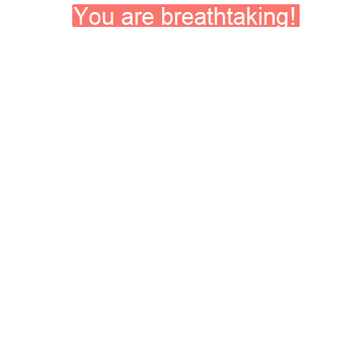
PS. The code to generate the GIF at the top of this blog is posted below. It uses another gganimate function called transition_states:
set.seed(3) # for reproducibility purposes

time = 5
n = 5

# generate dataframe with random synonyms sentences and assigned locations
sentences_df <- data_frame(
  sentence = paste0("You are ", sample(syn("amazing"), n), "!")
  , x = runif(n)
  , y = seq(time, time * n, time)
)

# generate the actual plot
ggplot(sentences_df,
       aes(x, -y,
           label = sentence,
           group = sentence,
           fill = sentence)) +
  geom_label(size = 12, colour = "white", label.size = 0.5) +
  transition_states(states = sentence, transition_length = time, state_length = time) +
  theme_void() +
  theme(legend.position = "none") +
  coord_cartesian(xlim = c(-0.5, 1.5)) ->
  plot3

# animate the plot
animate(plot3, nframes = n * time + time)
The R for Data Science (R4DS) book by Hadley Wickham is a definite must-read for every R programmer. Amongst others, the power of functional programming is explained in it very well in the chapter on Iteration. I wrote about functional programming before, but I recently re-read the R4DS book section after coming across some new valuable resources on particularly R’s purrr functions.
The purpose of this blog post is twofold. First, I wanted to share these new resources I came across, along with the other resources I already have collected over time on functional programming. Second, I wanted to demonstrate via code why functional programming is so powerful, and how it can speed up, clean, and improve your own workflow.
1. Resources
So first things first, “what are these new functional programming resources?”, you must be wondering. Well, here they are:
Thomas Mock was as inspired by the R4DS book as I was, and will run you through the details behind some of the examples in this tutorial.
Hadley Wickham himself gave a talk at a 2016 EdinbR meetup, explaing why and how to (1) use tidyr to make nested data frame, (2) use purrr for functional programming instead of for loops, and (3) visualise models by converting them to tidy data with broom:
Via YouTube.
Colin Fay dedicated several blogs to purrr. Some are very helpful as introduction — particularly this one — others demonstrate more expert applications of the power of purrr — such as this sequence of six blogs on web mining.
This GitHub repository by Dan Ovando does a fantastic job of explaining functional programming and demonstrating the functionality of purrr.
Cormac Nolan made a beautiful RPub Markdown where he displays how functional programming in combination with purrr‘s functions can result in very concise, fast, and supercharged code.
Last, but not least, part of Duke University 2017’s statistical programming course can be found here, related to functional programming with and without purrr.
2. Functional programming example
I wanted to run you through the basics behind functional programming, the apply family and their purrring successors. I try to do so by providing you some code which you can run in R yourself alongside this read. The content is very much inspired on the R4DS book chapter on iteration.
Let’s start with some data
# let's grab a subset of the mtcars dataset
mtc <- mtcars[ , 1:3] # store the first three columns in a new object
Say we would like to know the average (mean) value of the data in each of the columns of this new dataset. A starting programmer would usually write something like the below:
#### basic approach:

mean(mtc$mpg)
mean(mtc$cyl)
mean(mtc$disp)
However, this approach breaks therule of three! Bascially, we want to avoid copying and pasting anything more than twice.
A basic solution would be to use a for-loop to iterate through each column’s data one by one, and calculate and store the mean for each. Here, we first want to pre-allocate an output vector, in order to prevent that we grow (and copy into memory) a vector in each of the iterations of our for-loop. Details regarding why you do not want to grow a vector can be found here. A similar memory-issue you can create with for-loops is described here.
In the end, our for-loop approach to calculating column means could look something like this:
#### for loop approach:

output <- vector("double", ncol(mtc)) # pre-allocate an empty vector

# replace each value in the vector by the column mean using a for loop
for(i in seq_along(mtc)){
  output[i] <- mean(mtc[[i]])
}

# print the output
output
[1] 20.09062 6.18750 230.72188
This output is obviously correct, and the for-loop does the job, however, we are left with some unnecessary data created in our global environment, which not only takes up memory, but also creates clutter.
ls() # inspect global environment
[1] "i" "mtc" "output"
Let’s remove the clutter and move on.
rm(i, output) # remove clutter
Now, R is a functional programming language so this means that we can write our own function with for-loops in it! This way we prevent the unnecessary allocation of memory to overhead variables like i and output. For instance, take the example below, where we create a custom function to calculate the column means. Note that we still want to pre-allocate a vector to store our results.
#### functional programming approach:

col_mean <- function(df) {
  output <- vector("double", length(df))
  for (i in seq_along(df)) {
    output[i] <- mean(df[[i]])
  }
  output
}
Now, we can call this standardized piece of code by calling the function in different contexts:
This way we prevent that we have to write the same code multiple times, thus preventing errors and typos, and we are sure of a standardized output.
Moreover, this functional programming approach does not create unnecessary clutter in our global environment. The variables created in the for loop (i and output) only exist in the local environment of the function, and are removed once the function call finishes. Check for yourself, only our dataset and our user-defined function col_mean remain:
ls()
[1] "col_mean" "mtc"
For the specific purpose we are demonstrating here, a more flexible approach than our custom function already exists in base R: in the form of the apply family. It’s a set of functions with internal loops in order to “apply” a function over the elements of an object. Let’s look at some example applications for our specific problem where we want to calculate the mean values for all columns of our dataset.
#### apply approach:

# apply loops a function over the margin of a dataset
apply(mtc, MARGIN = 1, mean) # either by its rows (MARGIN = 1)
apply(mtc, MARGIN = 2, mean) # or over the columns (MARGIN = 2)

# in both cases apply returns the results in a vector
# sapply loops a function over the columns, returning the results in a vector
sapply(mtc, mean)
  mpg       cyl      disp
20.09062   6.18750 230.72188
# lapply loops a function over the columns, returning the results in a list
lapply(mtc, mean)
Sidenote: sapply and lapply both loop their input function over a dataframe’s columns by default as R dataframes are actually lists of equal-length vectors (see Advanced R [Wickham, 2014]).
# tapply loops a function over a vector
# grouping it by a second INDEX vector
# and returning the results in a vector
tapply(mtc$mpg, INDEX = mtc$cyl, mean)
   4        6        8
26.66364 19.74286 15.10000
These apply functions are a cleaner approach than the prior for-loops, as the output is more predictable (standard a vector or a list) and no unnecessary variables are allocated in our global environment.
Performing the same action to each element of an object and saving the results is so common in programming that our friends at RStudio decided to create the purrr package. It provides another family of functions to do these actions for you in a cleaner and more versatile approach building on functional programming.
install.packages("purrr")
library("purrr")
Like the apply family, there are multiple functions that each return a specific output:
# map_lgl returns a logical vector
# as numeric means aren't often logical, I had to call a different function
map_lgl(mtc, is.logical) # mtc's columns are numerical, hence FALSE
mpg   cyl  disp
FALSE FALSE FALSE
# map_int returns an integer vector
# as numeric means aren't often integers, I had to call a different function
map_int(mtc, is.integer) # returned FALSE, which is converted to integer (0)
mpg  cyl disp
  0    0    0
#map_dbl returns a double vector.
map_dbl(mtc, mean)
  mpg       cyl      disp
20.09062   6.18750 230.72188
# map_chr returns a character vector.
map_chr(mtc, mean)
     mpg          cyl         disp
"20.090625"   "6.187500" "230.721875"
All purrr functions are implemented in C. This makes them a little faster at the expense of readability. Moreover, the purrr functions can take in additional arguments. For instance, in the below example, the na.rm argument is passed to the mean function
map_dbl(rbind(mtc, c(NA, NA, NA)), mean) # returns NA due to the row of missing values
map_dbl(rbind(mtc, c(NA, NA, NA)), mean, na.rm = TRUE) # handles those NAs
mpg  cyl disp
 NA   NA   NA

     mpg       cyl      disp
20.09062   6.18750 230.72188
Once you get familiar with purrr, it becomes a very powerful tool. For instance, in the below example, we split our little dataset in groups for cyl and then run a linear model within each group, returning these models as a list (standard output of map). All with only three lines of code!
We can expand this as we go, for instance, by inputting this list of linear models into another map function where we run a model summary, and then extract the model coefficient using another subsequent map:
mtc %>% split(.$cyl) %>% map(~ lm(mpg ~ disp, data = .)) %>% map(summary) %>% # returns a list of linear model summaries map("coefficients")
$4
              Estimate Std. Error   t value     Pr(>|t|)
(Intercept) 40.8719553 3.58960540 11.386197 1.202715e-06
disp        -0.1351418 0.03317161 -4.074021 2.782827e-03
$6
                Estimate Std. Error   t value    Pr(>|t|)
(Intercept) 19.081987419 2.91399289 6.5483988 0.001243968
disp         0.003605119 0.01555711 0.2317344 0.825929685
$8
               Estimate  Std. Error   t value     Pr(>|t|)
(Intercept) 22.03279891 3.345241115  6.586311 2.588765e-05
disp        -0.01963409 0.009315926 -2.107584 5.677488e-02
The possibilities are endless, our code is fast and readable, our function calls provide predictable return values, and our environment stays clean!
PS. sorry for the terrible layout but WordPress really has been acting up lately… I really should move to some other blog hosting method. Any tips? Potentially Jekyll?
Tensorflow is a open-source machine learning (ML) framework. It’s primarily used to build neural networks, and thus very often used to conduct so-called deep learning through multi-layered neural nets.
Although there are other ML frameworks — such as Caffe or Torch — Tensorflow is particularly famous because it was developed by researchers of Google’s Brain Lab. There are widespread debates on which framework is best, nonetheless, Tensorflow does a pretty good job on marketing itself.
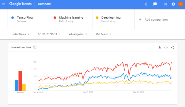
Google search engine searches on Tensorflow in comparison to searches on Machine learing and Deep learning
Bret Beheim — senior researcher at the Max Planck Institute for Evolutionary Anthropology — posted a great GIF animation of the response to his research survey. He calls the figure citation gates, relating the year of scientific publication to the likelihood that the research materials are published open-source or accessible.
To generate the visualization, Bret used R’s base plotting functionality combined with Thomas Lin Pedersen‘s R package tweenrto animate it.
I've been experimenting with R animations using the tweenR package for visualizing the results of our reproducibility survey, and I think it turned out pretty nice. pic.twitter.com/MRerAWHNYT
Bret shared his R code for the above GIF of his citation gateson GitHub. With the open source code, this amazing visual display inspired others to make similar GIFs for their own projects. For example, Anne-Wil Kruijt’s dance of the confidence intervals:
Two wks ago I built a shiny 'CI demo' app for a job interview. Yet I wasn't quite content with it. Then 2 days ago @babeheim posted an amazing gif (srsly, go check it!). Super inspired, & borrowing heavily from his code: my rendition of 'the Dance of the Confidence Intervals' pic.twitter.com/ORheOBBzDm
A spin-off of the citation gates: A gif showing confidence intervals of sample means.
Applied to a Human Resource Management context, we could use this similar animation setup to explore, for instance, recruitment, selection, or talent management processes.
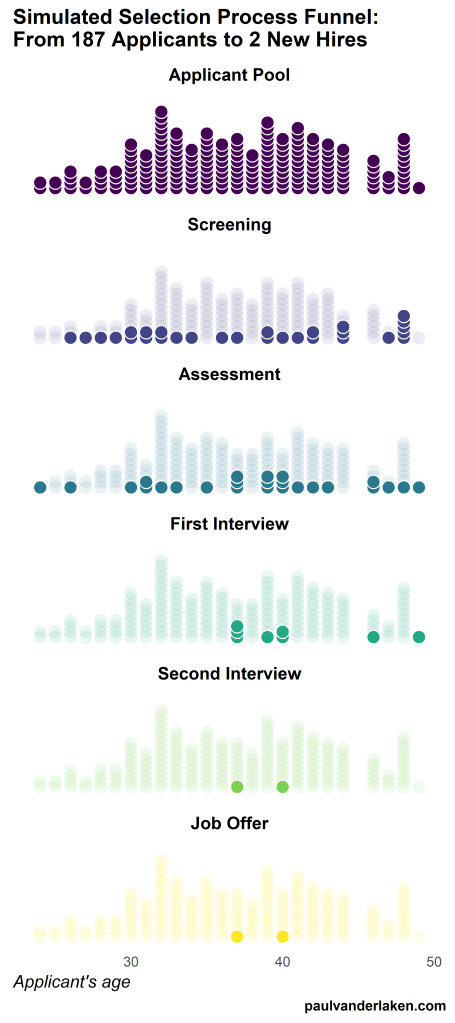
Unfortunately, I couldn’t get the below figure to animate properly yet, but I am working on it (damn ggplot2 facets). It’s a quick simulation of how this type of visualization could help to get insights into the recruitment and selection process for open vacancies.
The figure shows how nearly 200 applicants — sorted by their age — go through several selection barriers. A closer look demonstrates that some applicants actually skip the screening and assessment steps and join via a fast lane in the first interview round, which could happen, for instance, when there are known or preferred internal candidates. When animated, such insights would become more clearly visible.
I’ve mentioned before that I dislike wordclouds (for instance here, or here) and apparently others share that sentiment. In his recent Medium blog, Daniel McNichol goes as far as to refer to the wordcloud as the pie chart of text data! Among others, Daniel calls wordclouds disorienting, one-dimensional, arbitrary and opaque and he mentions their lack of order, information, and scale.
Wordcloud of the negative characteristics of wordclouds, via Medium
Instead of using wordclouds, Daniel suggests we revert to alternative approaches. For instance, in their Tidy Text Mining with R book, Julia Silge and David Robinson suggest using bar charts or network graphs, providing the necessary R code. Another alternative is provided in Daniel’s blog: the chatterplot!
While Daniel didn’t invent this unorthodox wordcloud-like plot, he might have been the first to name it a chatterplot. Daniel’s chatterplot uses a full x/y cartesian plane, turning the usually only arbitrary though exploratory wordcloud into a more quantitatively sound, information-rich visualization.
R package ggplot’s geom_text() function — or alternatively ggrepel‘s geom_text_repel() for better legibility — is perfectly suited for making a chatterplot. And interesting features/variables for the axis — apart from the regular word frequencies — can be easily computed using the R tidytext package.
Here’s an example generated by Daniel, plotting words simulatenously by their frequency of occurance in comments to Hacker News articles (y-axis) as well as by the respective popularity of the comments the word was used in (log of the ranking, on the x-axis).
[CHATTERPLOTs are] like a wordcloud, except there’s actual quantitative logic to the order, placement & aesthetic aspects of the elements, along with an explicit scale reference for each. This allows us to represent more, multidimensional information in the plot, & provides the viewer with a coherent visual logic& direction by which to explore the data.
I highly recommend the use of these chatterplots over their less-informative wordcloud counterpart, and strongly suggest you read Daniel’s original blog, in which you can also find the R code for the above visualizations.
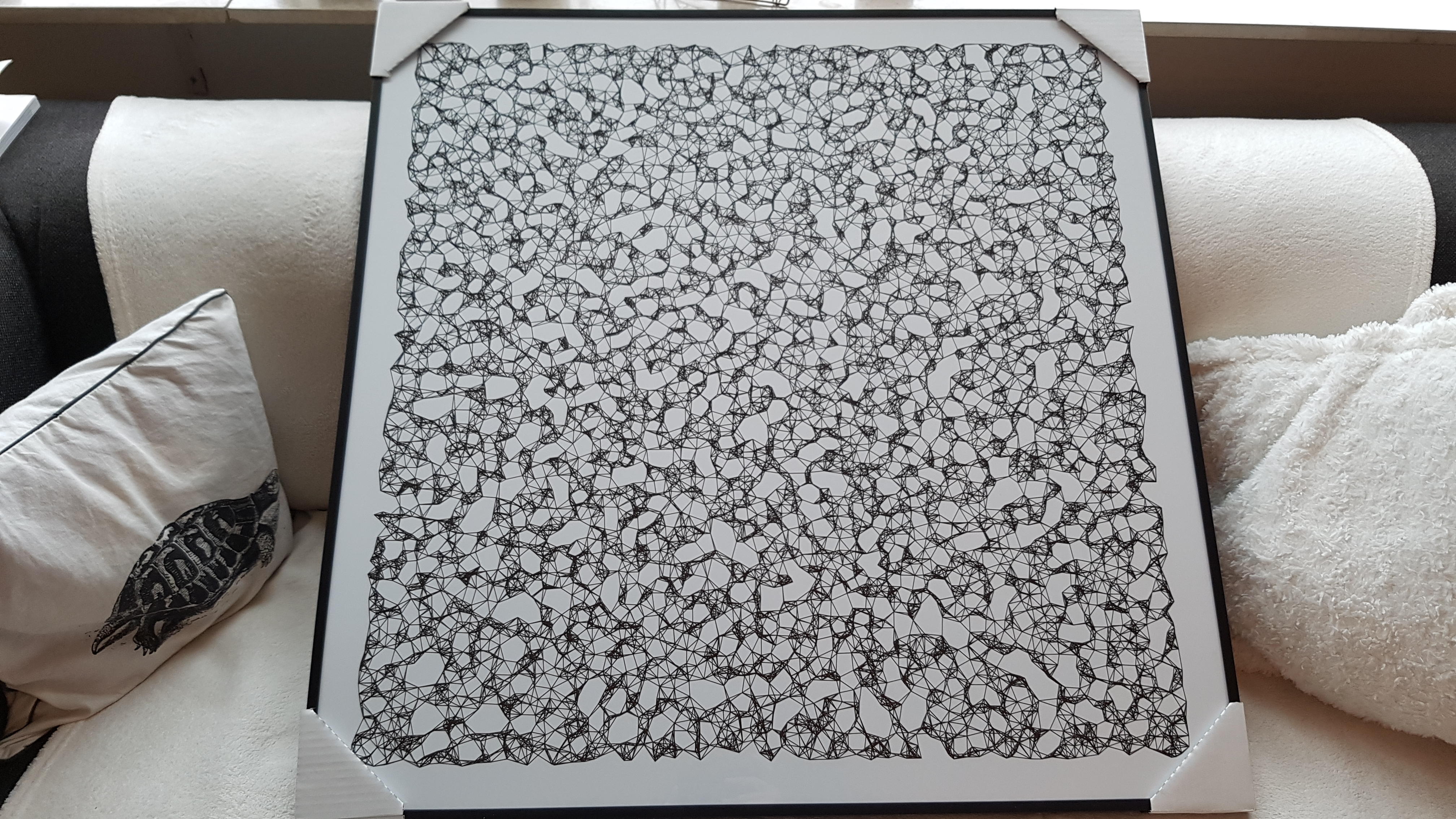
Marcus Volz is a research fellow at the University of Melbourne, studying geometric networks, optimisation and computational geometry. He’s interested in visualisation, and always looking for opportunities to represent complex information in novel ways to accelerate learning and uncover the unexpected.
One of Marcus’ hobbies is the visualization of mathematical patterns and statistical algorithms via R. He has a whole portfolio full of them, including a Github page with all the associated R code. For my recent promotion, my girlfriend asked Marcus to generate a K-nearest neighbors visual and she had it printed on a large canvas.
The picture contains about 10.000 points, randomly uniformly distributed across x and y, connected by lines with their closest k other points. Marcus shared the code to generate such k-nearest neighbor algorithm plots here on Github. So if you know your way around R, you could make your own version:
#' k-nearest neighbour graph
#'
#' Computes a k-nearest neighbour graph for a given set of points. Refer to the \href{https://en.wikipedia.org/wiki/Nearest_neighbor_graph}{Wikipedia article} for details.
#' @param points A data frame with x, y coordinates for the points
#' @param k Number of neighbours
#' @keywords nearest neightbour graph
#' @export
#' @examples
#' k_nearest_neighbour_graph()

k_nearest_neighbour_graph <- function(points, k=8) {
  get_k_nearest <- function(points, ptnum, k) {
    xi <- points$x[ptnum]
    yi <- points$y[ptnum]     points %>%
      dplyr::mutate(dist = sqrt((x - xi)^2 + (y - yi)^2)) %>%
      dplyr::arrange(dist) %>%
      dplyr::filter(row_number() %in% seq(2, k+1)) %>%
      dplyr::mutate(xend = xi, yend = yi)
  }

  1:nrow(points) %>%
    purrr::map_df(~get_k_nearest(points, ., k))
}
Those less versed in R can use Marcus package mathart. With this package, Marcus shares many more visual depictions of cool algorithms! You can install the package and several dependencies with the following lines of code:
This page of Marcus’ mathart Github repository contains the code exact code for these and many other visualizations of algorithms and statistical phenomena. Do check it out if you’re interested!
Also, check out the “Fun” section of my R tips and tricks list for more cool visuals you can generate in R!


