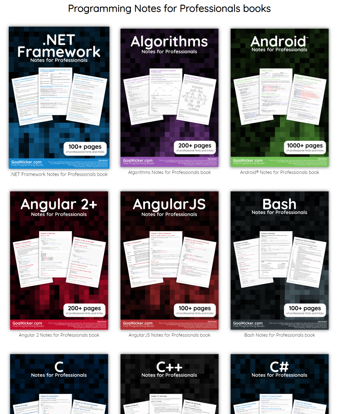
This specific link has been on my to-do list for so-long now that I’ve decided to just share it without any further ado.
The people behind GoalKicker, for whatever reason, decided to compile nearly 100 books on different programming languages based on among others StackOverflow entries. Their open access library contains books on languages from Latex to Linux, from Java to JavaScript, from SQL to MySQL, and from C, to C++, C#, and objective-C.
2018 seemed to be the year of challengesgoing viral on the web. Most of them were plain stupid and/or dangerous. However, one viral challenge I did like: #100DaysOfCode
1. Code minimum an hour every day for the next 100 days.
2. Tweet your progress every day with the #100DaysOfCode hashtag.
3. Each day, reach out to at least two people on Twitter who are also doing the challenge
Many (aspiring) programming professionals competed in this challenge, sharing their learning journeys in domains from web development, machine learning, or data visualization.
With this blog, I wanted to share two of those learning journeys that stood out for me.
Machine learning
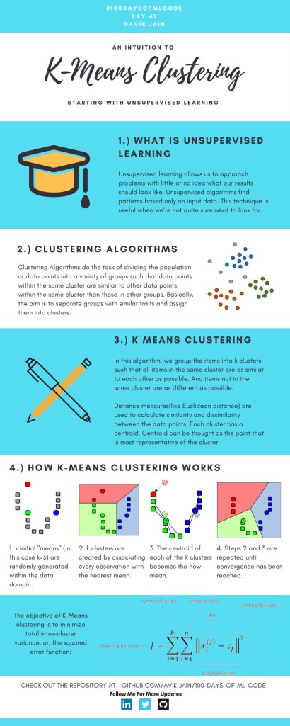
First, there’s Avik Jain’s 100 days of Machine Learning code repository on Github. Avik’s repository contains all learning activities he followed during the 53 days of programming he completed. Some of Avik’s entries really stood out, and I particularly liked his educational infographics:
Just look at the wonderful design and visual aids on this decision tree for dummies infographic, pseudocode and all:
Day 23: Decision trees for dummies. This just looks fabulous right?!
Although Avik didn’t seem to have completed the full 100 days, many others did.
Data visualization
I have blogged about Hannah Yan Han‘s 100 days of code project before, but she definately deserves another mention here. Her 100 days revolved around data science, data visualization, and storytelling using both R and Python. You can find her #100DaysOfCode Medium page here, and her associated Github repository here.
For example, one day Hannah explored where instant noodles come from, how they are served, and whether people like them or not.
What I found so great about Hannah’s project is that she picked a novel dataset every couple of days. Moreover, she used a extremely large variety of different visualization formats. All visuals were equally beautiful, but Hannah made sure to pick the right one for the purpose she was trying to serve. If you are interested in data visualization, you seriously should check out Hannah’s 100DaysOfCode Medium page.
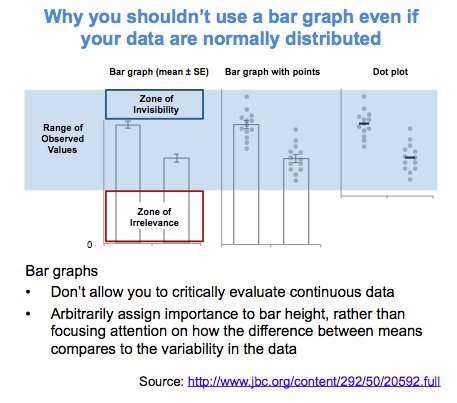
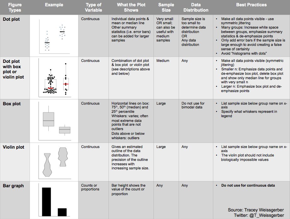
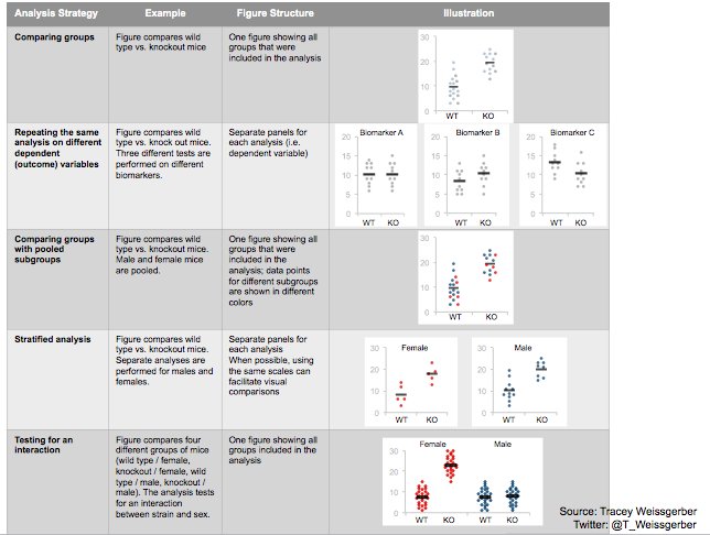
Tracey Weissgerber, Natasa Milic, Stacey Winham, and Vesna Garovic wrote this interesting 2015 paper on bar graphs. By a systematic review of physiology research, they demonstrate we need to reconsider how we present continuous data in small samples.
Bar and line plots are commonly used to display continuous data. This is problematic, as many different data distributions can lead to the same bar or line graph. Nevertheless, the rarely used scatterplots, box plots, and histograms much better allow users to critically evaluate continuous data.
They provide many interesting visuals that underline their argument.
For instance, the four datasets below (B, C, D, and E) will all result in the same barplot (A), whereas they demonstrate quite different characteristics.
Alternatively, bar plots are often used for to display group means when observations within groups may not be independent. For instance, it could be that the bars below represent two measurement occassians, and that each of our sampled observations occurs in both. In that case, the scatterplots with connected dots may be more suitable. While the bars in plot A would represent datasets B, C, and D, these are clearly different when viewed in scatterplots.
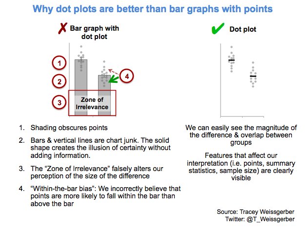
Also, a lot of meaningful information is typically lost in bar plots. For instance, the number of observations in a group. But also the distribution of values. While the former can be added (see B below), the latter can much better be shown in a scatter plot like C (below).
Actually, in a later blog post, lead researcher Tracey Weissgerber shares the below visual. It highlights the distractive irrelevance of bar plot and the information that is lost (becomes invisible) when opting for a bar chart.
Tracey refactored this into a similar visual of her own:
So what can you do instead, you may ask yourself. To this question too, Tracey has an answer, sharing the below overview of alternatives options:
She made another overview which may help you pick the best visual for your data. This one takes your intention behind the visual as a starting point, though is unfortunately a bit low quality:
However, then I imagined that not everybody may be familiar with k-means, hence, I wrote the whole blog below.
Next thing I know, u/dashee87 on r/datascience points me to these two other blogs that had already done the same… but way better! These guys perfectly explain k-means, alongside many other clustering algorithms. Including interactive examples and what not!!
Seriously, do not waste your time on reading my blog below, but follow these links. If you want to play, go for Naftali’s apps. If you want to learn, go for David’s animated blog.
Naftali Harris built this fantastic interactive app where you can run the k-means algorithm step by step on many different datasets. You can even pick the clusters’ starting locations yourself! Next to this he provides a to-the-point explanation of the inner workings. On top of all this, he built the same app for the DBSCAN algorithm(wiki), so you can compare the algorithms’ performance… Insane!
David Sheehan (yes, that’s dashee) is more of a Python guy and walks you through the inner workings of six algorithmic clustering approaches in his blog here. Included are k-means, expectation maximization, hierarchical, mean shift, and affinity propagation clustering, and DBSCAN. David has made detailed step-wise GIF animations of all these algorithms. And he explains the technicalities in a simple and understandable way. On top of this, David shared his Jupyter notebook to generate the animations, along with a repository of the GIFs themselves. Very well done! Seriously one of the best blogs I’ve read in a while.
Let me walk you through what k-means is, why it is called k-means, and how the algorithm interally works, step by step.
Let me dissect that sentence for you, starting at the back.
Algorithm
Simply put, an algorithm (wiki) is a set of task instructions to be followed. Often algorithms are perform by computers, and used in calculations or problem-solving. Basically, an algorithm is thus not much more than a sequence of task instructions to be followed by a computer — like a cooking recipe.
In machine learning (wiki), algorithmic tasks are often divided in supervised or unsupervisedlearning (let’s skip over reinforcement learning for now).
The learning part reflects that algorithms try to learn a solution — learn how to solve a problem.
The supervision part reflects whether the algorithm receives answers or solutions to learn from. For supervised learning, examples are required. In the case of unsupervised learning, algorithms do not learn by example but have figure out a proper solution themselves.
Clustering
Clustering (wiki) is essentially a fancy word for grouping. Clustering algorithms seek to group things together, and try to do so in an optimal way.
Group things. As long as we can represent things in terms of data, clustering algorithms can group them. We can group cars by their weight and horsepower, people by their length and IQ, or frogs by their slimyness and greenness. These things we would like to group, we often call observations (depicted by the letter N or n).
Optimal way. Clustering is very much an unsupervised task. Clustering algorithms do not receive examples to learn from (that’s actually classification (wiki)). Algorithms are not told what “good” clustering or grouping looks like.
Yet, how do clustering algorithms determine the optimal way to group our observations then?
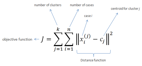
Well, clustering algorithms like k-means do so by optimizing a certain value. This value is reflected in an algorithm’s so-called objective function.
k-means’ objective function is displayed below. In simple language, k-means seeks to minimize (= optimize) the total distance of observations (= cases) to their group’s (= cluster) center (= centroid).
Fortunately, you can immediately forget this function. For now, all you need to know is that algorithms often repeat specific steps of their instructions in order for their objective function to produce a satisfactory value.
Hurray, we can now move to the k-means algorithm itself!
Why is it called k-means in the first place?
Let’s start at the front this time.
k. The k in k-means reflects the number of groups the algorithm is going to form. The algorithm depends on its user to specify what number of k should be. If the user picks k = 2 for instance, the k-means algorithm will identify 2 group by their 2 means.
As I said before, clustering algorithms like k-means are unsupervised. They do not know what good clustering looks like. In the case where the used specified k = 2, the algorithm will seek to optimize its objective function given that there are 2 groups. It will try to put our observations in 2 groups that minimizes the total distance of the observations to their group’s center. I will how that works visually later in this blog.
means. The means in k-means reflects that the algorithm considers the mean value of a cluster as its cluster center. Here, mean is a fancy word for average. Again, I will visualize how this works later.
You might have guessed it already: there are indeed variations of the k-means algorithm that do not use the cluster means, but, for instance, the cluster medians (wiki) or mediods (wiki). These algorithms are only slight modifications of the k-means algorithm, and simply called the k-medians (wiki) and k-medoids algorithms (wiki).
How does k-means work?
Finally, we get to the inner workings of k-means!
The k-means algorithm consists of five simple steps:
Obtain a predefined k.
Pick k random points as cluster centers.
Assign observations to their closest cluster center based on the Euclidean distance.
Update the center of each cluster based on the included observations.
Terminate if no observations changed cluster, otherwise go back to step 3.
Easy right?
OK, I can see how this may not be directly clear.
Let’s run through the steps one by one using an example dataset.
Example dataset: mtcars
Say we have the dataset below, containing information on 32 cars.
We can consider each car a separate observation. For each of these observations, we have its weight and its horsepower.
These characteristics — weight and horsepower — of our observations are the variables in our dataset. Our cars vary based on these variables.
Name
Weight
Horsepower
Mazda RX4
1188
110
Mazda RX4 Wag
1304
110
Datsun 710
1052
93
Hornet 4 Drive
1458
110
Hornet Sportabout
1560
175
Valiant
1569
105
Duster 360
1619
245
Merc 240D
1447
62
Merc 230
1429
95
Merc 280
1560
123
Merc 280C
1560
123
Merc 450SE
1846
180
Merc 450SL
1692
180
Merc 450SLC
1715
180
Cadillac Fleetwood
2381
205
Lincoln Continental
2460
215
Chrysler Imperial
2424
230
Fiat 128
998
66
Honda Civic
733
52
Toyota Corolla
832
65
Toyota Corona
1118
97
Dodge Challenger
1597
150
AMC Javelin
1558
150
Camaro Z28
1742
245
Pontiac Firebird
1744
175
Fiat X1-9
878
66
Porsche 914-2
971
91
Lotus Europa
686
113
Ford Pantera L
1438
264
Ferrari Dino
1256
175
Maserati Bora
1619
335
Volvo 142E
1261
109
Visually, we can represent this same dataset as follows:
Step 1: Define k
For whatever reason, we might want to group these 32 cars.
We know the cars’ weight and horsepower, so we can use these variables to group the cars. The underlying assumption being that cars that are more similar in terms of weight and/or horsepower would belong together in the same group.
Normally, we would have smart or valid reasons to expect a specific number of groups among our observations. For now, let’s simply say that we want to put these cars into, say, 2 groups.
Well, that’s step 1 already completed: we defined k = 2.
Step 2: Initialize cluster centers
In step 2, we need to initialize the algorithm.
Everyone needs to start somewhere, and the default k-means algorithm starts out super naively: it just picks random locations as our starting cluster centers.
For instance, the algorithm might initialize cluster 1 randomly at a weight of 1000 kilograms and a horsepower of 100.
We can use coordinate notation [x; y] or [weight; horsepower] to write this location in short. Hence, the initial random center of cluster 1 picked by the k-means algorithm is located at [1000; 100].
Randomly, k-means could initialize cluster 2 at a weight of 1500kg and a horsepower of 200. It’s intitial center is thus at [1500; 200].
Visually, we can display this initial situation like the below, with our 32 cars as grey dots in the background:
Now, step 2 is done, and our k-means algorithm has been fully initialized. We are now ready to enter the core loop of the algorithm. The next three steps — 3, 4, and 5 — will be repeated until the algorithm tells itself it is done.
Step 3: Assignment to closest cluster
Now, in step 3, the algorithm will assign every single car in our dataset to the cluster whose center is closest.
To do this, the algorithm looks at every car, one by one, and calculate its distance to every of our cluster centers.
So how would this distance calculating thing work?
The algorithm starts with the first car in our dataset, a Mazda RX4.
This Mazda RX4 weighs 1188kg and has 110 horsepower. Hence, it is located at [1188; 110].
As this is the first time our k-means algorithm reaches step 3, the cluster centers are still at the random locations the algorithm has picked in step 2.
The k-means algorithm now calculates the Euclidean distance (wiki) of this Mazda RX4 data point [1188; 110] to each of the cluster centers.
The Euclidean distance is calculated using the formula below. The first line shows you that the Euclidean distance is the square root of the squared distance between two observations. The second line — with the big Greek capital letter Sigma (Σ) — is a shorter way to demonstrate that the distance is calculated and summed up for each of the variables considered.
Again, please don’t mind the formula, the Euclidean distance is basically the length of a straight line between two data points.
So… back to our Mazda RX4. This Mazda is one of the two observations we need to input in the formula. The second observation would be a cluster center. We input both of the location of our Mazda [1188; 110] and that of a cluster center –, say cluster 1’s [1000; 100] — in the formula, and out comes the Euclidean distance between these two observations.
The Euclidean distance of our Mazda RX4 to the center of cluster 1 would thus be √((1118 – 1000)2 + (110 – 100)2), which equals 192.2082 — or a rounded 192.
We need to repeat this, but now with the location of our second cluster center. The Euclidean distance from our Mazda RX4 to the center of cluster 2 would be √((1118 – 1500)2 + (110 – 150)2), which equals 314.5537 — or a rounded 314.
Again, I visualized this situation below.
You can clearly see that our Mazda RX4 is closer to cluster center 1 (192) than to cluster center 2 (314). Hence, as the distance to cluster 1’s center is smaller, the k-means algorithm will now assign our Mazda RX4 to cluster 1.
Subsequently, the algorithm continues with the second car in our dataset.
Let this second car be the Mercedes 280C for now, weighing in at 1560 kg with a horsepower of 153.
Again, the k-means algorithm would calcalute the Euclidean distance from this Mercedes [1560; 153] to each of our cluster centers.
It would find that this Mercedes is located much closer to cluster 2’s center (560) than cluster 1’s (65).
Hence, the k-means algorithm will assign the Mercedes 280C to cluster 2, before continuing with the next car…
and the next car after that…
and the next car…
… until all cars are assigned to one of the clusters.
This would mean that step 3 is completed. Visually, the situation at the end of step 3 will look like this:
Step 4: Update the cluster centers
Now, in step 4, the k-means algorithm will update the cluster centers.
As a result of step 3, there are now actual observations assigned to the clusters. Hence, the k-means algorithm can let go of its naive initial random guesses and calculate the actual cluster centers.
Because we are dealing with the k-means algorithm, these centers will be based on the mean values of the observations in each group.
So for each cluster, the algorithm takes the observations assigned to it, and calculates the cluster’s mean value for every variable. In our case, the algorithm thus calculates 4 means: the average weight and the average horsepower, for each of our two clusters.
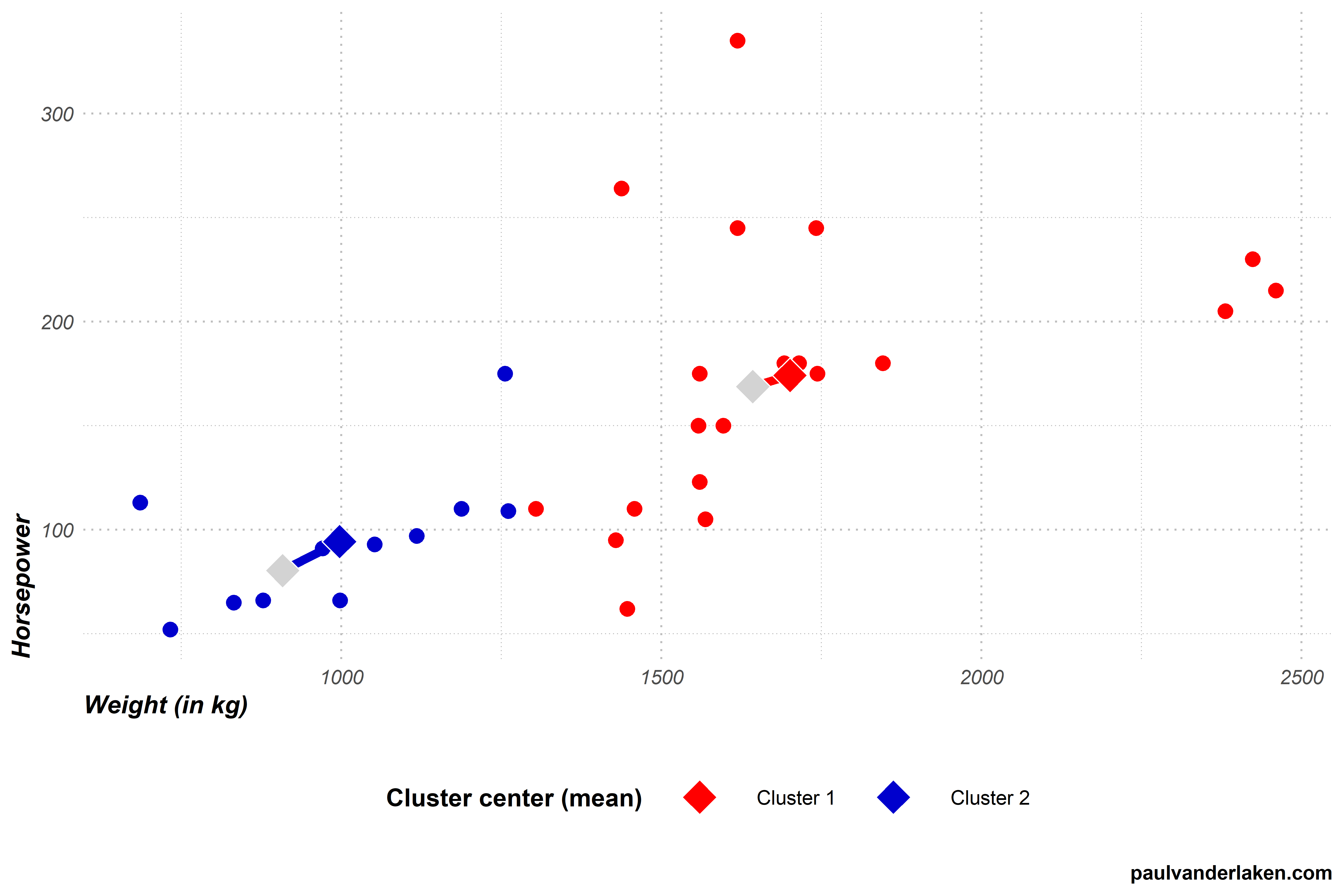
For cluster 1, the average weight of its cars is a rounded 939 kg. Its average horsepower is approximately 84. Hence the cluster center is updated to location [939; 84]. Cluster 2’s mean values come in at [1663; 171].
With the cluster centers updated, the k-means algorithm has finished step 4. Visually, the situation now looks as follows, with the old cluster centers in grey.
Step 5: Terminate or go back to step 3.
So that was actually all there is to the k-means algorithm. From now on, the algorithm either terminates or goes back to step 3.
So how does the k-means algorithm know when it is done?
Earlier in this blog post I already asked “how do clustering algorithms determine the optimal way to group our observations?”
Well, we already know that the k-means algorithm wants to optimize its objective function. It seeks to minimize the total distance of observations to their respective cluster centers. It does so by assigning observations to the cluster whose center is nearest according to the Euclidean distance.
Now, with the above in mind, the k-means algorithm determines that it has reached an optimal clustering solution if, in step 3, no single observation switches to a different cluster.
If that is the case, then every observation is assigned to the group whose center values best represent its underlying characteristics (weight and horsepower), and the k-means algorithm is thus satisfied with the solution given this number of groups (= k). These groups centers now best describe the characteristics of the individual observations at hand, given this k, as evidenced that each observations belongs to the cluster whose center values are closest to their own values.
Now, the k-means algorithm will have to check whether it is done somewhere in its instructions. It seems most logical to directly do this in step 3: quickly check whether every observations remained in its original cluster.
This is not so difficult if you have only 32 cars. However, what if we were clustering 100.000 cars? We would not want to check for 100.000 cars whether they remained in their respective cluster, right? That’s a heavy task, even for a computer.
Potentially there is an easier way to check this? Maybe we could look at our cluster centers? We update them in step 4. And if no observations have changed clusters, then the locations of our cluster centers will for sure also not have changed.
Even in our simple example it is less work to see check whether 2 cluster centers have remained the same, than comparing whether 32 cars have not changed clusters.
So basically, that’s what we will do in this step five. We check whether our cluster centers have moved.
In this case, they did. As can be seen in the visual at the end of step 4.
This is also to be expected, as it is very unlikely that the algorithm could have randomly picked the initial cluster centers in their optimal locations, right?
We conclude step 5 and, because the cluster center locations have changed in step 4, the algorithm is sent back to step 3.
Let’s see how the k-means algorithm continues in our example.
Step 3 (2nd time): Assignment to closest cluster
In step 3, the algorithm reassigns every car in our dataset to the cluster whose center is nearest.
To do this, the algorithm has to look at every car, one by one, and calculate its distance to every of our cluster centers.
Our cluster centers have been updated in the previous step 4. Hence, the distances between our observations and cluster centers may have changed respective to the first time the algorithm performed step 3.
Indeed two cars that were previously closer to the blue cluster 2 center are now actually closer to the red cluster 1 center.
In this step 3, again all observations are assigned to their closest clusters, and two observations thus change cluster.
Visually, the situation now looks like the below. I’ve marked the two cars that switched in yellow and with an exclamation mark.
The k-means algorithm now again reaches step 4.
Step 4 (2nd time): Update the cluster centers
In step 4, the algorithm updates the cluster centers. Because we are dealing with the k-means algorithm, these centers will be based on the mean values of the observations in each group.
For cluster 1, both the average weight and the average horsepower have increased due to the two new cars. The cluster center thus moves from approximately [939; 84] to [998; 94].
Cluster 2 lost two cars from its cluster, but both were on the lower end of its ranges. Hence its average weight and horsepower have also increased, moving the center from approximately [1663; 171] to [1701; 174].
With the cluster centers updated, step 4 is once again completed. Visually, the situation now looks as follows, with the old centers in grey.
Step 5 (2nd time): Terminate or go back to step 3.
In step 5, the k-means algorithm again checks whether it is done. It concludes that it is not, because the cluster centers have both moved once more. This indicates that at least some observations have changed cluster, and that a better solution may be possible. Hence, the algorithm needs to return to step 3 for a third time.
Are you still with me? We are nearly there, I hope…
Step 3 (3nd time): Assignment to closest cluster
In step 3, the algorithm assigns every car in our dataset to the cluster whose center is nearest. To do this, the algorithm looks at every car, one by one, and calculates its distance to each of our cluster centers. As our cluster centers have been updated in the previous step 4, so too will their distances to the cars.
After calculating the distances, step 3 is once again completed by assigning the observations to their closest clusters. Another car moved from the blue cluster 2 to the red cluster 1, highlighted in yellow with an exclamation mark.
Step 4 (3rd time): Update the cluster centers
In step 4, the algorithm updates the cluster centers. For each cluster, it looks at the values of the observations assigned to it, and calculates the mean for every variable.
For cluster 1, both the average weight and the average horsepower have again increased slightly due to the newly assigned car. The cluster center moves from approximately [998; 94] to [1023; 96].
Cluster 2 lost a car from its cluster, but it was on the lower end of its range. Hence, its average weight and horsepower have also increased, moving the cluster center from approximately [1701; 174] to [1721; 177].
With the renewed cluster centers, step 4 is once again completed. Visually, the situation looks as follows, with the old centers in grey.
Step 5 (3rd): Terminate or go back to step 3.
In step 5, the k-means algorithm will again conclude that it is not yet done. The cluster centers have both moved once more, due to one car changing from cluster 2 to cluster 1 in step 3 (3rd time). Hence, the algorithm returns to step 3 for a fourth, but fortunately final, time.
Step 3 (4th time): Assignment to closest cluster
In step 3, the k-means algorithm assigns every car in our dataset to the cluster whose center is nearest. Our cluster centers have only changed slightly in the previous step 4, and thus the distances are nearly similar to last time. Hence, this is the first time the algorithm completes step 3 without having to reassign observations to clusters. We thus know the algorithm will terminate the next time it checks for cluster changes.
Step 4 (4th time): Update the cluster centers
In step 4, the k-means algorithm tries to update the cluster centers. However, no observations moved clusters in step 3 so there is nothing to update.
Step 5 (4th): Terminate or go back to step 3.
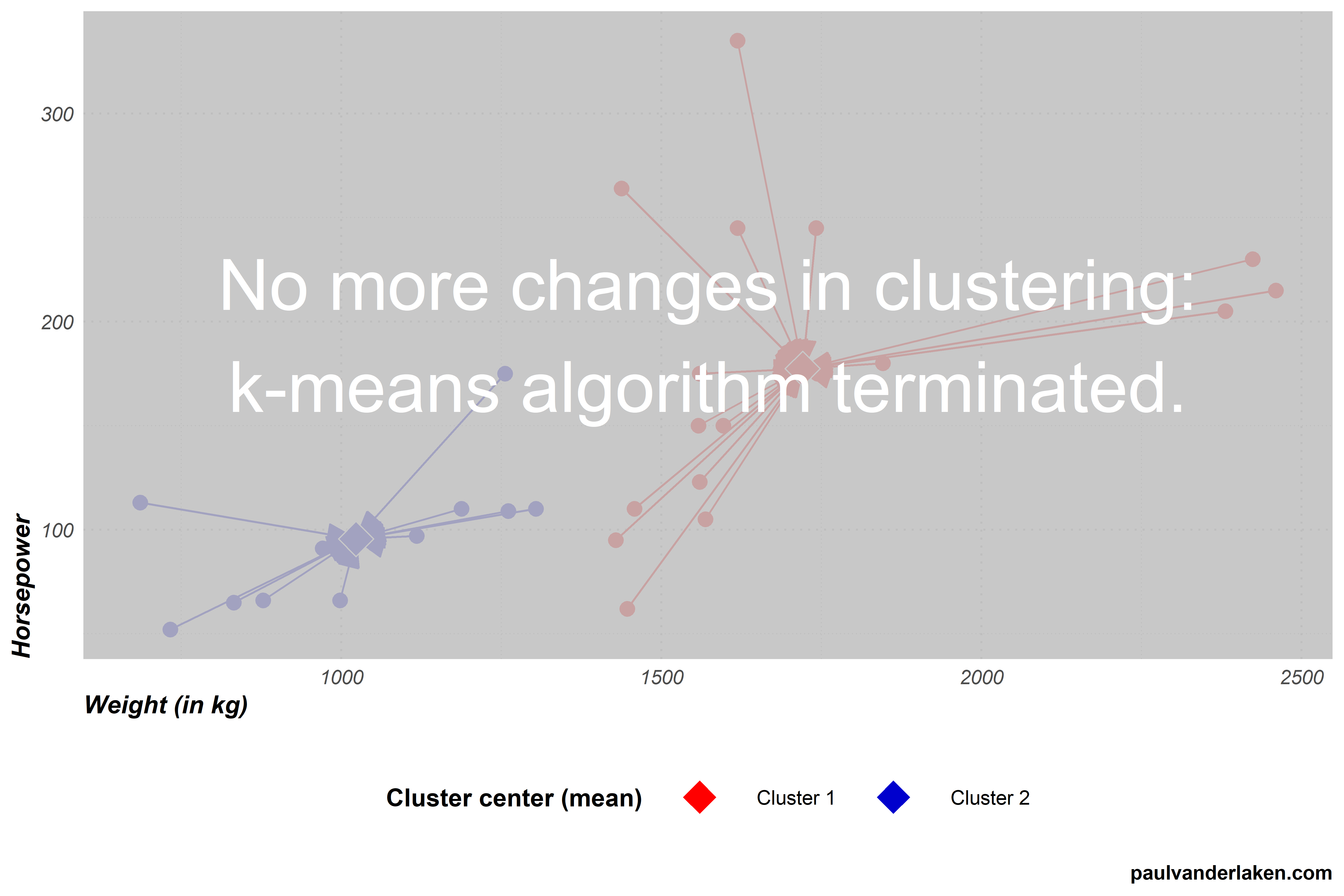
As no changes occured to our cluster centers, the algorithm now concludes that it has reached the optimal clustering and terminates.
The clustering solution
With the clustering now completed, we can try to make some sense of the clusters the k-means algorithm produced.
For instance, we can examine how the observations included in each cluster vary on our variables. The density plot below is an example how we could go about exploring what the clusters represent.
We can clearly see what the clusters are made up of.
Cluster 1 holds most of the cars with low horsepower, and nearly all of those with low weights.
Cluster 2, in contrast, includes cars with horsepower ranging from low through high, and all cars are relatively heavy.
We could thus name our clusters respecitvively low horsepower and low weight cars, for cluster 1, and medium to high weight cars, for cluster 2.
Obviously, these clustering solutions will become more interesting as we add more clusters, and more variables to seperate our clusters and observations on.
A word of caution regarding k-means
Normalized input data
In our car clustering example, particularly the weight of cars seemed to be an important discriminating characteristic.
This is largely due to the fact that we didn’t normalize our data before running the k-means algorithm. I explicitly didn’t normalize (wiki) for simplicity sake and didactic purposes.
However, using k-means with raw data is actually a really easily-made but impactful mistake! Not normalizing data will cause k-means to put relative much importance on variables with a larger variance. Such as our variable weight. Cars’ weights ranged from a low 686 kg, to a high 2460 kg, thus spreading almost 1800 units. In contrast, horsepower ranged only from 52 hp to 335 hp, thus spreading less than 300 units.
If not normalized, this larger variation among weight values will cause the calculated Euclidean distance to be much more strongly affected by the weights of cars. Hence, these car weights will thus more strongly determine the final clustering solution simply because of their unit of measurement. In order to align the units of measurement for all variables, you should thus normalize your data before running k-means.
No categorical data
The need to normalize input data before running the k-means algorithm also touches on a second important characteristic of k-means: it does not handle categorical data.
Categorical data is discrete, and doesn’t have a natural origin. For instance, car color is a categorical variable. Cars can be blue, yellow, pink, or black. You can really calculate Euclidean distances for such data, at least not in a meaningful way. How far is blue from yellow, further or closer than it is from black?
Fortunately, there are variations of k-means that can handle categorical data, for instance, the k-modes algorithm.
No garuantees
The k-means algorithm does not guarantee to find the optimal solution. k-means is a fairly simple sequence of tasks and its clustering quality depends a lot on two factors.
First, the k specified by the user. In our example, we arbitrarily picked k = 2. This makes the algorithm seek specifically for solutions with two clusters, whereas maybe 3- or 4-cluster solutions would have made more sense.
Sometimes, users will have good theories to expect a certain number of clusters. At other times, they do not and are left to guess and experiment.
While there are methods to assess to some extent the statistically optimal number of clusters, often the decision for k will be somewhat subjective, though strongly affect the clustering solution..
Second, and more imporant maybe, is the influence of the random starting points for the initial cluster centers picked by the algorithm itself.
The clustering solutions that the algorithm produces are very sensitive to these initial conditions.
Due to its random starting points, it is also very likely that every time you run the k-means algorithm you will get different results, even on the same dataset.
To illustrate this, I ran the k-means visualization algorithm I wrote run a dozen of times.
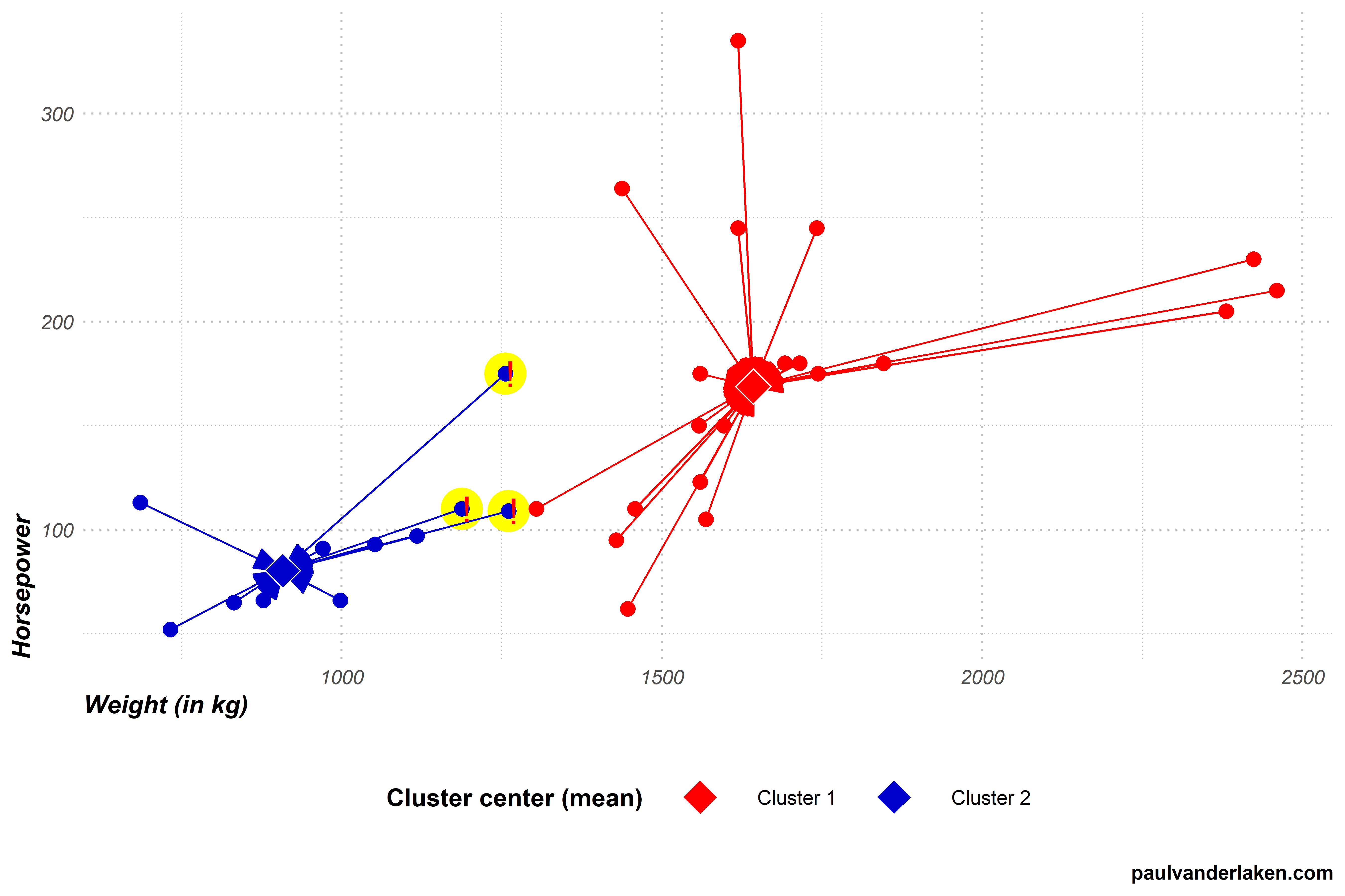
Below is solution number 3 to which the k-means algorithm converged for our cars dataset. You can see that this is different from our earlier solution where the car at [1450; 270] belonged to the blue cluster 2, whereas here it is assigned to the red cluster 1.
Most k-means algorithms I ran on this dataset of cars resulted in approximately the same solution, like the one above and the one we saw before.
However, the k-means algorithm also produced some very different solutions. Like the one below, number 9. In this case cluster 2 was randomly initiated very muhc on the high end of the weight spectrum. As a result, the cluster 2 center remained all the way on the right side of the graph throughout the iterations of the algorithm.
Or this take this long-lasting iteration, where the k-means algorithm randomly located both cluster centers all the way in the bottom left corner, but fortunately recovered to the same solution we saw before.
One the one hand, the k-means algorithm sequences above illustrate the danger and downside of the k-means algorithm employing its random starting points. On the other hand, the mostly similar solutions produced even by the vanilla algorithm illustrate how the fantasticly simple algorithm is quite sturdy. Moreover, many smart improvements have fortunately been developed to avoid the random stupidity produced by the default algorithm — most notably the k-means++ algorithm (wiki). With these improvements, k-means continues to be one of the simplest though most popular and effective clustering algorithms out there!
Thanks for reading this blog!
While I intended to only share the link to the interactive visualization, I got carried away and ended up simulating the whole thing myself. Hopefully it wasn’t time wasted, and you learned a thing or two
Do reach out if you want to know more or are interested in the code to generate these simulations and visuals. Also, feel free to comment on, forward, or share any of the contents!
The cars dataset you can access in R by calling mtcars directly in your R console. Do explore it, as it contains many more variables on these 32 cars.
Some additional k-means resources
Here are some pages you can browse if you’re looking to learn more.
One of their GIFs I particularly liked, copied below. Using the OpenSci syn package they looked up synonyms for cool and printed those in some nice colors.
On GitHub, you can find the original code for this project. However, I didn’t get it working on my machine — due to recent updates to the gganimate package — so I had to create my own version, which you find below.
devtools::install_github("ropenscilabs/syn") # only needed for first-time install devtools::install_github('thomasp85/gganimate') # install the most recent version of gganimate
synonyms <- syn("great") # store synonyms for your word of chosing
n = 15 # number of synonyms to sample time = 3 # their position in the plot as well as the duration of their display
# generate dataframe with random synonyms sentences and assigned locations sentences_df <- data_frame( sentence = paste("#rstats ==", sample(synonyms, n), "!!") , x = time , y = seq(time, time * n, time) )
# generate the actual plot ggplot(sentences_df, aes(x, -y, label = sentence, group = sentence, fill = sentence)) + geom_label(size = 10, colour = "white", label.size = 0.3) + transition_components(id = sentence, time = y, enter_length = n * time + time , exit_length = n * time + time) + scale_fill_viridis_d() + theme_void() + theme(legend.position = "none") -> plot1
# animate the plot animate(plot1, nframes = n * time + time)
This code renders the following GIF:
Try to play around with the code to change the GIF:
Change the set.seed argument to get different synonyms in there,
Change the n to include more or less words,
Change the x and y variables to position the labels differently,
Change the size, colour, and fill of the geom_label function to change the label design,
Or change the transition_components arguments to change the display timing.
Moreover, you could change the sentence variable to something to motivate yourself. For instnace, in the following code, I changed it to include my name, and synonyms for the word good. Moreover, I picked a different gganimate function — transition_time — to display the labels according to a different pattern.
set.seed(2) # for reproducibility purposes
# generate dataframe with random synonyms sentences and assigned locations sentences_df <- data_frame( sentence = paste0("Paul is ", sample(syn("good"), n), "!") , x = time , y = seq(time, time * n, time) )
# animate the plot animate(plot2, nframes = n * time + time)
I think the result is very pleasing, comforting, and positive! Except maybe for the dinkum bit, but fortunately neither I or thesaurus.com know what that means, so it might as well be positive : )
If you go about creating your own animations, you can save them using the save_animation function of the gganimate package. Good luck!
PS. The code to generate the GIF at the top of this blog is posted below. It uses another gganimate function called transition_states:
set.seed(3) # for reproducibility purposes

time = 5
n = 5

# generate dataframe with random synonyms sentences and assigned locations
sentences_df <- data_frame(
  sentence = paste0("You are ", sample(syn("amazing"), n), "!")
  , x = runif(n)
  , y = seq(time, time * n, time)
)

# generate the actual plot
ggplot(sentences_df,
       aes(x, -y,
           label = sentence,
           group = sentence,
           fill = sentence)) +
  geom_label(size = 12, colour = "white", label.size = 0.5) +
  transition_states(states = sentence, transition_length = time, state_length = time) +
  theme_void() +
  theme(legend.position = "none") +
  coord_cartesian(xlim = c(-0.5, 1.5)) ->
  plot3

# animate the plot
animate(plot3, nframes = n * time + time)
The R for Data Science (R4DS) book by Hadley Wickham is a definite must-read for every R programmer. Amongst others, the power of functional programming is explained in it very well in the chapter on Iteration. I wrote about functional programming before, but I recently re-read the R4DS book section after coming across some new valuable resources on particularly R’s purrr functions.
The purpose of this blog post is twofold. First, I wanted to share these new resources I came across, along with the other resources I already have collected over time on functional programming. Second, I wanted to demonstrate via code why functional programming is so powerful, and how it can speed up, clean, and improve your own workflow.
1. Resources
So first things first, “what are these new functional programming resources?”, you must be wondering. Well, here they are:
Thomas Mock was as inspired by the R4DS book as I was, and will run you through the details behind some of the examples in this tutorial.
Hadley Wickham himself gave a talk at a 2016 EdinbR meetup, explaing why and how to (1) use tidyr to make nested data frame, (2) use purrr for functional programming instead of for loops, and (3) visualise models by converting them to tidy data with broom:
Via YouTube.
Colin Fay dedicated several blogs to purrr. Some are very helpful as introduction — particularly this one — others demonstrate more expert applications of the power of purrr — such as this sequence of six blogs on web mining.
This GitHub repository by Dan Ovando does a fantastic job of explaining functional programming and demonstrating the functionality of purrr.
Cormac Nolan made a beautiful RPub Markdown where he displays how functional programming in combination with purrr‘s functions can result in very concise, fast, and supercharged code.
Last, but not least, part of Duke University 2017’s statistical programming course can be found here, related to functional programming with and without purrr.
2. Functional programming example
I wanted to run you through the basics behind functional programming, the apply family and their purrring successors. I try to do so by providing you some code which you can run in R yourself alongside this read. The content is very much inspired on the R4DS book chapter on iteration.
Let’s start with some data
# let's grab a subset of the mtcars dataset
mtc <- mtcars[ , 1:3] # store the first three columns in a new object
Say we would like to know the average (mean) value of the data in each of the columns of this new dataset. A starting programmer would usually write something like the below:
#### basic approach:

mean(mtc$mpg)
mean(mtc$cyl)
mean(mtc$disp)
However, this approach breaks therule of three! Bascially, we want to avoid copying and pasting anything more than twice.
A basic solution would be to use a for-loop to iterate through each column’s data one by one, and calculate and store the mean for each. Here, we first want to pre-allocate an output vector, in order to prevent that we grow (and copy into memory) a vector in each of the iterations of our for-loop. Details regarding why you do not want to grow a vector can be found here. A similar memory-issue you can create with for-loops is described here.
In the end, our for-loop approach to calculating column means could look something like this:
#### for loop approach:

output <- vector("double", ncol(mtc)) # pre-allocate an empty vector

# replace each value in the vector by the column mean using a for loop
for(i in seq_along(mtc)){
  output[i] <- mean(mtc[[i]])
}

# print the output
output
[1] 20.09062 6.18750 230.72188
This output is obviously correct, and the for-loop does the job, however, we are left with some unnecessary data created in our global environment, which not only takes up memory, but also creates clutter.
ls() # inspect global environment
[1] "i" "mtc" "output"
Let’s remove the clutter and move on.
rm(i, output) # remove clutter
Now, R is a functional programming language so this means that we can write our own function with for-loops in it! This way we prevent the unnecessary allocation of memory to overhead variables like i and output. For instance, take the example below, where we create a custom function to calculate the column means. Note that we still want to pre-allocate a vector to store our results.
#### functional programming approach:

col_mean <- function(df) {
  output <- vector("double", length(df))
  for (i in seq_along(df)) {
    output[i] <- mean(df[[i]])
  }
  output
}
Now, we can call this standardized piece of code by calling the function in different contexts:
This way we prevent that we have to write the same code multiple times, thus preventing errors and typos, and we are sure of a standardized output.
Moreover, this functional programming approach does not create unnecessary clutter in our global environment. The variables created in the for loop (i and output) only exist in the local environment of the function, and are removed once the function call finishes. Check for yourself, only our dataset and our user-defined function col_mean remain:
ls()
[1] "col_mean" "mtc"
For the specific purpose we are demonstrating here, a more flexible approach than our custom function already exists in base R: in the form of the apply family. It’s a set of functions with internal loops in order to “apply” a function over the elements of an object. Let’s look at some example applications for our specific problem where we want to calculate the mean values for all columns of our dataset.
#### apply approach:

# apply loops a function over the margin of a dataset
apply(mtc, MARGIN = 1, mean) # either by its rows (MARGIN = 1)
apply(mtc, MARGIN = 2, mean) # or over the columns (MARGIN = 2)

# in both cases apply returns the results in a vector
# sapply loops a function over the columns, returning the results in a vector
sapply(mtc, mean)
  mpg       cyl      disp
20.09062   6.18750 230.72188
# lapply loops a function over the columns, returning the results in a list
lapply(mtc, mean)
Sidenote: sapply and lapply both loop their input function over a dataframe’s columns by default as R dataframes are actually lists of equal-length vectors (see Advanced R [Wickham, 2014]).
# tapply loops a function over a vector
# grouping it by a second INDEX vector
# and returning the results in a vector
tapply(mtc$mpg, INDEX = mtc$cyl, mean)
   4        6        8
26.66364 19.74286 15.10000
These apply functions are a cleaner approach than the prior for-loops, as the output is more predictable (standard a vector or a list) and no unnecessary variables are allocated in our global environment.
Performing the same action to each element of an object and saving the results is so common in programming that our friends at RStudio decided to create the purrr package. It provides another family of functions to do these actions for you in a cleaner and more versatile approach building on functional programming.
install.packages("purrr")
library("purrr")
Like the apply family, there are multiple functions that each return a specific output:
# map_lgl returns a logical vector
# as numeric means aren't often logical, I had to call a different function
map_lgl(mtc, is.logical) # mtc's columns are numerical, hence FALSE
mpg   cyl  disp
FALSE FALSE FALSE
# map_int returns an integer vector
# as numeric means aren't often integers, I had to call a different function
map_int(mtc, is.integer) # returned FALSE, which is converted to integer (0)
mpg  cyl disp
  0    0    0
#map_dbl returns a double vector.
map_dbl(mtc, mean)
  mpg       cyl      disp
20.09062   6.18750 230.72188
# map_chr returns a character vector.
map_chr(mtc, mean)
     mpg          cyl         disp
"20.090625"   "6.187500" "230.721875"
All purrr functions are implemented in C. This makes them a little faster at the expense of readability. Moreover, the purrr functions can take in additional arguments. For instance, in the below example, the na.rm argument is passed to the mean function
map_dbl(rbind(mtc, c(NA, NA, NA)), mean) # returns NA due to the row of missing values
map_dbl(rbind(mtc, c(NA, NA, NA)), mean, na.rm = TRUE) # handles those NAs
mpg  cyl disp
 NA   NA   NA

     mpg       cyl      disp
20.09062   6.18750 230.72188
Once you get familiar with purrr, it becomes a very powerful tool. For instance, in the below example, we split our little dataset in groups for cyl and then run a linear model within each group, returning these models as a list (standard output of map). All with only three lines of code!
We can expand this as we go, for instance, by inputting this list of linear models into another map function where we run a model summary, and then extract the model coefficient using another subsequent map:
mtc %>% split(.$cyl) %>% map(~ lm(mpg ~ disp, data = .)) %>% map(summary) %>% # returns a list of linear model summaries map("coefficients")
$4
              Estimate Std. Error   t value     Pr(>|t|)
(Intercept) 40.8719553 3.58960540 11.386197 1.202715e-06
disp        -0.1351418 0.03317161 -4.074021 2.782827e-03
$6
                Estimate Std. Error   t value    Pr(>|t|)
(Intercept) 19.081987419 2.91399289 6.5483988 0.001243968
disp         0.003605119 0.01555711 0.2317344 0.825929685
$8
               Estimate  Std. Error   t value     Pr(>|t|)
(Intercept) 22.03279891 3.345241115  6.586311 2.588765e-05
disp        -0.01963409 0.009315926 -2.107584 5.677488e-02
The possibilities are endless, our code is fast and readable, our function calls provide predictable return values, and our environment stays clean!
PS. sorry for the terrible layout but WordPress really has been acting up lately… I really should move to some other blog hosting method. Any tips? Potentially Jekyll?


