Google has announced to provide open access to its artificial intelligence and machine learning courses. On their overview page, you will find many educational resources from machine learning experts at Google. They announced to share AI and machine learning lessons, tutorials and hands-on exercises for people at all experience levels. Simply filter through the resources and start learning, building and problem-solving.
For instance, up your game straight away with this 15-hour Machine Learning crash course. Zuri Kemp – who leads Google’s machine learning education program – said that over 18,000 Googlers have already enrolled in the course. Designed by the engineering education team, the courses explores loss functions and gradient descent and teached you to build your own neural network in Tensorflow.
Professor John Kruschke and Torrin Liddell – one of his Ph.D. students at Indiana University – wrote a fantastically useful scientific paper introducing Bayesian data analysis to the masses. Kruschke and Liddell explain the main ideas behind Bayesian statistics, how Bayesians deal with continuous and binary variables, how to use and set meaningful priors, the differences between confidence and credibility intervals, how to perform model comparison tests, and many more. The paper is published open access so you can read it here.
I found it incredibly useful, providing me with a better understanding of how Bayesian analysis works, what kind of questions you can answer with it, and what the resulting insights would comprise of. After reading it, I was honestly asking myself why I don’t use Bayesian methods more often… So what’s next, how to learn more?
The field of computer vision tries to replicate our human visual capabilities, allowing computers to perceive their environment in a same way as you and I do. The recent breakthroughs in this field are super exciting and I couldn’t but share them with you.
In the TED talk below by Joseph Redmon (PhD at the University of Washington) showcases the latest progressions in computer vision resulting, among others, from his open-source research on Darknet – neural network applications in C. Most impressive is the insane speed with which contemporary algorithms are able to classify objects. Joseph demonstrates this by detecting all kinds of random stuff practically in real-time on his phone! Moreover, you’ve got to love how well the system works: even the ties worn in the audience are classified correctly!
The second talk, below, is more scientific and maybe even a bit dry at the start. Blaise Aguera y Arcas (engineer at Google) starts with a historic overview brain research but, fortunately, this serves a cause, as ~6 minutes in Blaise provides one of the best explanations I have yet heard of how a neural network processes images and learns to perceive and classify the underlying patterns. Blaise continues with a similarly great explanation of how this process can be reversed to generate weird, Asher-like images, one could consider creative art:
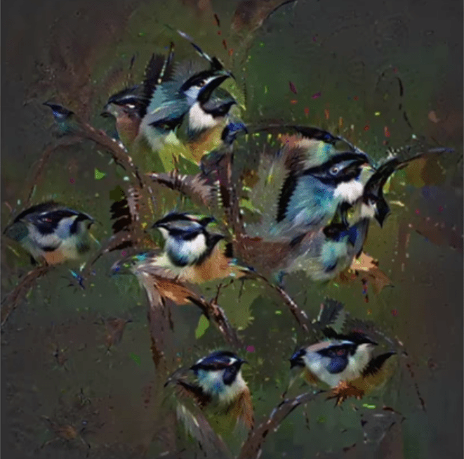
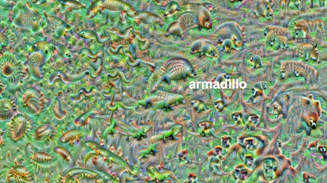
An example of a reversed neural network thus “estimating” an image of a bird [via Youtube]Blaise’s colleagues at Google took this a step further and used t-SNE to visualize the continuous space of animal concepts as perceived by their neural network, here a zoomed in part on the Armadillo part of the map, apparently closely located to fish, salamanders, and monkeys?
A zoomed view of part of a t-SNE map of latent animal concepts generated by reversing a neural network [via Youtube]We’ve seen these latent spaces/continua before. This example Andrej Karpathy shared immediately comes to mind:
If you want to learn more about this process of image synthesis through deep learning, I can recommend the scientific papers discussed by one of my favorite Youtube-channels, Two-Minute Papers. Karoly’s videos, such as the ones below, discuss many of the latest developments:
Let me know if you have any other video’s, papers, or materials you think are worthwhile!
rstudio::conf is theyearly conference when it comes to R programming and RStudio. In 2017, nearly 500 people attended and, last week, 1100 people went to the 2018 edition. Regretfully, I was on holiday in Cardiff and missed out on meeting all my #rstats hero’s. Just browsing through the #rstudioconf Twitter-feed, I already learned so many new things that I decided to dedicate a page to it!
Fortunately, you can watch the live streams taped during the conference:
One of the workshops deserves an honorable mention. Jenny Bryan presented on What they forgot to teach you about R, providing some excellent advice on reproducible workflows. It elaborates on her earlier blog on project-oriented workflows, which you should read if you haven’t yet. Some best pRactices Jenny suggests:
Restart R often. This ensures your code is still working as intended. Use Shift-CMD-F10 to do so quickly in RStudio.
Use stable instead of absolute paths. This allows you to (1) better manage your imports/exports and folders, and (2) allows you to move/share your folders without the code breaking. For instance, here::here("data","raw-data.csv") loads the raw-data.csv-file from the data folder in your project directory. If you are not using the here package yet, you are honestly missing out! Alternatively you can use fs::path_home(). normalizePath() will make paths work on both windows and mac. You can usebasename instead of strsplit to get name of file from a path.
To upload an existing git directory to GitHub easily, you can usethis::use_github().
If you include the below YAML header in your .R file, you can easily generate .md files for you github repo.
#' ---
#' output: github_document
#' ---
Moreover, Jenny proposed these useful default settings for knitr:
Another of Jenny Bryan‘s talks was named Data Rectangling and although you might not get much out of her slides without her presenting them, you should definitely try the associated repurrrsivetutorial if you haven’t done so yet. It’s a poweR up for any useR!
I can’t remember who shared it, but a very cool trick is to name the viewing tab of any dataframe you pipe into View() using df %>% View("enter_view_tab_name").
These probably only present a minimal portion of the thousands of tips and tricks you could have learned by simply attending rstudio::conf. I will definitely try to attend next year’s edition. Nevertheless, I hope the above has been useful. If I missed out on any tips, presentations, tweets, or other materials, please reply below, tweet me or pop me a message!
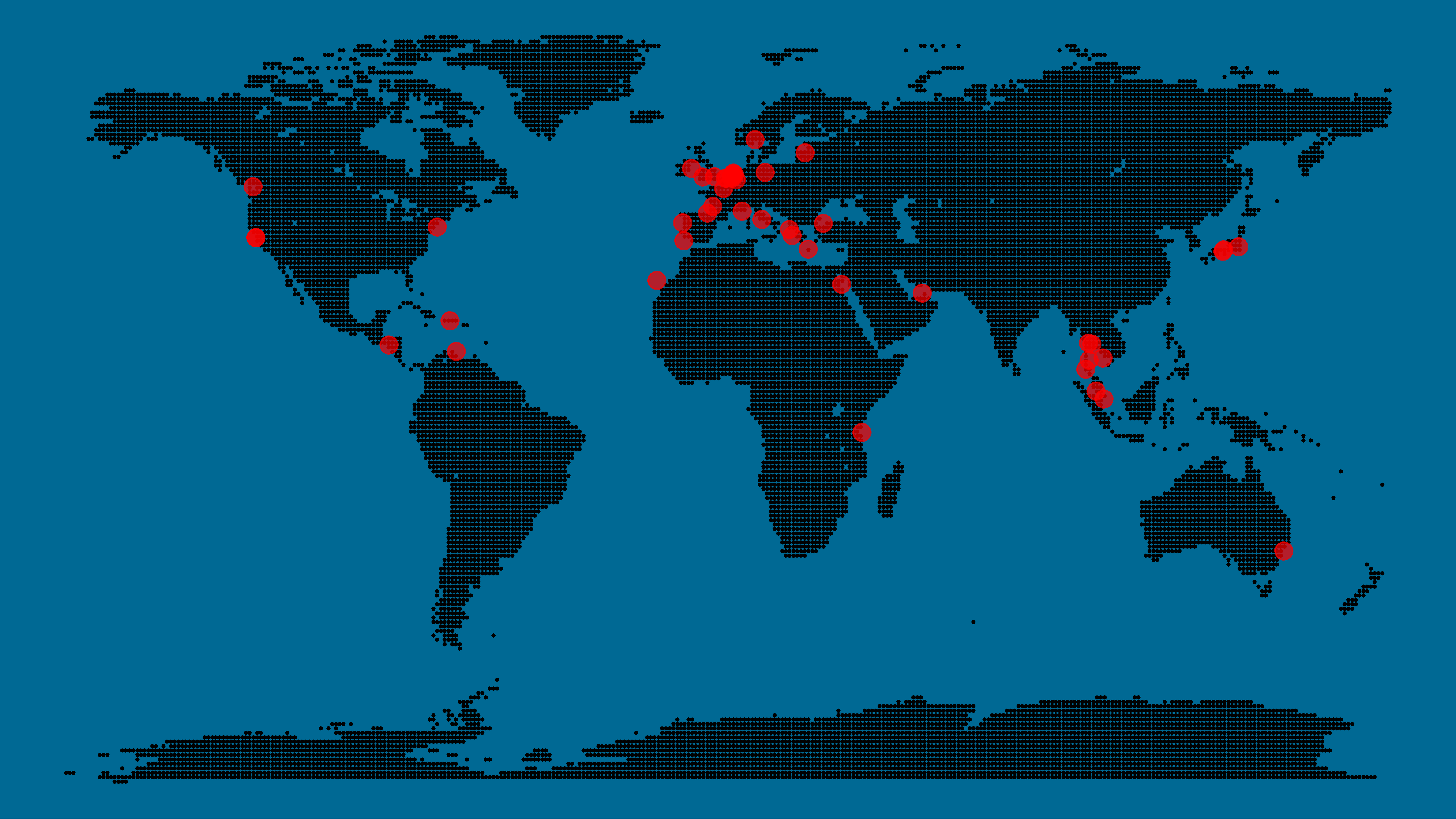
A pixel map of holiday and living locations made by Taras Kaduk in R [original]
Taras Kaduk seems as excited about R and the tidyverse as I am, as he built the beautiful map above. It flags all the cities he has visited and, in red, the cities he has lived. Taras was nice enough to share his code here, in the original blog post.
Now, I am not much of a globetrotter, but I do like programming. Hence, I immediately wanted to play with the code and visualize my own holiday destinations. Below you can find my attempt. The updated code I also posted below, but WordPress doesn’t handle code well, so you better look here.
Let’s run you through the steps to make such a map. First, we need to load some packages. I use the apply family to install and/or load a set of packages so that if I/you run the script on a different computer, it will still work. In terms of packages, the tidyverse (read more) includes some nice data manipulation packages as well as the famous ggplot2 package for visualizations. We need maps and ggmap for their mapping functionalities. here is a great little package for convenient project management, as you will see (read more).
Next, we need to load in the coordinates (longitudes and latitudes) of our holiday destinations. Now, I started out creating a dataframe with city coordinates by hand. However, this was definitely not a scale-able solution. Fortunately, after some Googling, I came across ggmap::geocode(). This function allows you to query the Google maps API(no longer works) Data Science Toolkit, which returns all kinds of coordinates data for any character string you feed it.
Although, I ran into two problems with this approach, this was nothing we couldn’t fix. First, my home city of Breda apparently has a name-city in the USA, which Google favors. Accordingly, you need to be careful and/or specific regarding the strings you feed to geocode() (e.g., “Breda NL“). Second, API’s often have a query limit, meaning you can only ask for data every so often. geocode() will quickly return NAs when you feed it more than two, three values. Hence, I wrote a simple while loop to repeat the query until the API retrieves coordinates. The query will pause shortly in between every attempt. Returned coordinates are then stored in the empty dataframe I created earlier. Now, we can easily query a couple dozen of locations without errors.
You can try it yourself: all you need to change is the city_name string.
### cities data ----------------------------------------------------------------

# cities to geolocate
city_name <- c("breda NL", "utrecht", "rotterdam", "tilburg", "amsterdam",
               "london", "singapore", "kuala lumpur", "zanzibar", "antwerp",
               "middelkerke", "maastricht", "bruges", "san fransisco", "vancouver",
               "willemstad", "hurghada", "paris", "rome", "bordeaux",
               "berlin", "kos", "crete", "kefalonia", "corfu",
               "dubai", " barcalona", "san sebastian", "dominican republic",
               "porto", "gran canaria", "albufeira", "istanbul",
               "lake como", "oslo", "riga", "newcastle", "dublin",
               "nice", "cardiff", "san fransisco", "tokyo", "kyoto", "osaka",
               "bangkok", "krabi thailand", "chang mai thailand", "koh tao thailand")

# initialize empty dataframe
tibble(
  city = city_name,
  lon = rep(NA, length(city_name)),
  lat = rep(NA, length(city_name))
) ->
  cities

# loop cities through API to overcome SQ limit
# stop after if unsuccessful after 5 attempts
for(c in city_name){
  temp <- tibble(lon = NA)
  # geolocate until found or tried 5 times
  attempt <- 0 # set attempt counter
  while(is.na(temp$lon) & attempt < 5) {
    temp <- geocode(c, source = "dsk")
    attempt <- attempt + 1
    cat(c, attempt, ifelse(!is.na(temp[[1]]), "success", "failure"), "\n") # print status
    Sys.sleep(runif(1)) # sleep for random 0-1 seconds
  }
  # write to dataframe
  cities[cities$city == c, -1] <- temp
}
Now, Taras wrote a very convenient piece of code to generate the dotted world map, which I borrowed from his blog:
With both the dot data and the cities’ geocode() coordinates ready, it is high time to visualize the map. Note that I use one geom_point() layer to plot the dots, small and black, and another layer to plot the cities data in transparent red. Taras added a third layer for the cities he had actually lived in; I purposefully did not as I have only lived in the Netherlands and the UK. Note that I again use the convenient here::here() function to save the plot in my current project folder.
I very much like the look of this map and I’d love to see what innovative, other applications you guys can come up with. To copy the code, please look here on RPubs. Do share your personal creations and also remember to take a look at Taras original blog!
Apparently, I was not the only geek who decided to celebrate the 20th anniversary of the Harry Potter saga with statistical analysis. Students Moritz Haine and Markus Dienstknecht of the Data Science for Decision Making Master at Maastricht University started their own celebratory project as part of a course Information Retrieval and Text Mining.
Students in previous years looked at for example Lord of the Rings, Star Wars and Game of Thrones. However, to our surprise, Harry Potter was missing. Since the books are about magic, we decided it would be interesting to identify all of the spells and the wizards that cast the most spells
Moritz Haine
From the books, the students extracted 41 different wizards, 64 different spells and 253 spells. Moritz points out that they could only include spoken spells, even though the most powerful wizards can also cast spells without naming them. They expect this might be the reason why Dumbledore and Voldemort are not ranked as high. At the end of their project, Moritz and Markus visualized their results in a spell-character mapping.
A network mapping of the characters and spells casted in the Harry Potter saga [original]This is the latest addition to my collection of Harry Potter analyses, to which a similar, interactive web application of spell usage was added only last week.