TJ Mahr hinted to this Canva webpage on Twitter. It contains 100 beautiful color palettes including their hexadecimal color codes. For instance, these three below.
The great thing is that these color palettes are include in the ggthemes package in R. Hence, the following code uses this Nightlife palette directly in an R script, resulting in the plot below.
A recent open access paper by Nicholas Tierney and Dianne Cook — professors at Monash University — deals with simpler handling, exploring, and imputation of missing values in data.They present new methodology building upon tidy data principles, with a goal to integrating missing value handling as an integral part of data analysis workflows. New data structures are defined (like the nabular) along with new functions to perform common operations (like gg_miss_case).
These new methods have bundled among others in the R packages naniar and visdat, which I highly recommend you check out. To put in the author’s own words:
The naniar and visdat packages build on existing tidy tools and strike a compromise between automation and control that makes analysis efficient, readable, but not overly complex. Each tool has clear intent and effects – plotting or generating data or augmenting data in some way. This reduces repetition and typing for the user, making exploration of missing values easier as they follow consistent rules with a declarative interface.
The below showcases some of the highly informational visuals you can easily generate with naniar‘s nabulars and the associated functionalities.
For instance, these heatmap visualizations of missing data for the airquality dataset. (A) represents the default output and (B) is ordered by clustering on rows and columns. You can see there are only missings in ozone and solar radiation, and there appears to be some structure to their missingness.
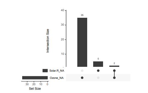
Another example is this upset plot of the patterns of missingness in the airquality dataset. Only Ozone and Solar.R have missing values, and Ozone has the most missing values. There are 2 cases where both Solar.R and Ozone have missing values.
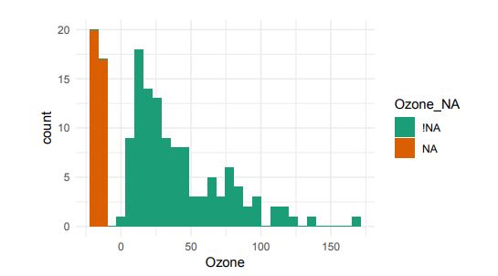
You can also generate a histogram using nabular data in order to show the values and missings in Ozone. Values are imputed below the range to show the number of missings in Ozone and colored according to missingness of ozone (‘Ozone_NA‘). This displays directly that there are approximately 35-40 missings in Ozone.
Alternatively, scatterplots can be easily generated. Displaying missings at 10 percent below the minimum of the airquality dataset. Scatterplots of ozone and solar radiation (A), and ozone and temperature (B). These plots demonstrate that there are missings in ozone and solar radiation, but not in temperature.
Finally, this parallel coordinate plot displays the missing values imputed 10% below range for the oceanbuoys dataset. Values are colored by missingness of humidity. Humidity is missing for low air and sea temperatures, and is missing for one year and one location.
JS13K Games is a competition where developers are challenged to create an entire game using less than 13 kilobytes of memory. Creative developer Matt Deslaudiers participated and created Bellwoods: an art game for mobile and desktop that you can play in your browser.
The concept of the game is simple: fly your kite through endless fields of colour and sound, trying to discover new worlds. To remain under 13kb, all of the graphics and audio in Bellwoods are procedurally generated. The game was mostly programmed in JavaScript with minimal custom HTML/CSS. Matt’s motivation and the actual development you can read about in his original blog. The source code the game, Matt also shared on GitHub.
Mélissa Hernandez, a French UX and Interaction Designer, helped Matt design this beautiful game. Together, they even versed a haiku that not only evokes the mood of the game, but also provides some subtle gameplay instructions:
over the tall grass following birds, chasing wind in search of color
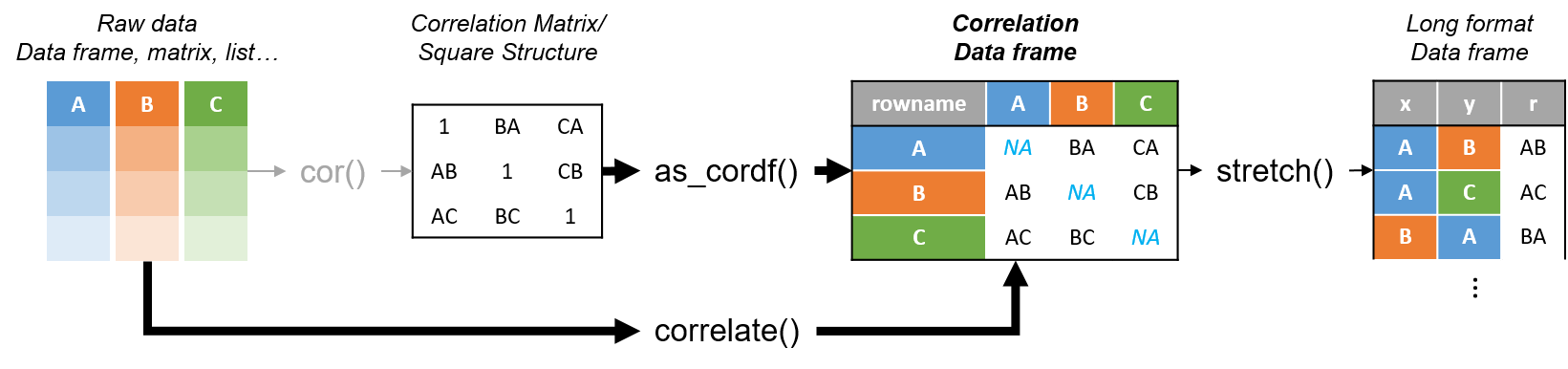
R’s standard correlation functionality (base::cor) seems very impractical to the new programmer: it returns a matrix and has some pretty shitty defaults it seems. Simon Jackson thought the same so he wrote a tidyverse-compatible new package: corrr!
Simon wrote some practical R code that has helped me out greatly before (e.g., color palette’s), but this new package is just great. He provides an elaborate walkthrough on his own blog, which I can highly recommend, but I copied some teasers below.
Diagram showing how the new functionality of corrr works.
Apart from corrr::correlate to retrieve a correlation data frame and corrr::stretch to turn that data frame into a long format, the new package includes corrr::focus, which can be used to simulteneously select the columns and filter the rows of the variables focused on. For example:
# install.packages("tidyverse")
library(tidyverse)

# install.packages("corrr")
library(corrr)

# install.packages("here")
library(here)

dir.create(here::here("images")) # create an images directory

mtcars %>%
  corrr::correlate() %>%
  # use mirror = TRUE to not only select columns but also filter rows
  corrr::focus(mpg:hp, mirror = TRUE) %>%
  corrr::network_plot(colors = c("red", "green")) %>%
  ggplot2::ggsave(
    filename = here::here("images", "mtcars_networkplot.png"),
    width = 5,
    height = 5
    )
With corrr::networkplot you get an immediate sense of the relationships in your data.
Let’s try some different visualizations:
mtcars %>%
  corrr::correlate() %>%
  corrr::focus(mpg) %>%
  dplyr::mutate(rowname = reorder(rowname, mpg)) %>%
  ggplot2::ggplot(ggplot2::aes(rowname, mpg)) +
  # color each bar based on the direction of the correlation
  ggplot2::geom_col(ggplot2::aes(fill = mpg >= 0)) +
  ggplot2::coord_flip() +
  ggplot2::ggsave(
    filename = here::here("images", "mtcars_mpg-barplot.png"),
    width = 5,
    height = 5
  )
The tidy correlation data frames can be easily piped into a ggplot2 function call
corrr also provides some very helpful functionality display correlations. Take, for instance, corrr::fashion and corrr::shave:
mtcars %>%
  corrr::correlate() %>%
  corrr::focus(mpg:hp, mirror = TRUE) %>%
  # converts the upper triangle (default) to missing values
  corrr::shave() %>%
  # converts a correlation df into clean matrix
  corrr::fashion() %>%
  readr::write_excel_csv(here::here("correlation-matrix.csv"))
Exporting a nice looking correlation matrix has never been this easy.
Finally, there is the great function of corrr::rplot to generate an amazing correlation overview visual in a wingle line. However, here it is combined with corr::rearrange to make sure that closely related variables are actually closely located on the axis, and again the upper half is shaved away:
Generate fantastic single-line correlation overviews with <code>corrr::rplot</code>
For some more functionalities, please visit Simon’s blog and/or the associated GitHub page. If you copy the code above and play around with it, be sure to work in an Rproject else the here::here() functions might misbehave.
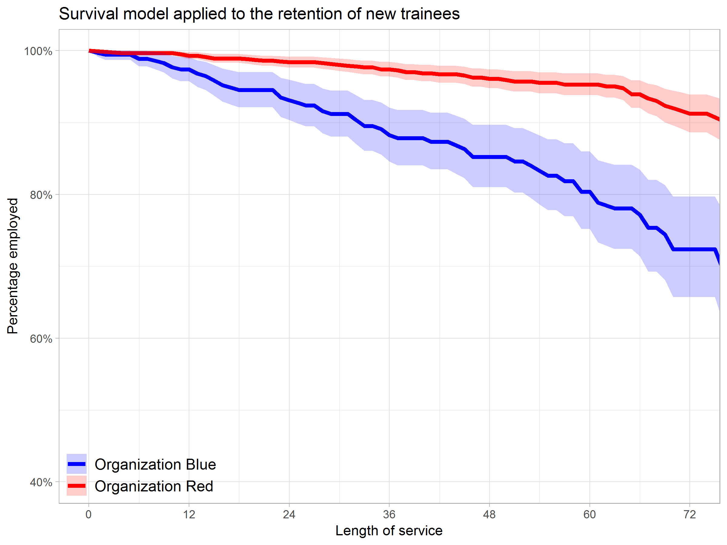
Past week, Analytics in HR published a guest blog about one of my People Analytics projects which you can read here. In the blog, I explain why and how I examined the turnover of management trainees in light of the international work assignments they go on.
For the analyses, I used a statistical model called a survival analysis – also referred to as event history analysis, reliability analysis, duration analysis, time-to-event analysis, or proporational hazard models. It estimates the likelihood of an event occuring at time t, potentially as a function of certain data.
The sec version of surival analysis is a relatively easy model, requiring very little data. You can come a long way if you only have the time of observation (in this case tenure), and whether or not an event (turnover in this case) occured. For my own project, I had two organizations, so I added a source column as well (see below).
ungeviz is a new R package by Claus Wilke, whom you may know from his amazing work and books on Data Visualization. The package name comes from the German word “Ungewissheit”, which means uncertainty. You can install the developmental version via:
devtools::install_github("clauswilke/ungeviz")
The package includes some bootstrapping functionality that, when combined with ggplot2 and gganimate, can produce some seriousy powerful visualizations. For instance, take the below piece of code:
data(BlueJays, package="Stat2Data")
# set up bootstrapping object that generates 20 bootstraps# and groups by variable `KnownSex`bs<-ungeviz::bootstrapper(20, KnownSex)
ggplot(BlueJays, aes(BillLength, Head, color=KnownSex)) +
geom_smooth(method="lm", color=NA) +
geom_point(alpha=0.3) +# `.row` is a generated column providing a unique row number# to all rows in the bootstrapped data frame
geom_point(data=bs, aes(group= .row)) +
geom_smooth(data=bs, method="lm", fullrange=TRUE, se=FALSE) +
facet_wrap(~KnownSex, scales="free_x") +
scale_color_manual(values= c(F="#D55E00", M="#0072B2"), guide="none") +
theme_bw() +
transition_states(.draw, 1, 1) +
enter_fade() +
exit_fade()
Here’s what’s happening:
Claus loads in the BlueJays dataset, which contains some data on birds.
He then runs the ungezviz::bootstrapper function to generate a new dataset of bootstrapped samples.
Next, Claus uses ggplot2::geom_smooth(method = "lm") to run a linear model on the orginal BlueJays dataset, but does not color in the regression line (color = NA), thus showing only the confidence interval of the model.
Moreover, Claus uses ggplot2::geom_point(alpha = 0.3) to visualize the orginal data points, but slightly faded.
Subsequent, for each of the bootstrapped samples (group = .row), Claus again draws the data points (unfaded), and runs linear models while drawing only the regression line (se = FALSE).
Using ggplot2::facet_wrap, Claus seperates the data for BlueJays$KnownSex.
Using gganimate::transition_states(.draw, 1, 1), Claus prints each linear regression line to a row of the bootstrapped dataset only one second, before printing the next.
The result an astonishing GIF of the regression lines that could be fit to bootstrapped subsamples of the BlueJays data, along with their confidence interval:
One example of the practical use of ungeviz, original on its GitHub page
Another valuable use of the new package is the visualization of uncertainty from fitted models, for example as confidence strips. The below code shows the powerful combination of broom::tidy with ungeviz::stat_conf_strip to visualize effect size estimates of a linear model along with their confidence intervals.
library(broom)
#> #> Attaching package: 'broom'#> The following object is masked from 'package:ungeviz':#> #> bootstrapdf_model<- lm(mpg~disp+hp+qsec, data=mtcars) %>%
tidy() %>%
filter(term!="(Intercept)")
ggplot(df_model, aes(estimate=estimate, moe=std.error, y=term)) +
stat_conf_strip(fill="lightblue", height=0.8) +
geom_point(aes(x=estimate), size=3) +
geom_errorbarh(aes(xmin=estimate-std.error, xmax=estimate+std.error), height=0.5) +
scale_alpha_identity() +
xlim(-2, 1)
Visualizing effect size estimates with ungeviz, via its GitHub page
Very curious to see where this package develops into. What use cases can you think of?


 Alternatively, scatterplots can be easily generated. Displaying missings at 10 percent below the minimum of the airquality dataset. Scatterplots of ozone and solar radiation (A), and ozone and temperature (B). These plots demonstrate that there are missings in ozone and solar radiation, but not in temperature.