Tag: r

Learn from the Pros: How media companies visualize data

Learn from the Pros: How media companies visualize data

Past months, multiple companies shared their approaches to data visualization and their lessons learned.

Click the companies in the list below to jump to their respective section
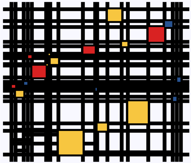

Financial Times

The Financial Times (FT) released a searchable database of the many data visualizations they produced over the years. Some lovely examples include:

Graphic showing what May needs to happen to get her deal over the line when MPs vote on Friday
Data visualization belonging to a recent Brexit piece by the FT, viahttps://www.ft.com/graphics
Dutch housing graphic
Searching the FT database for European House Prices via https://www.ft.com/graphics returns this map of the Netherlands.

BBC

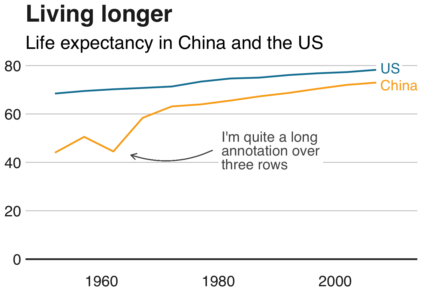
The BBC released a free cookbook for data visualization using R programming. Here is the associated Medium post announcing the book.

The BBC data team developed an R package (bbplot) which makes the process of creating publication-ready graphics in their in-house style using R’s ggplot2 library a more reproducible process, as well as making it easier for people new to R to create graphics.

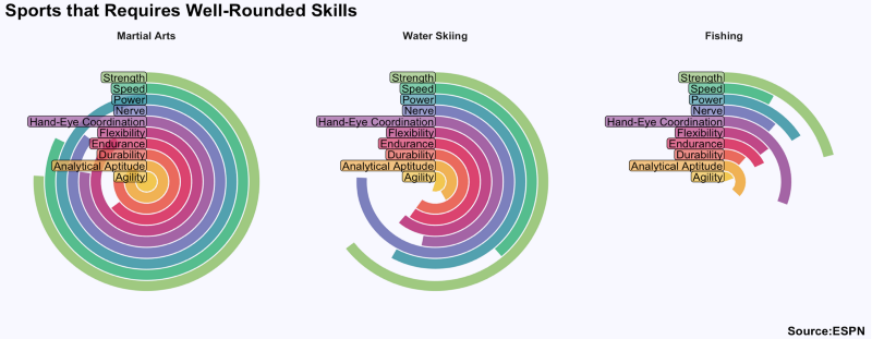
Apart from sharing several best practices related to data visualization, they walk you through the steps and R code to create graphs such as the below:

One of the graphs the BBC cookbook will help you create, via https://bbc.github.io/rcookbook/

Economist

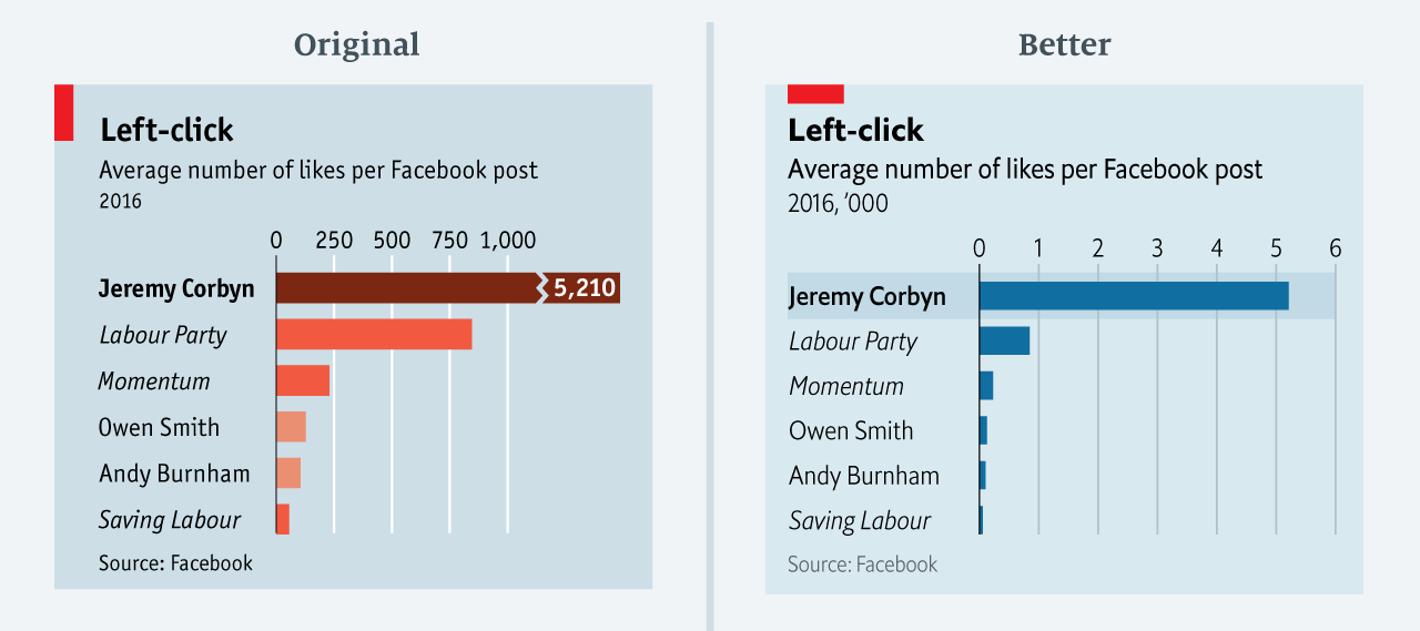
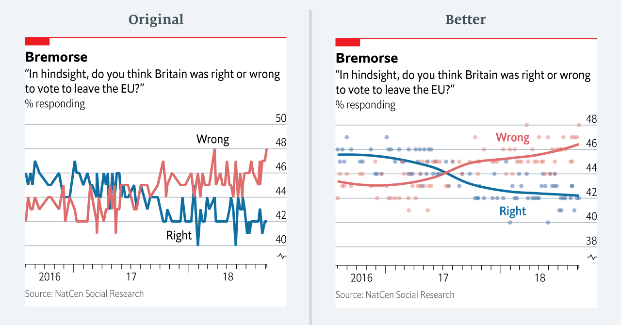
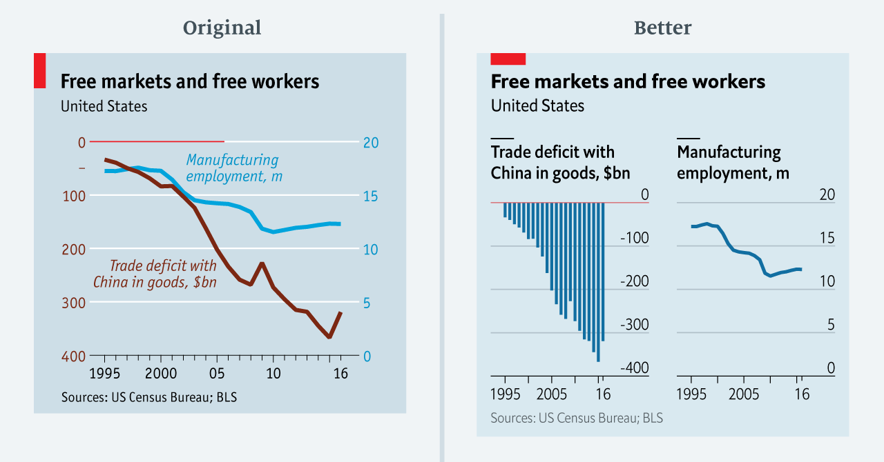
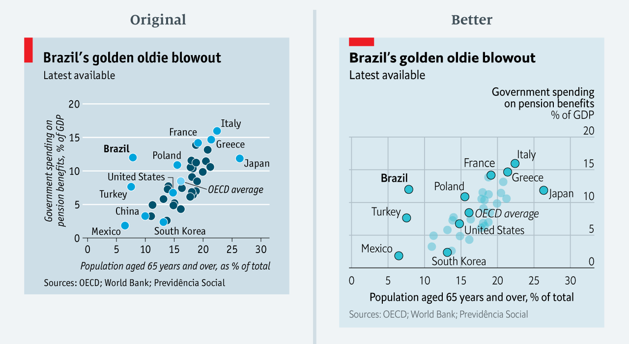
The data team at the Economist also felt a need to share their lessons learned via Medium. They show some of their most misleading, confusing, and failing graphics of the past years, and share the following mistakes and their remedies:

  • Truncating the scale (image #1 below)
  • Forcing a relationship by cherry-picking scales
  • Choosing the wrong visualisation method (image #2 below)
  • Taking the “mind-stretch” a little too far (image #3 below)
  • Confusing use of colour (image #4 below)
  • Including too much detail
  • Lots of data, not enough space

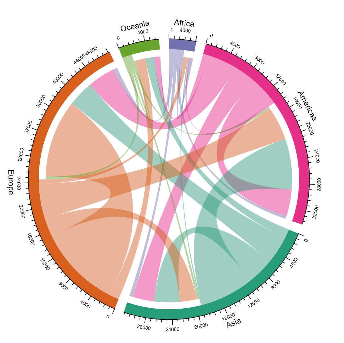
Moreover, they share the data behind these failing and repaired data visualizations:

Via https://medium.economist.com/mistakes-weve-drawn-a-few-8cdd8a42d368

FiveThirtyEight

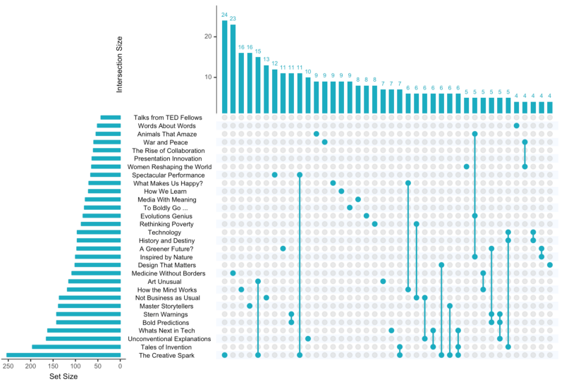
I could not resist including this (older) overview of the 52 best charts FiveThirtyEight claimed they made.

All 538’s data visualizations are just stunningly beautiful and often very
ingenious, using new chart formats to display complex patterns. Moreover, the range of topics they cover is huge. Anything ranging from their traditional background — politics — to great cover stories on sumo wrestling and pricy wine.

Viahttps://fivethirtyeight.com/features/the-52-best-and-weirdest-charts-we-made-in-2016/
Via https://fivethirtyeight.com/features/the-52-best-and-weirdest-charts-we-made-in-2016/ You should definitely check out the original cover story via https://projects.fivethirtyeight.com/sumo/
Via https://fivethirtyeight.com/features/the-52-best-and-weirdest-charts-we-made-in-2016/

StatQuest: Statistical concepts, clearly explained

StatQuest: Statistical concepts, clearly explained

Josh Starmer is assistant professor at the genetics department of the University of North Carolina at Chapel Hill.

But more importantly:
Josh is the mastermind behind StatQuest!

StatQuest is a Youtube channel (and website) dedicated to explaining complex statistical concepts — like data distributions, probability, or novel machine learning algorithms — in simple terms.

Once you watch one of Josh’s “Stat-Quests”, you immediately recognize the effort he put into this project. Using great visuals, a just-about-right pace, and relateable examples, Josh makes statistics accessible to everyone. For instance, take this series on logistic regression:

And do you really know what happens under the hood when you run a principal component analysis? After this video you will:

Or are you more interested in learning the fundamental concepts behind machine learning, then Josh has some videos for you, for instance on bias and variance or gradient descent:

With nearly 200 videos and counting, StatQuest is truly an amazing resource for students ‘and teachers on topics related to statistics and data analytics. For some of the concepts, Josh even posted videos running you through the analysis steps and results interpretation in the R language.


StatQuest started out as an attempt to explain statistics to my co-workers – who are all genetics researchers at UNC-Chapel Hill. They did these amazing experiments, but they didn’t always know what to do with the data they generated. That was my job. But I wanted them to understand that what I do isn’t magic – it’s actually quite simple. It only seems hard because it’s all wrapped up in confusing terminology and typically communicated using equations. I found that if I stripped away the terminology and communicated the concepts using pictures, it became easy to understand.

Over time I made more and more StatQuests and now it’s my passion on YouTube.

Josh Starmer via https://statquest.org/about/

Free Programming Books (I still need to read)

Free Programming Books (I still need to read)

There are multiple unread e-mails in my inbox.

Links to books.

Just sitting there. Waiting to be opened, read. For months already.

The sender, you ask? Me. Paul van der Laken.

A nuisance that guy, I tell you. He keeps sending me reminders, of stuff to do, books to read. Books he’s sure a more productive me would enjoy.

Now, I could wipe my inbox. Be done with it. But I don’t wan’t to lose this digital to-do list… Perhaps I should put them here instead. So you can help me read them!

Each of the below links represents a formidable book on programming! (I hear)
And there are free versions! Have a quick peek. A peek won’t hurt you:

Disclaimer: This page contains one or more links to Amazon.
Any purchases made through those links provide us with a small commission that helps to host this blog.

The books listed above have a publicly accessible version linked. Some are legitimate. Other links are somewhat shady.
If you feel like you learned something from reading one of the books (which you surely will), please buy a hardcopy version. Or an e-book. At the very least, reach out to the author and share what you appreciated in his/her work.
It takes valuable time to write a book, and we should encourage and cherish those who take that time.

For more books on R programming, check out my R resources overview.

For books on data analytics and (behavioural) psychology in (HR) management, check out Books for the modern data-driven HR professional.

Circular Map Cutouts in R

Circular Map Cutouts in R

Katie Jolly wanted to surprise a friend with a nice geeky gift: a custom-made map cutout. Using R and some visual finetuning in Inkscape, she was able to made the below.

A detailed write-up of how Katie got to this product is posted here.

Basically, the R’s tigris package included all data on roads, and the ArcGIS Open Data Hub provided the neighborhood boundaries. Fortunately, the sf package is great for transforming and manipulating geospatial data, and includes some functions to retrieve a subset of roads based on their distance to a centroid. With this subset, Katie could then build these wonderful plots in no time with ggplot2.

GoalKicker: Free Programming Books

This specific link has been on my to-do list for so-long now that I’ve decided to just share it without any further ado.

The people behind GoalKicker, for whatever reason, decided to compile nearly 100 books on different programming languages based on among others StackOverflow entries. Their open access library contains books on languages from Latex to Linux, from Java to JavaScript, from SQL to MySQL, and from C, to C++, C#, and objective-C.

Basically, they host it all. Have a look yourself: https://books.goalkicker.com/

#100DaysOfCode: Machine Learning & Data Visualization

#100DaysOfCode: Machine Learning & Data Visualization

2018 seemed to be the year of challenges going viral on the web. Most of them were plain stupid and/or dangerous. However, one viral challenge I did like: #100DaysOfCode

1. Code minimum an hour every day for the next 100 days.

2. Tweet your progress every day with the #100DaysOfCode hashtag.

3. Each day, reach out to at least two people on Twitter who are also doing the challenge

100 Days of Code rulebook

Many (aspiring) programming professionals competed in this challenge, sharing their learning journeys in domains from web development, machine learning, or data visualization.

With this blog, I wanted to share two of those learning journeys that stood out for me.

Machine learning

First, there’s Avik Jain’s 100 days of Machine Learning code repository on Github. Avik’s repository contains all learning activities he followed during the 53 days of programming he completed. Some of Avik’s entries really stood out, and I particularly liked his educational infographics:

Just look at the wonderful design and visual aids on this decision tree for dummies infographic, pseudocode and all:

Day 23: Decision trees for dummies. This just looks fabulous right?!

Apart from the infographics, Avik also links to many very well produced tutorials that helped him improve his machine learning skills. Such as the free Python for Data Science Handbook Avik worked through, or this Youtube tutorial on deep learning in Python with Tensorflow and Keras:

Although Avik didn’t seem to have completed the full 100 days, many others did.

Data visualization

I have blogged about Hannah Yan Han‘s 100 days of code project before, but she definately deserves another mention here. Her 100 days revolved around data science, data visualization, and storytelling using both R and Python. You can find her #100DaysOfCode Medium page here, and her associated Github repository here.

For example, one day Hannah explored where instant noodles come from, how they are served, and whether people like them or not.

A different day she would examine which sports are the thoughest:

Or how scientific researchers migrate across the globe:

Hannah used many different plot types in those 100 days. Also some lesser known ones, like these upset plots on TED talk data:

Heck, she even made her own R package to generate Mondriaan-like paintings on one of the days:

What I found so great about Hannah’s project is that she picked a novel dataset every couple of days. Moreover, she used a extremely large variety of different visualization formats. All visuals were equally beautiful, but Hannah made sure to pick the right one for the purpose she was trying to serve. If you are interested in data visualization, you seriously should check out Hannah’s 100DaysOfCode Medium page.