Talent.Works is back, elaborating on the applicant characteristics that relate to landing an interview. While the majority of applicants has a meager ~2% chance of getting invited to an interview, some applicants do way better! What accounts for their success?
Timo Grossenbacher works as reporter/coder for SRF Data, the data journalism unit of Swiss Radio and TV. He analyzes and visualizes data and investigates data-driven stories. On his website, he hosts a growing list of cool projects. One of his recent blogs covers categorical spatial interpolation in R. The end result of that blog looks amazing:
This map was built with data Timo crowdsourced for one of his projects. With this data, Timo took the following steps, which are covered in his tutorial:
Read in the data, first the geometries (Germany political boundaries), then the point data upon which the interpolation will be based on.
Preprocess the data (simplify geometries, convert CSV point data into an sf object, reproject the geodata into the ETRS CRS, clip the point data to Germany, so data outside of Germany is discarded).
Then, a regular grid (a raster without “data”) is created. Each grid point in this raster will later be interpolated from the point data.
Run the spatial interpolation with the kknn package. Since this is quite computationally and memory intensive, the resulting raster is split up into 20 batches, and each batch is computed by a single CPU core in parallel.
Visualize the resulting raster with ggplot2.
All code for the above process can be accessed on Timo’s Github. The georeferenced points underlying the interpolation look like the below, where each point represents the location of a person who selected a certain pronunciation in an online survey. More details on the crowdsourced pronunciation project van be found here, .
Another of Timo’s R map, before he applied k-nearest neighbors on these crowdsourced data. [original]If you want to know more, please read the original blog or follow Timo’s new DataCamp course called Communicating with Data in the Tidyverse.
In optimizing their transportation services, Uber uses evolutionary strategies and genetic algorithms to train deep neural networks through reinforcement learning. A lot of difficult words in one sentence; you can imagine the complexity of the process.
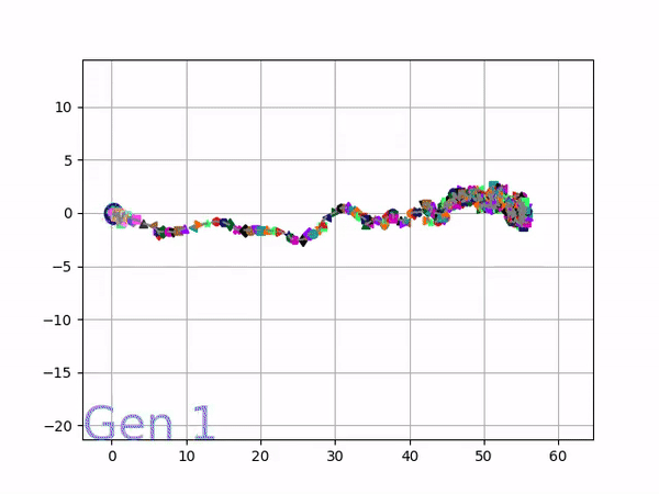
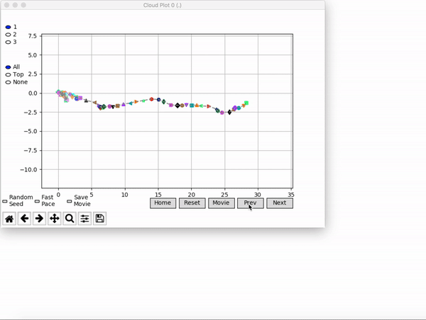
Because it is particularly difficult to observe the underlying dynamics of this learning process in neural network optimization, Uber built VINE – a Visual Inspector for NeuroEvolution. VINE helps to discover how evolutionary strategies and genetic optimizing are performing under the hood. In a recent article, they demonstrate how VINE works on the MujocoHumanoid Locomotion task.
[…] In the Humanoid Locomotion Task, each pseudo-offspring neural network controls the movement of a robot, and earns a score, called its fitness, based on how well it walks. [Evolutionary principles] construct the next parent by aggregating the parameters of pseudo-offspring based on these fitness scores […]. The cycle then repeats.
VINE plots parent neural networks and their pseudo-offspring according to their performance. Users can then interact with these plots to:
visualize parents, top performance, and/or the entire pseudo-offspring cloud of any generation,
compare between and within generation performance,
and zoom in on any pseudo-offspring (points) in the plot to display performance information.
The GIFs below demonstrate what VINE is capable of displaying:
The evolution of performance over generations. The color changes in each generation. Within a generation, the color intensity of each pseudo-offspring is based on the percentile of its fitness score in that generation (aggregated into five bins). [original]Vine allows user to deep dive into each single generation, comparing generations and each pseudo-offspring within them [original]VINE can be found at this link. It is lightweight, portable, and implemented in Python.
The field of computer vision tries to replicate our human visual capabilities, allowing computers to perceive their environment in a same way as you and I do. The recent breakthroughs in this field are super exciting and I couldn’t but share them with you.
In the TED talk below by Joseph Redmon (PhD at the University of Washington) showcases the latest progressions in computer vision resulting, among others, from his open-source research on Darknet – neural network applications in C. Most impressive is the insane speed with which contemporary algorithms are able to classify objects. Joseph demonstrates this by detecting all kinds of random stuff practically in real-time on his phone! Moreover, you’ve got to love how well the system works: even the ties worn in the audience are classified correctly!
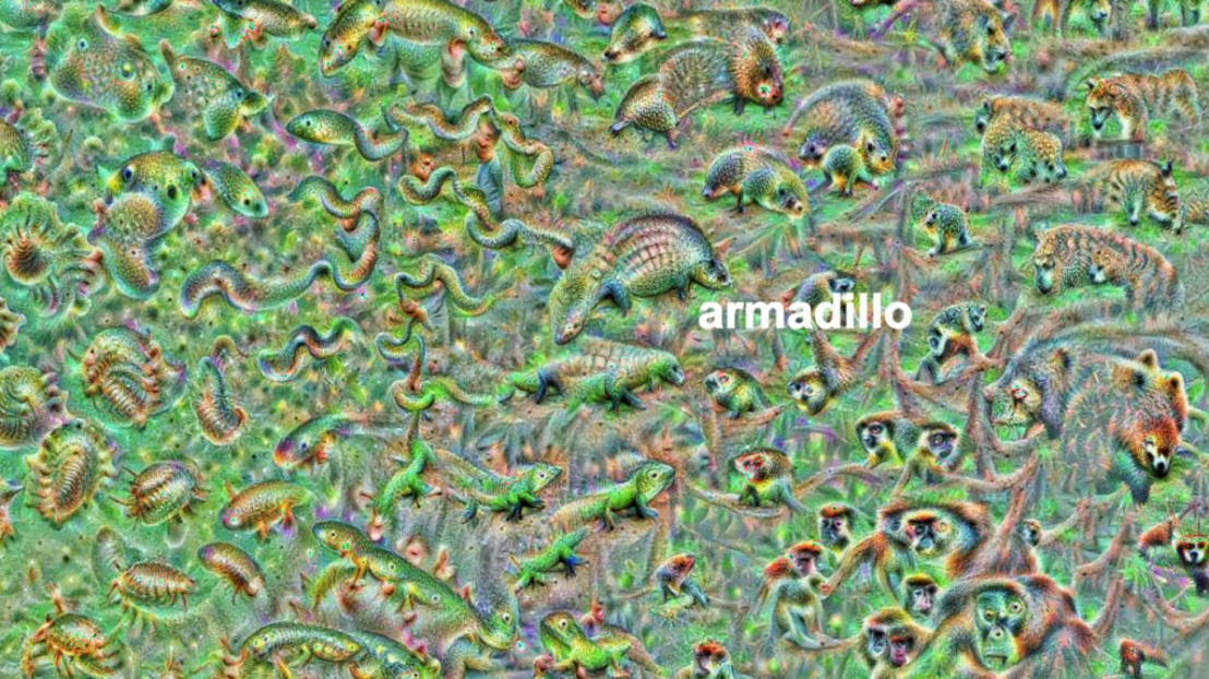
The second talk, below, is more scientific and maybe even a bit dry at the start. Blaise Aguera y Arcas (engineer at Google) starts with a historic overview brain research but, fortunately, this serves a cause, as ~6 minutes in Blaise provides one of the best explanations I have yet heard of how a neural network processes images and learns to perceive and classify the underlying patterns. Blaise continues with a similarly great explanation of how this process can be reversed to generate weird, Asher-like images, one could consider creative art:
An example of a reversed neural network thus “estimating” an image of a bird [via Youtube]Blaise’s colleagues at Google took this a step further and used t-SNE to visualize the continuous space of animal concepts as perceived by their neural network, here a zoomed in part on the Armadillo part of the map, apparently closely located to fish, salamanders, and monkeys?
A zoomed view of part of a t-SNE map of latent animal concepts generated by reversing a neural network [via Youtube]We’ve seen these latent spaces/continua before. This example Andrej Karpathy shared immediately comes to mind:
If you want to learn more about this process of image synthesis through deep learning, I can recommend the scientific papers discussed by one of my favorite Youtube-channels, Two-Minute Papers. Karoly’s videos, such as the ones below, discuss many of the latest developments:
Let me know if you have any other video’s, papers, or materials you think are worthwhile!
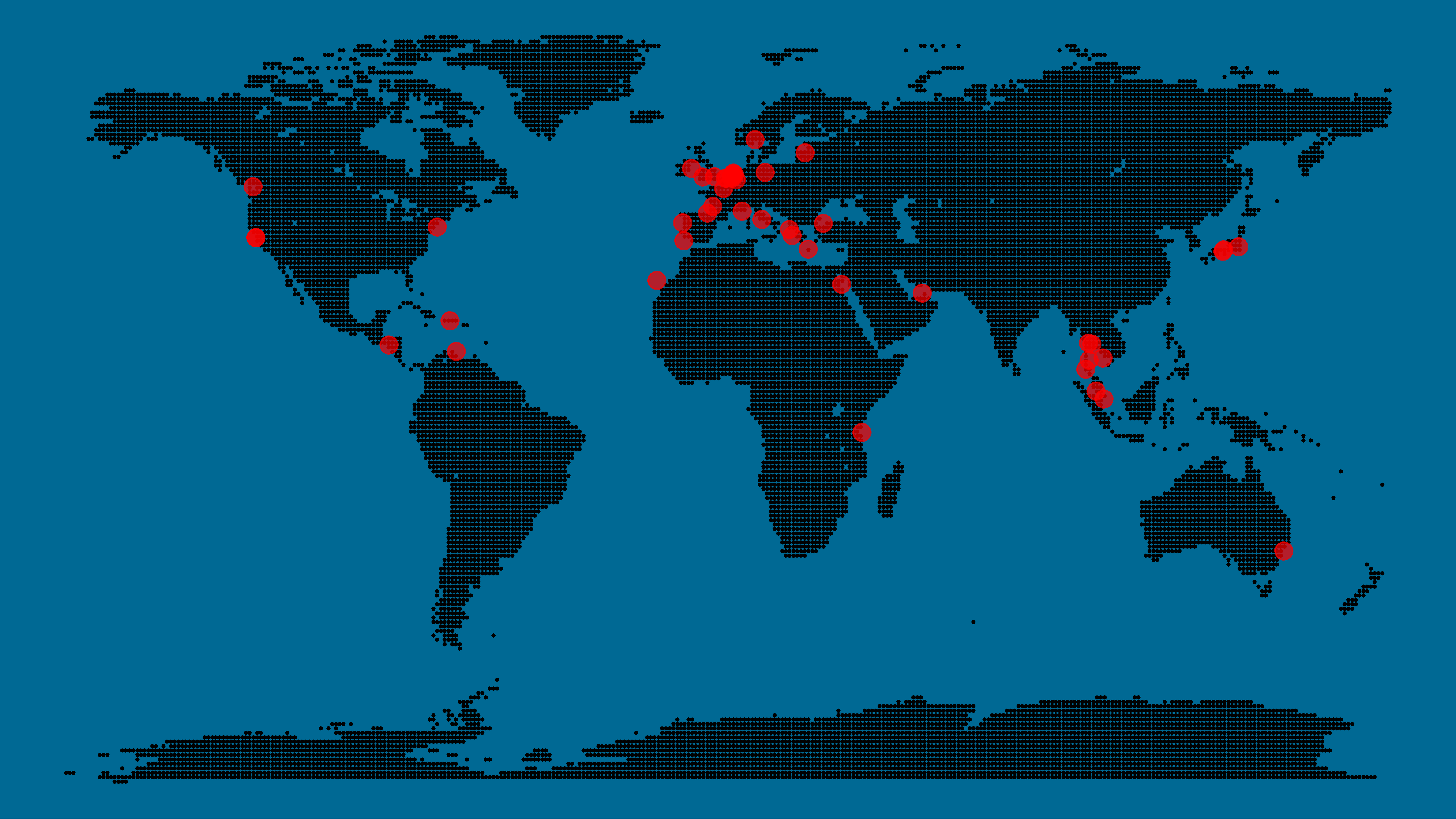
A pixel map of holiday and living locations made by Taras Kaduk in R [original]
Taras Kaduk seems as excited about R and the tidyverse as I am, as he built the beautiful map above. It flags all the cities he has visited and, in red, the cities he has lived. Taras was nice enough to share his code here, in the original blog post.
Now, I am not much of a globetrotter, but I do like programming. Hence, I immediately wanted to play with the code and visualize my own holiday destinations. Below you can find my attempt. The updated code I also posted below, but WordPress doesn’t handle code well, so you better look here.
Let’s run you through the steps to make such a map. First, we need to load some packages. I use the apply family to install and/or load a set of packages so that if I/you run the script on a different computer, it will still work. In terms of packages, the tidyverse (read more) includes some nice data manipulation packages as well as the famous ggplot2 package for visualizations. We need maps and ggmap for their mapping functionalities. here is a great little package for convenient project management, as you will see (read more).
Next, we need to load in the coordinates (longitudes and latitudes) of our holiday destinations. Now, I started out creating a dataframe with city coordinates by hand. However, this was definitely not a scale-able solution. Fortunately, after some Googling, I came across ggmap::geocode(). This function allows you to query the Google maps API(no longer works) Data Science Toolkit, which returns all kinds of coordinates data for any character string you feed it.
Although, I ran into two problems with this approach, this was nothing we couldn’t fix. First, my home city of Breda apparently has a name-city in the USA, which Google favors. Accordingly, you need to be careful and/or specific regarding the strings you feed to geocode() (e.g., “Breda NL“). Second, API’s often have a query limit, meaning you can only ask for data every so often. geocode() will quickly return NAs when you feed it more than two, three values. Hence, I wrote a simple while loop to repeat the query until the API retrieves coordinates. The query will pause shortly in between every attempt. Returned coordinates are then stored in the empty dataframe I created earlier. Now, we can easily query a couple dozen of locations without errors.
You can try it yourself: all you need to change is the city_name string.
### cities data ----------------------------------------------------------------

# cities to geolocate
city_name <- c("breda NL", "utrecht", "rotterdam", "tilburg", "amsterdam",
               "london", "singapore", "kuala lumpur", "zanzibar", "antwerp",
               "middelkerke", "maastricht", "bruges", "san fransisco", "vancouver",
               "willemstad", "hurghada", "paris", "rome", "bordeaux",
               "berlin", "kos", "crete", "kefalonia", "corfu",
               "dubai", " barcalona", "san sebastian", "dominican republic",
               "porto", "gran canaria", "albufeira", "istanbul",
               "lake como", "oslo", "riga", "newcastle", "dublin",
               "nice", "cardiff", "san fransisco", "tokyo", "kyoto", "osaka",
               "bangkok", "krabi thailand", "chang mai thailand", "koh tao thailand")

# initialize empty dataframe
tibble(
  city = city_name,
  lon = rep(NA, length(city_name)),
  lat = rep(NA, length(city_name))
) ->
  cities

# loop cities through API to overcome SQ limit
# stop after if unsuccessful after 5 attempts
for(c in city_name){
  temp <- tibble(lon = NA)
  # geolocate until found or tried 5 times
  attempt <- 0 # set attempt counter
  while(is.na(temp$lon) & attempt < 5) {
    temp <- geocode(c, source = "dsk")
    attempt <- attempt + 1
    cat(c, attempt, ifelse(!is.na(temp[[1]]), "success", "failure"), "\n") # print status
    Sys.sleep(runif(1)) # sleep for random 0-1 seconds
  }
  # write to dataframe
  cities[cities$city == c, -1] <- temp
}
Now, Taras wrote a very convenient piece of code to generate the dotted world map, which I borrowed from his blog:
With both the dot data and the cities’ geocode() coordinates ready, it is high time to visualize the map. Note that I use one geom_point() layer to plot the dots, small and black, and another layer to plot the cities data in transparent red. Taras added a third layer for the cities he had actually lived in; I purposefully did not as I have only lived in the Netherlands and the UK. Note that I again use the convenient here::here() function to save the plot in my current project folder.
I very much like the look of this map and I’d love to see what innovative, other applications you guys can come up with. To copy the code, please look here on RPubs. Do share your personal creations and also remember to take a look at Taras original blog!
Apparently, I was not the only geek who decided to celebrate the 20th anniversary of the Harry Potter saga with statistical analysis. Students Moritz Haine and Markus Dienstknecht of the Data Science for Decision Making Master at Maastricht University started their own celebratory project as part of a course Information Retrieval and Text Mining.
Students in previous years looked at for example Lord of the Rings, Star Wars and Game of Thrones. However, to our surprise, Harry Potter was missing. Since the books are about magic, we decided it would be interesting to identify all of the spells and the wizards that cast the most spells
Moritz Haine
From the books, the students extracted 41 different wizards, 64 different spells and 253 spells. Moritz points out that they could only include spoken spells, even though the most powerful wizards can also cast spells without naming them. They expect this might be the reason why Dumbledore and Voldemort are not ranked as high. At the end of their project, Moritz and Markus visualized their results in a spell-character mapping.
A network mapping of the characters and spells casted in the Harry Potter saga [original]This is the latest addition to my collection of Harry Potter analyses, to which a similar, interactive web application of spell usage was added only last week.