Bret Beheim — senior researcher at the Max Planck Institute for Evolutionary Anthropology — posted a great GIF animation of the response to his research survey. He calls the figure citation gates, relating the year of scientific publication to the likelihood that the research materials are published open-source or accessible.
To generate the visualization, Bret used R’s base plotting functionality combined with Thomas Lin Pedersen‘s R package tweenrto animate it.
I've been experimenting with R animations using the tweenR package for visualizing the results of our reproducibility survey, and I think it turned out pretty nice. pic.twitter.com/MRerAWHNYT
Bret shared his R code for the above GIF of his citation gateson GitHub. With the open source code, this amazing visual display inspired others to make similar GIFs for their own projects. For example, Anne-Wil Kruijt’s dance of the confidence intervals:
Two wks ago I built a shiny 'CI demo' app for a job interview. Yet I wasn't quite content with it. Then 2 days ago @babeheim posted an amazing gif (srsly, go check it!). Super inspired, & borrowing heavily from his code: my rendition of 'the Dance of the Confidence Intervals' pic.twitter.com/ORheOBBzDm
A spin-off of the citation gates: A gif showing confidence intervals of sample means.
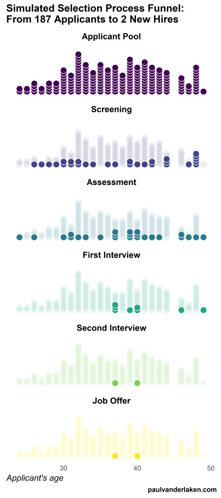
Applied to a Human Resource Management context, we could use this similar animation setup to explore, for instance, recruitment, selection, or talent management processes.
Unfortunately, I couldn’t get the below figure to animate properly yet, but I am working on it (damn ggplot2 facets). It’s a quick simulation of how this type of visualization could help to get insights into the recruitment and selection process for open vacancies.
The figure shows how nearly 200 applicants — sorted by their age — go through several selection barriers. A closer look demonstrates that some applicants actually skip the screening and assessment steps and join via a fast lane in the first interview round, which could happen, for instance, when there are known or preferred internal candidates. When animated, such insights would become more clearly visible.
I’ve mentioned before that I dislike wordclouds (for instance here, or here) and apparently others share that sentiment. In his recent Medium blog, Daniel McNichol goes as far as to refer to the wordcloud as the pie chart of text data! Among others, Daniel calls wordclouds disorienting, one-dimensional, arbitrary and opaque and he mentions their lack of order, information, and scale.
Wordcloud of the negative characteristics of wordclouds, via Medium
Instead of using wordclouds, Daniel suggests we revert to alternative approaches. For instance, in their Tidy Text Mining with R book, Julia Silge and David Robinson suggest using bar charts or network graphs, providing the necessary R code. Another alternative is provided in Daniel’s blog: the chatterplot!
While Daniel didn’t invent this unorthodox wordcloud-like plot, he might have been the first to name it a chatterplot. Daniel’s chatterplot uses a full x/y cartesian plane, turning the usually only arbitrary though exploratory wordcloud into a more quantitatively sound, information-rich visualization.
R package ggplot’s geom_text() function — or alternatively ggrepel‘s geom_text_repel() for better legibility — is perfectly suited for making a chatterplot. And interesting features/variables for the axis — apart from the regular word frequencies — can be easily computed using the R tidytext package.
Here’s an example generated by Daniel, plotting words simulatenously by their frequency of occurance in comments to Hacker News articles (y-axis) as well as by the respective popularity of the comments the word was used in (log of the ranking, on the x-axis).
[CHATTERPLOTs are] like a wordcloud, except there’s actual quantitative logic to the order, placement & aesthetic aspects of the elements, along with an explicit scale reference for each. This allows us to represent more, multidimensional information in the plot, & provides the viewer with a coherent visual logic& direction by which to explore the data.
I highly recommend the use of these chatterplots over their less-informative wordcloud counterpart, and strongly suggest you read Daniel’s original blog, in which you can also find the R code for the above visualizations.
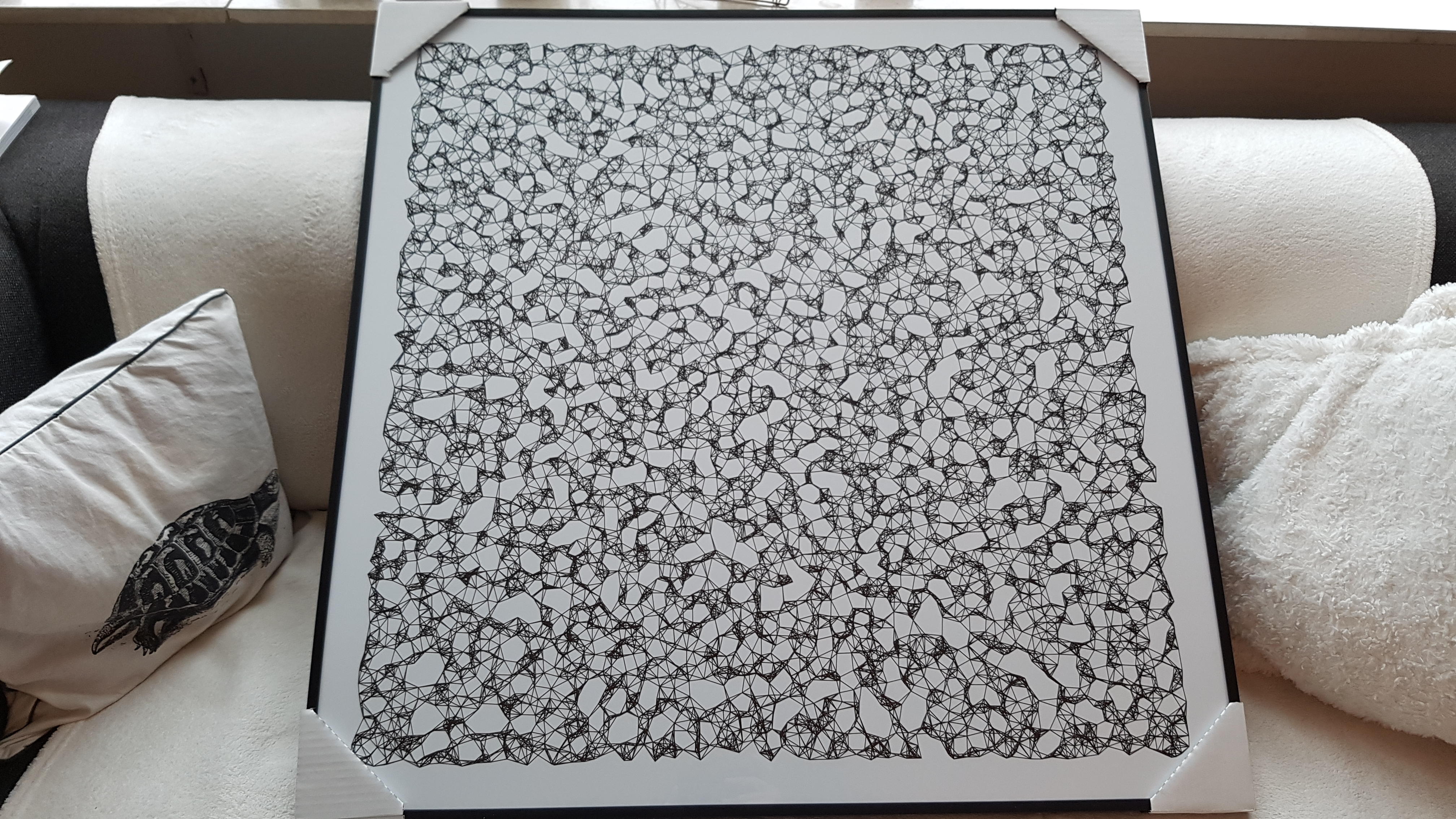
Marcus Volz is a research fellow at the University of Melbourne, studying geometric networks, optimisation and computational geometry. He’s interested in visualisation, and always looking for opportunities to represent complex information in novel ways to accelerate learning and uncover the unexpected.
One of Marcus’ hobbies is the visualization of mathematical patterns and statistical algorithms via R. He has a whole portfolio full of them, including a Github page with all the associated R code. For my recent promotion, my girlfriend asked Marcus to generate a K-nearest neighbors visual and she had it printed on a large canvas.
The picture contains about 10.000 points, randomly uniformly distributed across x and y, connected by lines with their closest k other points. Marcus shared the code to generate such k-nearest neighbor algorithm plots here on Github. So if you know your way around R, you could make your own version:
#' k-nearest neighbour graph
#'
#' Computes a k-nearest neighbour graph for a given set of points. Refer to the \href{https://en.wikipedia.org/wiki/Nearest_neighbor_graph}{Wikipedia article} for details.
#' @param points A data frame with x, y coordinates for the points
#' @param k Number of neighbours
#' @keywords nearest neightbour graph
#' @export
#' @examples
#' k_nearest_neighbour_graph()

k_nearest_neighbour_graph <- function(points, k=8) {
  get_k_nearest <- function(points, ptnum, k) {
    xi <- points$x[ptnum]
    yi <- points$y[ptnum]     points %>%
      dplyr::mutate(dist = sqrt((x - xi)^2 + (y - yi)^2)) %>%
      dplyr::arrange(dist) %>%
      dplyr::filter(row_number() %in% seq(2, k+1)) %>%
      dplyr::mutate(xend = xi, yend = yi)
  }

  1:nrow(points) %>%
    purrr::map_df(~get_k_nearest(points, ., k))
}
Those less versed in R can use Marcus package mathart. With this package, Marcus shares many more visual depictions of cool algorithms! You can install the package and several dependencies with the following lines of code:
This page of Marcus’ mathart Github repository contains the code exact code for these and many other visualizations of algorithms and statistical phenomena. Do check it out if you’re interested!
Also, check out the “Fun” section of my R tips and tricks list for more cool visuals you can generate in R!
Today I learned about dygraphs, a fast, flexible open source JavaScript charting library. As everything in JavaScript, the charts produced by dygraphs integrate completely in the webbrowser and are thus very functional and interactive. See, for instance, the below where the graph highlights the y-axis value for both time series in the graph based on the x-axis value of my mouse location (January 24 2009). Very cool!
Fortunately, I do know my way around R, and of course someone had already integrated dypgrahs in R in the form of the dygraphs R package. It works like a charm!
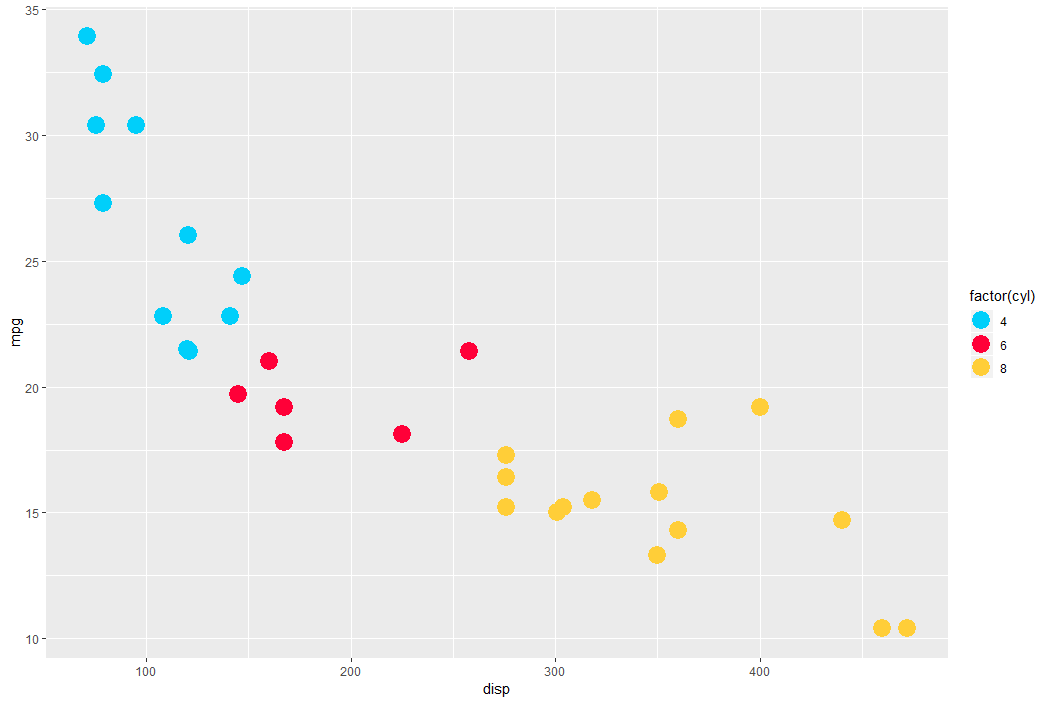
TJ Mahr hinted to this Canva webpage on Twitter. It contains 100 beautiful color palettes including their hexadecimal color codes. For instance, these three below.
The great thing is that these color palettes are include in the ggthemes package in R. Hence, the following code uses this Nightlife palette directly in an R script, resulting in the plot below.
A recent open access paper by Nicholas Tierney and Dianne Cook — professors at Monash University — deals with simpler handling, exploring, and imputation of missing values in data.They present new methodology building upon tidy data principles, with a goal to integrating missing value handling as an integral part of data analysis workflows. New data structures are defined (like the nabular) along with new functions to perform common operations (like gg_miss_case).
These new methods have bundled among others in the R packages naniar and visdat, which I highly recommend you check out. To put in the author’s own words:
The naniar and visdat packages build on existing tidy tools and strike a compromise between automation and control that makes analysis efficient, readable, but not overly complex. Each tool has clear intent and effects – plotting or generating data or augmenting data in some way. This reduces repetition and typing for the user, making exploration of missing values easier as they follow consistent rules with a declarative interface.
The below showcases some of the highly informational visuals you can easily generate with naniar‘s nabulars and the associated functionalities.
For instance, these heatmap visualizations of missing data for the airquality dataset. (A) represents the default output and (B) is ordered by clustering on rows and columns. You can see there are only missings in ozone and solar radiation, and there appears to be some structure to their missingness.
Another example is this upset plot of the patterns of missingness in the airquality dataset. Only Ozone and Solar.R have missing values, and Ozone has the most missing values. There are 2 cases where both Solar.R and Ozone have missing values.
You can also generate a histogram using nabular data in order to show the values and missings in Ozone. Values are imputed below the range to show the number of missings in Ozone and colored according to missingness of ozone (‘Ozone_NA‘). This displays directly that there are approximately 35-40 missings in Ozone.
Alternatively, scatterplots can be easily generated. Displaying missings at 10 percent below the minimum of the airquality dataset. Scatterplots of ozone and solar radiation (A), and ozone and temperature (B). These plots demonstrate that there are missings in ozone and solar radiation, but not in temperature.
Finally, this parallel coordinate plot displays the missing values imputed 10% below range for the oceanbuoys dataset. Values are colored by missingness of humidity. Humidity is missing for low air and sea temperatures, and is missing for one year and one location.


 Alternatively, scatterplots can be easily generated. Displaying missings at 10 percent below the minimum of the airquality dataset. Scatterplots of ozone and solar radiation (A), and ozone and temperature (B). These plots demonstrate that there are missings in ozone and solar radiation, but not in temperature.

