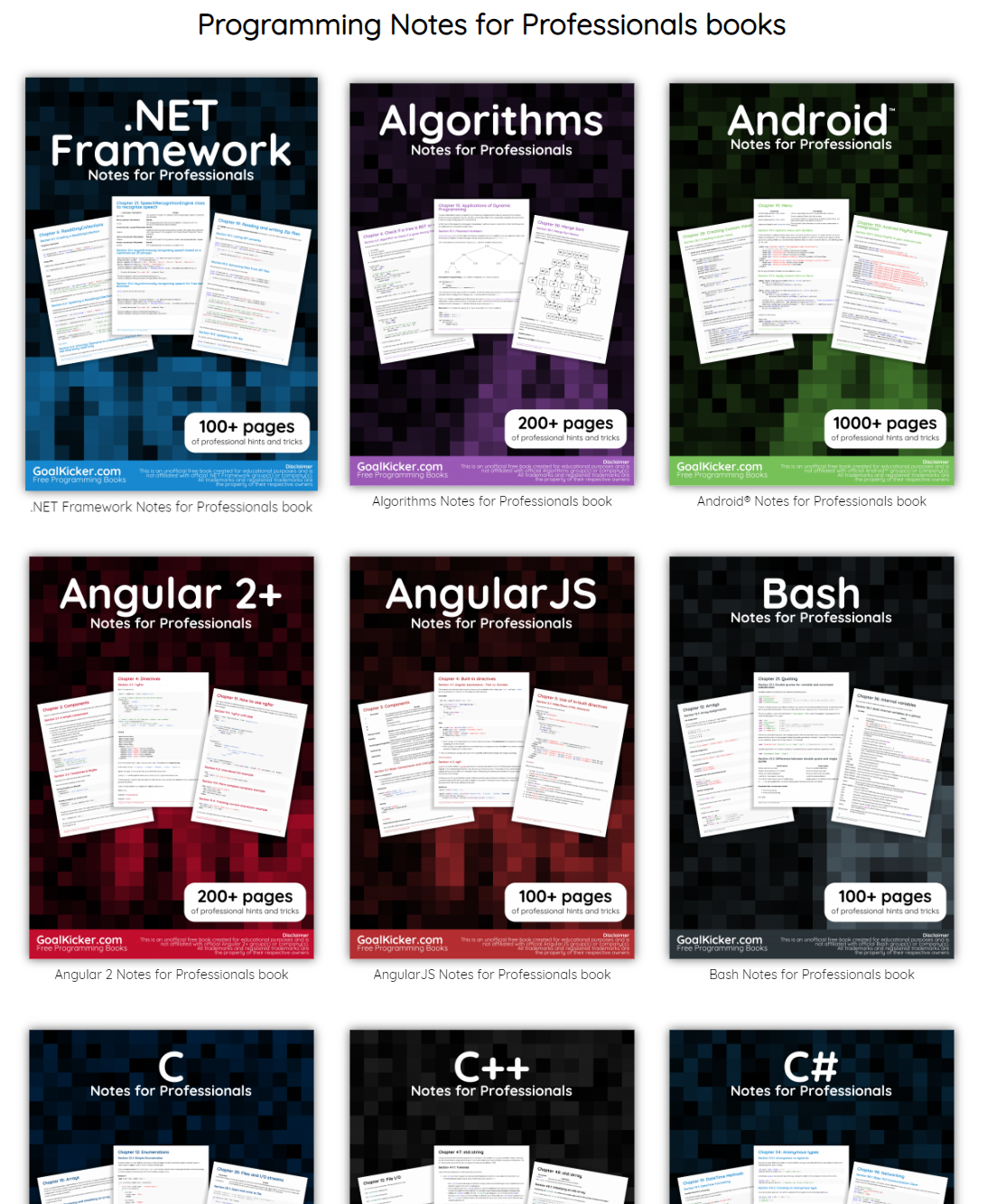
This specific link has been on my to-do list for so-long now that I’ve decided to just share it without any further ado.
The people behind GoalKicker, for whatever reason, decided to compile nearly 100 books on different programming languages based on among others StackOverflow entries. Their open access library contains books on languages from Latex to Linux, from Java to JavaScript, from SQL to MySQL, and from C, to C++, C#, and objective-C.
2018 seemed to be the year of challengesgoing viral on the web. Most of them were plain stupid and/or dangerous. However, one viral challenge I did like: #100DaysOfCode
1. Code minimum an hour every day for the next 100 days.
2. Tweet your progress every day with the #100DaysOfCode hashtag.
3. Each day, reach out to at least two people on Twitter who are also doing the challenge
Many (aspiring) programming professionals competed in this challenge, sharing their learning journeys in domains from web development, machine learning, or data visualization.
With this blog, I wanted to share two of those learning journeys that stood out for me.
Machine learning
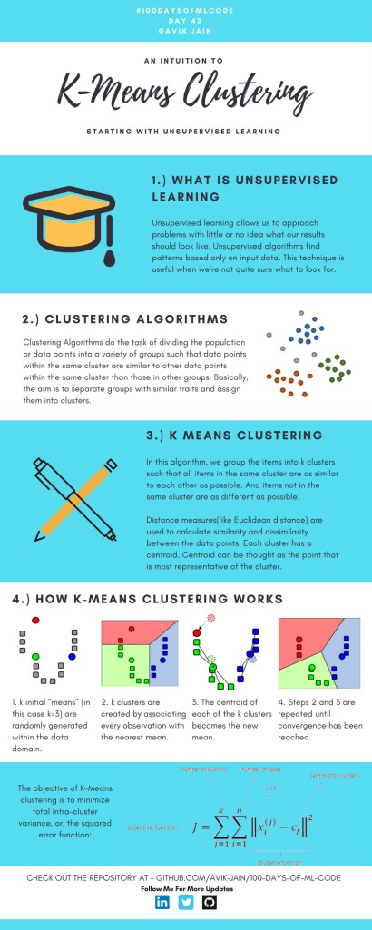
First, there’s Avik Jain’s 100 days of Machine Learning code repository on Github. Avik’s repository contains all learning activities he followed during the 53 days of programming he completed. Some of Avik’s entries really stood out, and I particularly liked his educational infographics:
Just look at the wonderful design and visual aids on this decision tree for dummies infographic, pseudocode and all:
Day 23: Decision trees for dummies. This just looks fabulous right?!
Although Avik didn’t seem to have completed the full 100 days, many others did.
Data visualization
I have blogged about Hannah Yan Han‘s 100 days of code project before, but she definately deserves another mention here. Her 100 days revolved around data science, data visualization, and storytelling using both R and Python. You can find her #100DaysOfCode Medium page here, and her associated Github repository here.
For example, one day Hannah explored where instant noodles come from, how they are served, and whether people like them or not.
What I found so great about Hannah’s project is that she picked a novel dataset every couple of days. Moreover, she used a extremely large variety of different visualization formats. All visuals were equally beautiful, but Hannah made sure to pick the right one for the purpose she was trying to serve. If you are interested in data visualization, you seriously should check out Hannah’s 100DaysOfCode Medium page.
Past days, I discovered this series of blogs on how to win the classic game of Battleships (gameplay explanation) using different algorithmic approaches. I thought they might amuse you as well : )
The story starts with this 2012 Datagenetics blog where Nick Berry constrasts four algorithms’ performance in the game of Battleships. The resulting levels of artificial intelligence (AI) seem to compare respectively to a distracted baby, two sensible adults, and a mathematical progidy.
The first, stupidest approach is to just take Random shots. The AI resulting from such an algorithm would just pick a random tile to shoot at each turn. Nick simulated 100 million games with this random apporach and computed that the algorithm would require 96 turns to win 50% of games, given that it would not be defeated before that time. At best, the expertise level of this AI would be comparable to that of a distracted baby. Basically, it would lose from the average toddler, given that the toddler would survive the boredom of playing such a stupid AI.
A first major improvement results in what is dubbed the Hunt algorithm. This improved algorithm includes an instruction to explore nearby spaces whenever a prior shot hit. Every human who has every played Battleships will do this intuitively. A great improvement indeed as Nick’s simulations demonstrated that this Hunt algorithm completes 50% of games within ~65 turns, as long as it is not defeated beforehand. Your little toddler nephew will certainly lose, and you might experience some difficulty as well from time to time.
A visual representation of the “Hunting” of the algorithm on a hit [via]
Another minor improvement comes from adding the so-called Parity principle to this Hunt algorithm (i.e., Nick’s Hunt + Parity algorithm). This principle instructs the algorithm to take into account that ships will always cover odd as well as even numbered tiles on the board. This information can be taken into account to provide for some more sensible shooting options. For instance, in the below visual, you should avoid shooting the upper left white tile when you have already shot its blue neighbors. You might have intuitively applied this tactic yourself in the past, shooting tiles in a “checkboard” formation. With the parity principle incorporated, the median completion rate of our algorithm improves to ~62 turns, Nick’s simulations showed.
Now, Nick’s final proposed algorithm is much more computationally intensive. It makes use of Probability Density Functions. At the start of every turn, it works out all possible locations that every remaining ship could fit in. As you can imagine, many different combinations are possible with five ships. These different combinations are all added up, and every tile on the board is thus assigned a probability that it includes a ship part, based on the tiles that are already uncovered.
Computing the probability that a tile contains a ship based on all possible board layouts [via]
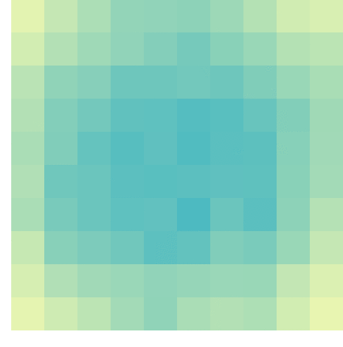
At the start of the game, no tiles are uncovered, so all spaces will have about the same likelihood to contain a ship. However, as more and more shots are fired, some locations become less likely, some become impossible, and some become near certain to contain a ship. For instance, the below visual reflects seven misses by the X’s and the darker tiles which thus have a relatively high probability of containing a ship part.
An example distribution with seven misses on the grid. [via]
Nick simulated 100 million games of Battleship for this probabilistic apporach as well as the prior algorithms. The below graph summarizes the results, and highlight that this new probabilistic algorithm greatly outperforms the simpler approaches. It completes 50% of games within ~42 turns! This algorithm will have you crying at the boardgame table.
Relative performance of the algorithms in the Datagenetics blog, where “New Algorithm” refers to the probabilistic approach and “No Parity” refers to the original “Hunt” approach.
Reddit user /u/DataSnaek reworked this probablistic algorithm in Python and turned its inner calculations into a neat GIF. Below, on the left, you see the probability of each square containing a ship part. The brighter the color (white <- yellow <- red <- black), the more likely a ship resides at that location. It takes into account that ships occupy multiple consecutive spots. On the right, every turn the algorithm shoots the space with the highest probability. Blue is unknown, misses are in red, sunk ships in brownish, hit “unsunk” ships in light blue (sorry, I am terribly color blind).
The probability matrix as a heatmap for every square after each move in the game. [via]
This latter attempt by DataSnaek was inspired by Jonathan Landy‘s attempt to train a reinforcement learning (RL) algorithm to win at Battleships. Although the associated GitHub repository doesn’t go into much detail, the approach is elaborately explained in this blog. However, it seems that this specific code concerns the training of a neural network to perform well on a very small Battleships board, seemingly containing only a single ship of size 3 on a board with only a single row of 10 tiles.
Fortunately, Sue He wrote about her reinforcement learning approach to Battleships in 2017. Building on the open source phoenix-battleship project, she created a Battleship app on Heroku, and asked co-workers to play. This produced data on 83 real, two-person games, showing, for instance, that Sue’s coworkers often tried to hide their size 2 ships in the corners of the Battleships board.
Probability heatmaps of ship placement in Sue He’s reinforcement learning Battleships project [via]
Next, Sue scripted a reinforcement learning agent in PyTorch to train and learn where to shoot effectively on the 10 by 10 board. It became effective quite quickly, requiring only 52 turns (on average over the past 25 games) to win, after training for only a couple hundreds games.
The performance of the RL agent at Battleships during the training process [via]
However, as Sue herself notes in her blog, disappointly, this RL agent still does not outperform the probabilistic approach presented earlier in this current blog.
Reddit user /u/christawful faced similar issues. Christ (I presume he is called) trained a convolutional neural network (CNN) with the below architecture on a dataset of Battleships boards. Based on the current board state (10 tiles * 10 tiles * 3 options [miss/hit/unknown]) as input data, the intermediate convolutional layers result in a final output layer containing 100 values (10 * 10) depicting the probabilities for each tile to result in a hit. Again, the algorithm can simply shoot the tile with the highest probability.
Christ’s convolutional neural network architecture for Battleships [via]
Christ was nice enough to include GIFs of the process as well [via]. The first GIF shows the current state of the board as it is input in the CNN — purple represents unknown tiles, black a hit, and white a miss (i.e., sea). The next GIF represent the calculated probabilities for each tile to contain a ship part — the darker the color the more likely it contains a ship. Finally, the third picture reflects the actual board, with ship pieces in black and sea (i.e., miss) as white.
As cool as this novel approach was, Chris ran into the same issue as Sue, his approach did not perform better than the purely probablistic one. The below graph demonstrates that while Christ’s CNN (“My Algorithm”) performed quite well — finishing a simulated 9000 games in a median of 52 turns — it did not outperform the original probabilistic approach of Nick Berry — which came in at 42 turns. Nevertheless, Chris claims to have programmed this CNN in a couple of hours, so very well done still.
The performance of Christ’s Battleship CNN compared to Nick Berry’s original algorithms [via]
Interested by all the above, I searched the web quite a while for any potential improvement or other algorithmic approaches. Unfortunately, in vain, as I did not find a better attempt than that early 2012 Datagenics probability algorithm by Nick.
Surely, with today’s mass cloud computing power, someone must be able to train a deep reinforcement learner to become the Battleship master? It’s not all probability right, there must be some patterns in generic playing styles, like Sue found among her colleagues. Or maybe even the ability of an algorithm to adapt to the opponent’s playin style, as we see in Libratus, the poker AI. Maybe the guys at AlphaGo could give it a shot?
For starters, Christ’s provided some interesting improvements on his CNN approach. Moreover, while the probabilistic approach seems the best performing, it might not the most computationally efficient. All in all, I am curious to see whether this story will continue.
I came across this awesome regular expression tool I wanted to share. Debuggex allows you to interactively write, test and visually inspect what your regular expressions match in either Python, JavaScript, or Perl.
Read more about regular expressions here, for instance their implementation in R.
However, then I imagined that not everybody may be familiar with k-means, hence, I wrote the whole blog below.
Next thing I know, u/dashee87 on r/datascience points me to these two other blogs that had already done the same… but way better! These guys perfectly explain k-means, alongside many other clustering algorithms. Including interactive examples and what not!!
Seriously, do not waste your time on reading my blog below, but follow these links. If you want to play, go for Naftali’s apps. If you want to learn, go for David’s animated blog.
Naftali Harris built this fantastic interactive app where you can run the k-means algorithm step by step on many different datasets. You can even pick the clusters’ starting locations yourself! Next to this he provides a to-the-point explanation of the inner workings. On top of all this, he built the same app for the DBSCAN algorithm(wiki), so you can compare the algorithms’ performance… Insane!
David Sheehan (yes, that’s dashee) is more of a Python guy and walks you through the inner workings of six algorithmic clustering approaches in his blog here. Included are k-means, expectation maximization, hierarchical, mean shift, and affinity propagation clustering, and DBSCAN. David has made detailed step-wise GIF animations of all these algorithms. And he explains the technicalities in a simple and understandable way. On top of this, David shared his Jupyter notebook to generate the animations, along with a repository of the GIFs themselves. Very well done! Seriously one of the best blogs I’ve read in a while.
Let me walk you through what k-means is, why it is called k-means, and how the algorithm interally works, step by step.
Let me dissect that sentence for you, starting at the back.
Algorithm
Simply put, an algorithm (wiki) is a set of task instructions to be followed. Often algorithms are perform by computers, and used in calculations or problem-solving. Basically, an algorithm is thus not much more than a sequence of task instructions to be followed by a computer — like a cooking recipe.
In machine learning (wiki), algorithmic tasks are often divided in supervised or unsupervisedlearning (let’s skip over reinforcement learning for now).
The learning part reflects that algorithms try to learn a solution — learn how to solve a problem.
The supervision part reflects whether the algorithm receives answers or solutions to learn from. For supervised learning, examples are required. In the case of unsupervised learning, algorithms do not learn by example but have figure out a proper solution themselves.
Clustering
Clustering (wiki) is essentially a fancy word for grouping. Clustering algorithms seek to group things together, and try to do so in an optimal way.
Group things. As long as we can represent things in terms of data, clustering algorithms can group them. We can group cars by their weight and horsepower, people by their length and IQ, or frogs by their slimyness and greenness. These things we would like to group, we often call observations (depicted by the letter N or n).
Optimal way. Clustering is very much an unsupervised task. Clustering algorithms do not receive examples to learn from (that’s actually classification (wiki)). Algorithms are not told what “good” clustering or grouping looks like.
Yet, how do clustering algorithms determine the optimal way to group our observations then?
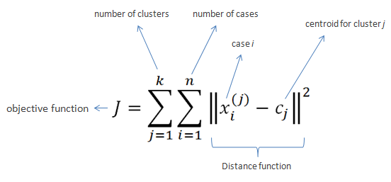
Well, clustering algorithms like k-means do so by optimizing a certain value. This value is reflected in an algorithm’s so-called objective function.
k-means’ objective function is displayed below. In simple language, k-means seeks to minimize (= optimize) the total distance of observations (= cases) to their group’s (= cluster) center (= centroid).
Fortunately, you can immediately forget this function. For now, all you need to know is that algorithms often repeat specific steps of their instructions in order for their objective function to produce a satisfactory value.
Hurray, we can now move to the k-means algorithm itself!
Why is it called k-means in the first place?
Let’s start at the front this time.
k. The k in k-means reflects the number of groups the algorithm is going to form. The algorithm depends on its user to specify what number of k should be. If the user picks k = 2 for instance, the k-means algorithm will identify 2 group by their 2 means.
As I said before, clustering algorithms like k-means are unsupervised. They do not know what good clustering looks like. In the case where the used specified k = 2, the algorithm will seek to optimize its objective function given that there are 2 groups. It will try to put our observations in 2 groups that minimizes the total distance of the observations to their group’s center. I will how that works visually later in this blog.
means. The means in k-means reflects that the algorithm considers the mean value of a cluster as its cluster center. Here, mean is a fancy word for average. Again, I will visualize how this works later.
You might have guessed it already: there are indeed variations of the k-means algorithm that do not use the cluster means, but, for instance, the cluster medians (wiki) or mediods (wiki). These algorithms are only slight modifications of the k-means algorithm, and simply called the k-medians (wiki) and k-medoids algorithms (wiki).
How does k-means work?
Finally, we get to the inner workings of k-means!
The k-means algorithm consists of five simple steps:
Obtain a predefined k.
Pick k random points as cluster centers.
Assign observations to their closest cluster center based on the Euclidean distance.
Update the center of each cluster based on the included observations.
Terminate if no observations changed cluster, otherwise go back to step 3.
Easy right?
OK, I can see how this may not be directly clear.
Let’s run through the steps one by one using an example dataset.
Example dataset: mtcars
Say we have the dataset below, containing information on 32 cars.
We can consider each car a separate observation. For each of these observations, we have its weight and its horsepower.
These characteristics — weight and horsepower — of our observations are the variables in our dataset. Our cars vary based on these variables.
Name
Weight
Horsepower
Mazda RX4
1188
110
Mazda RX4 Wag
1304
110
Datsun 710
1052
93
Hornet 4 Drive
1458
110
Hornet Sportabout
1560
175
Valiant
1569
105
Duster 360
1619
245
Merc 240D
1447
62
Merc 230
1429
95
Merc 280
1560
123
Merc 280C
1560
123
Merc 450SE
1846
180
Merc 450SL
1692
180
Merc 450SLC
1715
180
Cadillac Fleetwood
2381
205
Lincoln Continental
2460
215
Chrysler Imperial
2424
230
Fiat 128
998
66
Honda Civic
733
52
Toyota Corolla
832
65
Toyota Corona
1118
97
Dodge Challenger
1597
150
AMC Javelin
1558
150
Camaro Z28
1742
245
Pontiac Firebird
1744
175
Fiat X1-9
878
66
Porsche 914-2
971
91
Lotus Europa
686
113
Ford Pantera L
1438
264
Ferrari Dino
1256
175
Maserati Bora
1619
335
Volvo 142E
1261
109
Visually, we can represent this same dataset as follows:
Step 1: Define k
For whatever reason, we might want to group these 32 cars.
We know the cars’ weight and horsepower, so we can use these variables to group the cars. The underlying assumption being that cars that are more similar in terms of weight and/or horsepower would belong together in the same group.
Normally, we would have smart or valid reasons to expect a specific number of groups among our observations. For now, let’s simply say that we want to put these cars into, say, 2 groups.
Well, that’s step 1 already completed: we defined k = 2.
Step 2: Initialize cluster centers
In step 2, we need to initialize the algorithm.
Everyone needs to start somewhere, and the default k-means algorithm starts out super naively: it just picks random locations as our starting cluster centers.
For instance, the algorithm might initialize cluster 1 randomly at a weight of 1000 kilograms and a horsepower of 100.
We can use coordinate notation [x; y] or [weight; horsepower] to write this location in short. Hence, the initial random center of cluster 1 picked by the k-means algorithm is located at [1000; 100].
Randomly, k-means could initialize cluster 2 at a weight of 1500kg and a horsepower of 200. It’s intitial center is thus at [1500; 200].
Visually, we can display this initial situation like the below, with our 32 cars as grey dots in the background:
Now, step 2 is done, and our k-means algorithm has been fully initialized. We are now ready to enter the core loop of the algorithm. The next three steps — 3, 4, and 5 — will be repeated until the algorithm tells itself it is done.
Step 3: Assignment to closest cluster
Now, in step 3, the algorithm will assign every single car in our dataset to the cluster whose center is closest.
To do this, the algorithm looks at every car, one by one, and calculate its distance to every of our cluster centers.
So how would this distance calculating thing work?
The algorithm starts with the first car in our dataset, a Mazda RX4.
This Mazda RX4 weighs 1188kg and has 110 horsepower. Hence, it is located at [1188; 110].
As this is the first time our k-means algorithm reaches step 3, the cluster centers are still at the random locations the algorithm has picked in step 2.
The k-means algorithm now calculates the Euclidean distance (wiki) of this Mazda RX4 data point [1188; 110] to each of the cluster centers.
The Euclidean distance is calculated using the formula below. The first line shows you that the Euclidean distance is the square root of the squared distance between two observations. The second line — with the big Greek capital letter Sigma (Σ) — is a shorter way to demonstrate that the distance is calculated and summed up for each of the variables considered.
Again, please don’t mind the formula, the Euclidean distance is basically the length of a straight line between two data points.
So… back to our Mazda RX4. This Mazda is one of the two observations we need to input in the formula. The second observation would be a cluster center. We input both of the location of our Mazda [1188; 110] and that of a cluster center –, say cluster 1’s [1000; 100] — in the formula, and out comes the Euclidean distance between these two observations.
The Euclidean distance of our Mazda RX4 to the center of cluster 1 would thus be √((1118 – 1000)2 + (110 – 100)2), which equals 192.2082 — or a rounded 192.
We need to repeat this, but now with the location of our second cluster center. The Euclidean distance from our Mazda RX4 to the center of cluster 2 would be √((1118 – 1500)2 + (110 – 150)2), which equals 314.5537 — or a rounded 314.
Again, I visualized this situation below.
You can clearly see that our Mazda RX4 is closer to cluster center 1 (192) than to cluster center 2 (314). Hence, as the distance to cluster 1’s center is smaller, the k-means algorithm will now assign our Mazda RX4 to cluster 1.
Subsequently, the algorithm continues with the second car in our dataset.
Let this second car be the Mercedes 280C for now, weighing in at 1560 kg with a horsepower of 153.
Again, the k-means algorithm would calcalute the Euclidean distance from this Mercedes [1560; 153] to each of our cluster centers.
It would find that this Mercedes is located much closer to cluster 2’s center (560) than cluster 1’s (65).
Hence, the k-means algorithm will assign the Mercedes 280C to cluster 2, before continuing with the next car…
and the next car after that…
and the next car…
… until all cars are assigned to one of the clusters.
This would mean that step 3 is completed. Visually, the situation at the end of step 3 will look like this:
Step 4: Update the cluster centers
Now, in step 4, the k-means algorithm will update the cluster centers.
As a result of step 3, there are now actual observations assigned to the clusters. Hence, the k-means algorithm can let go of its naive initial random guesses and calculate the actual cluster centers.
Because we are dealing with the k-means algorithm, these centers will be based on the mean values of the observations in each group.
So for each cluster, the algorithm takes the observations assigned to it, and calculates the cluster’s mean value for every variable. In our case, the algorithm thus calculates 4 means: the average weight and the average horsepower, for each of our two clusters.
For cluster 1, the average weight of its cars is a rounded 939 kg. Its average horsepower is approximately 84. Hence the cluster center is updated to location [939; 84]. Cluster 2’s mean values come in at [1663; 171].
With the cluster centers updated, the k-means algorithm has finished step 4. Visually, the situation now looks as follows, with the old cluster centers in grey.
Step 5: Terminate or go back to step 3.
So that was actually all there is to the k-means algorithm. From now on, the algorithm either terminates or goes back to step 3.
So how does the k-means algorithm know when it is done?
Earlier in this blog post I already asked “how do clustering algorithms determine the optimal way to group our observations?”
Well, we already know that the k-means algorithm wants to optimize its objective function. It seeks to minimize the total distance of observations to their respective cluster centers. It does so by assigning observations to the cluster whose center is nearest according to the Euclidean distance.
Now, with the above in mind, the k-means algorithm determines that it has reached an optimal clustering solution if, in step 3, no single observation switches to a different cluster.
If that is the case, then every observation is assigned to the group whose center values best represent its underlying characteristics (weight and horsepower), and the k-means algorithm is thus satisfied with the solution given this number of groups (= k). These groups centers now best describe the characteristics of the individual observations at hand, given this k, as evidenced that each observations belongs to the cluster whose center values are closest to their own values.
Now, the k-means algorithm will have to check whether it is done somewhere in its instructions. It seems most logical to directly do this in step 3: quickly check whether every observations remained in its original cluster.
This is not so difficult if you have only 32 cars. However, what if we were clustering 100.000 cars? We would not want to check for 100.000 cars whether they remained in their respective cluster, right? That’s a heavy task, even for a computer.
Potentially there is an easier way to check this? Maybe we could look at our cluster centers? We update them in step 4. And if no observations have changed clusters, then the locations of our cluster centers will for sure also not have changed.
Even in our simple example it is less work to see check whether 2 cluster centers have remained the same, than comparing whether 32 cars have not changed clusters.
So basically, that’s what we will do in this step five. We check whether our cluster centers have moved.
In this case, they did. As can be seen in the visual at the end of step 4.
This is also to be expected, as it is very unlikely that the algorithm could have randomly picked the initial cluster centers in their optimal locations, right?
We conclude step 5 and, because the cluster center locations have changed in step 4, the algorithm is sent back to step 3.
Let’s see how the k-means algorithm continues in our example.
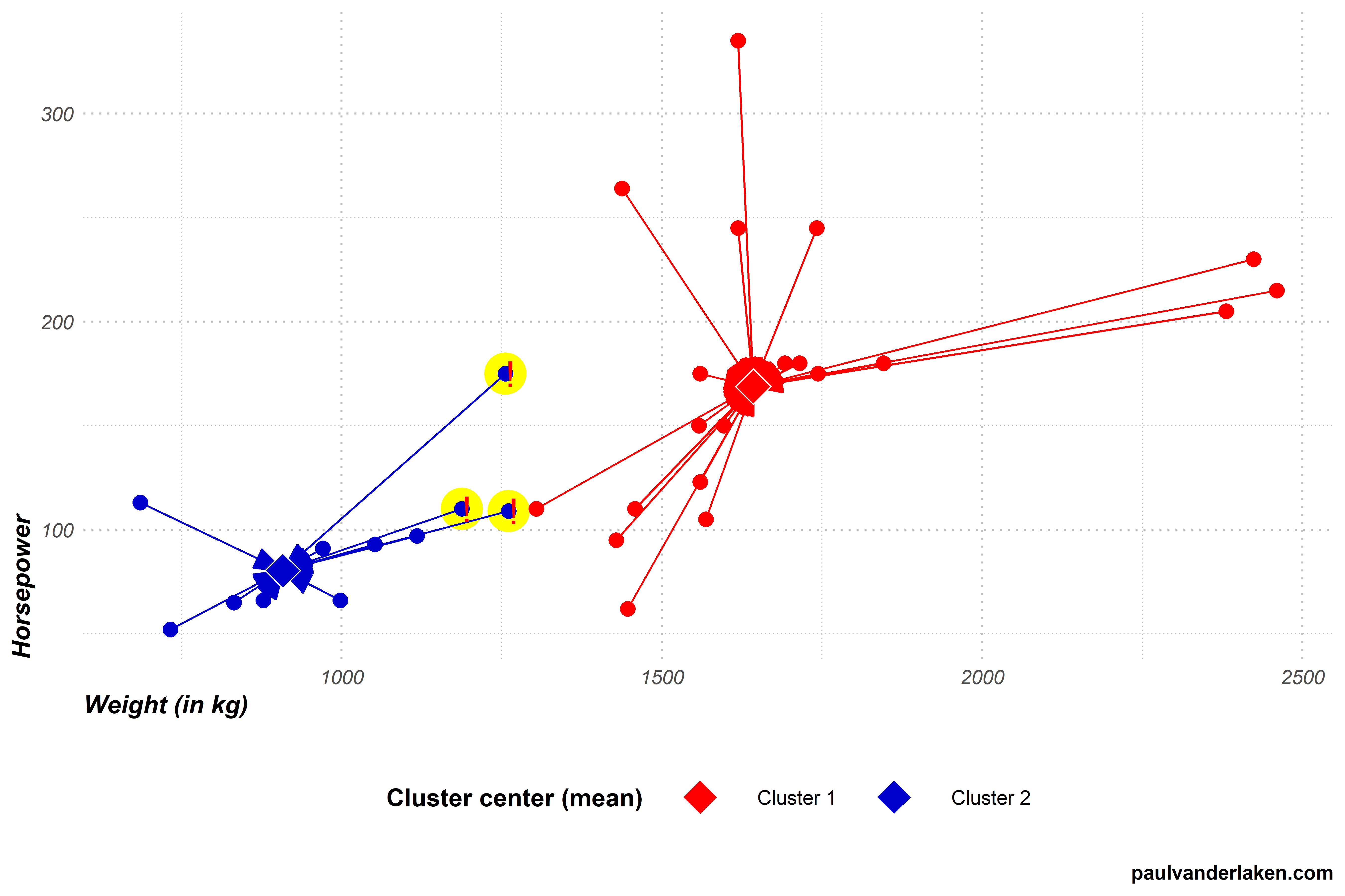
Step 3 (2nd time): Assignment to closest cluster
In step 3, the algorithm reassigns every car in our dataset to the cluster whose center is nearest.
To do this, the algorithm has to look at every car, one by one, and calculate its distance to every of our cluster centers.
Our cluster centers have been updated in the previous step 4. Hence, the distances between our observations and cluster centers may have changed respective to the first time the algorithm performed step 3.
Indeed two cars that were previously closer to the blue cluster 2 center are now actually closer to the red cluster 1 center.
In this step 3, again all observations are assigned to their closest clusters, and two observations thus change cluster.
Visually, the situation now looks like the below. I’ve marked the two cars that switched in yellow and with an exclamation mark.
The k-means algorithm now again reaches step 4.
Step 4 (2nd time): Update the cluster centers
In step 4, the algorithm updates the cluster centers. Because we are dealing with the k-means algorithm, these centers will be based on the mean values of the observations in each group.
For cluster 1, both the average weight and the average horsepower have increased due to the two new cars. The cluster center thus moves from approximately [939; 84] to [998; 94].
Cluster 2 lost two cars from its cluster, but both were on the lower end of its ranges. Hence its average weight and horsepower have also increased, moving the center from approximately [1663; 171] to [1701; 174].
With the cluster centers updated, step 4 is once again completed. Visually, the situation now looks as follows, with the old centers in grey.
Step 5 (2nd time): Terminate or go back to step 3.
In step 5, the k-means algorithm again checks whether it is done. It concludes that it is not, because the cluster centers have both moved once more. This indicates that at least some observations have changed cluster, and that a better solution may be possible. Hence, the algorithm needs to return to step 3 for a third time.
Are you still with me? We are nearly there, I hope…
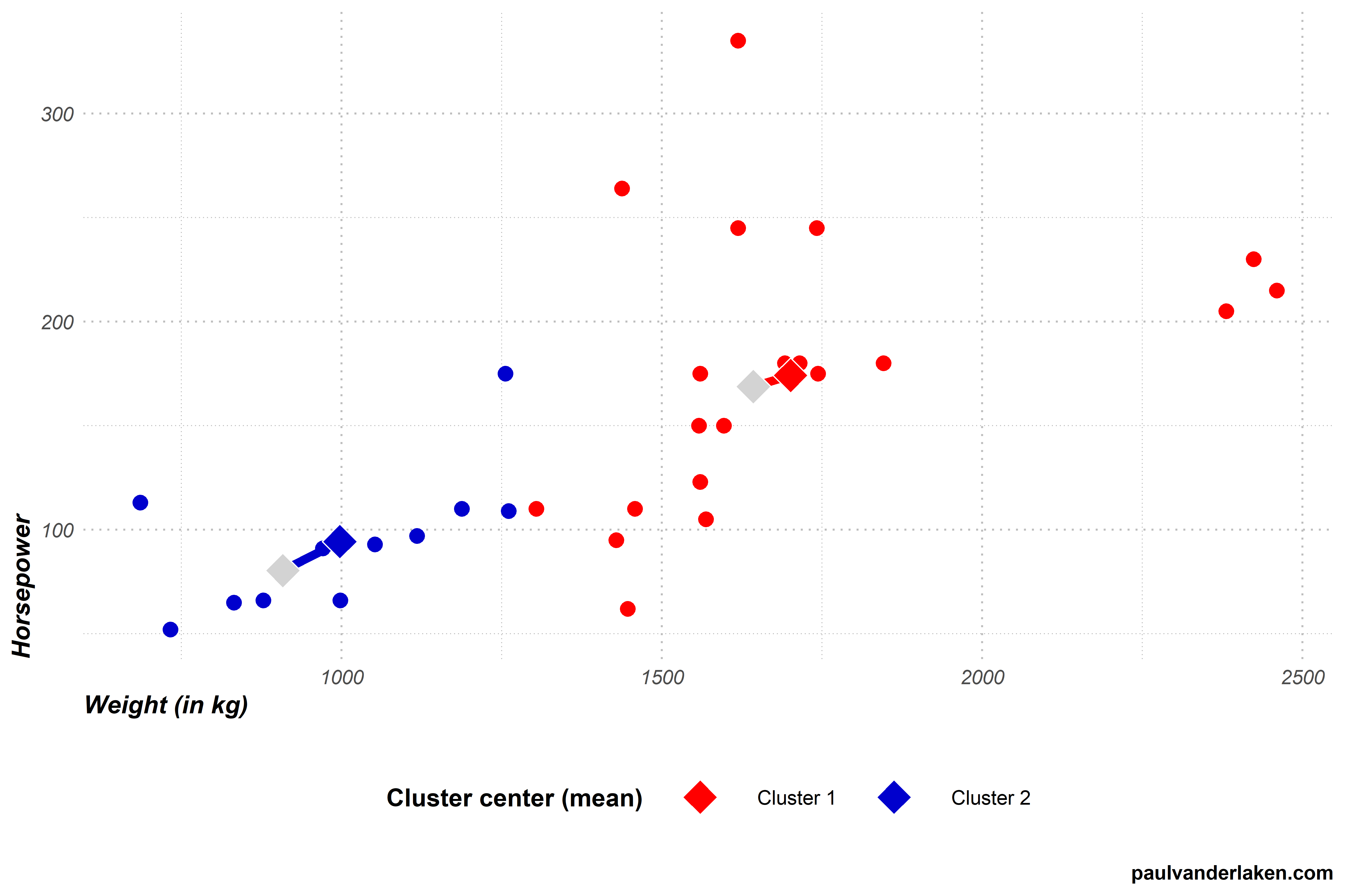
Step 3 (3nd time): Assignment to closest cluster
In step 3, the algorithm assigns every car in our dataset to the cluster whose center is nearest. To do this, the algorithm looks at every car, one by one, and calculates its distance to each of our cluster centers. As our cluster centers have been updated in the previous step 4, so too will their distances to the cars.
After calculating the distances, step 3 is once again completed by assigning the observations to their closest clusters. Another car moved from the blue cluster 2 to the red cluster 1, highlighted in yellow with an exclamation mark.
Step 4 (3rd time): Update the cluster centers
In step 4, the algorithm updates the cluster centers. For each cluster, it looks at the values of the observations assigned to it, and calculates the mean for every variable.
For cluster 1, both the average weight and the average horsepower have again increased slightly due to the newly assigned car. The cluster center moves from approximately [998; 94] to [1023; 96].
Cluster 2 lost a car from its cluster, but it was on the lower end of its range. Hence, its average weight and horsepower have also increased, moving the cluster center from approximately [1701; 174] to [1721; 177].
With the renewed cluster centers, step 4 is once again completed. Visually, the situation looks as follows, with the old centers in grey.
Step 5 (3rd): Terminate or go back to step 3.
In step 5, the k-means algorithm will again conclude that it is not yet done. The cluster centers have both moved once more, due to one car changing from cluster 2 to cluster 1 in step 3 (3rd time). Hence, the algorithm returns to step 3 for a fourth, but fortunately final, time.
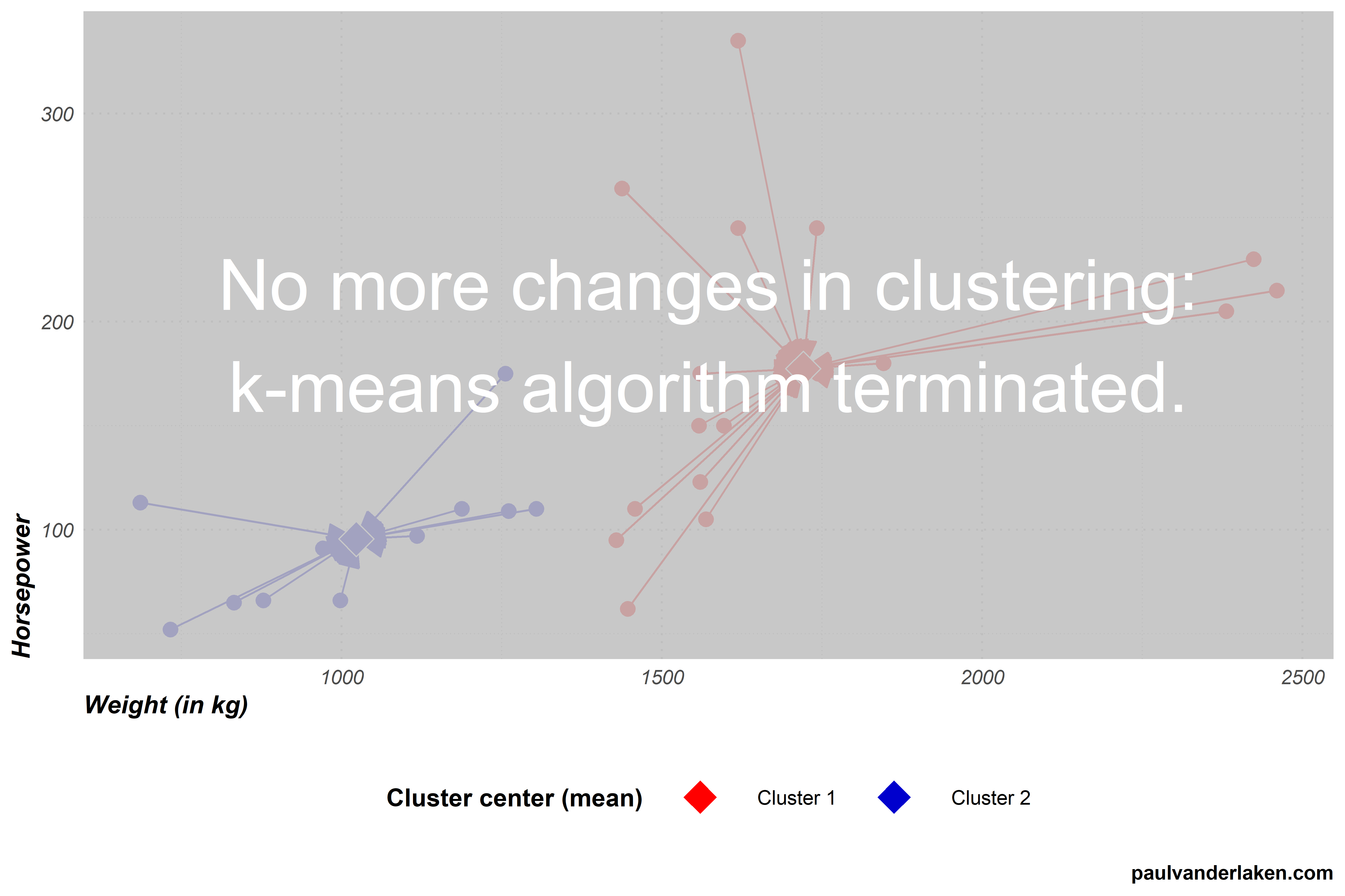
Step 3 (4th time): Assignment to closest cluster
In step 3, the k-means algorithm assigns every car in our dataset to the cluster whose center is nearest. Our cluster centers have only changed slightly in the previous step 4, and thus the distances are nearly similar to last time. Hence, this is the first time the algorithm completes step 3 without having to reassign observations to clusters. We thus know the algorithm will terminate the next time it checks for cluster changes.
Step 4 (4th time): Update the cluster centers
In step 4, the k-means algorithm tries to update the cluster centers. However, no observations moved clusters in step 3 so there is nothing to update.
Step 5 (4th): Terminate or go back to step 3.
As no changes occured to our cluster centers, the algorithm now concludes that it has reached the optimal clustering and terminates.
The clustering solution
With the clustering now completed, we can try to make some sense of the clusters the k-means algorithm produced.
For instance, we can examine how the observations included in each cluster vary on our variables. The density plot below is an example how we could go about exploring what the clusters represent.
We can clearly see what the clusters are made up of.
Cluster 1 holds most of the cars with low horsepower, and nearly all of those with low weights.
Cluster 2, in contrast, includes cars with horsepower ranging from low through high, and all cars are relatively heavy.
We could thus name our clusters respecitvively low horsepower and low weight cars, for cluster 1, and medium to high weight cars, for cluster 2.
Obviously, these clustering solutions will become more interesting as we add more clusters, and more variables to seperate our clusters and observations on.
A word of caution regarding k-means
Normalized input data
In our car clustering example, particularly the weight of cars seemed to be an important discriminating characteristic.
This is largely due to the fact that we didn’t normalize our data before running the k-means algorithm. I explicitly didn’t normalize (wiki) for simplicity sake and didactic purposes.
However, using k-means with raw data is actually a really easily-made but impactful mistake! Not normalizing data will cause k-means to put relative much importance on variables with a larger variance. Such as our variable weight. Cars’ weights ranged from a low 686 kg, to a high 2460 kg, thus spreading almost 1800 units. In contrast, horsepower ranged only from 52 hp to 335 hp, thus spreading less than 300 units.
If not normalized, this larger variation among weight values will cause the calculated Euclidean distance to be much more strongly affected by the weights of cars. Hence, these car weights will thus more strongly determine the final clustering solution simply because of their unit of measurement. In order to align the units of measurement for all variables, you should thus normalize your data before running k-means.
No categorical data
The need to normalize input data before running the k-means algorithm also touches on a second important characteristic of k-means: it does not handle categorical data.
Categorical data is discrete, and doesn’t have a natural origin. For instance, car color is a categorical variable. Cars can be blue, yellow, pink, or black. You can really calculate Euclidean distances for such data, at least not in a meaningful way. How far is blue from yellow, further or closer than it is from black?
Fortunately, there are variations of k-means that can handle categorical data, for instance, the k-modes algorithm.
No garuantees
The k-means algorithm does not guarantee to find the optimal solution. k-means is a fairly simple sequence of tasks and its clustering quality depends a lot on two factors.
First, the k specified by the user. In our example, we arbitrarily picked k = 2. This makes the algorithm seek specifically for solutions with two clusters, whereas maybe 3- or 4-cluster solutions would have made more sense.
Sometimes, users will have good theories to expect a certain number of clusters. At other times, they do not and are left to guess and experiment.
While there are methods to assess to some extent the statistically optimal number of clusters, often the decision for k will be somewhat subjective, though strongly affect the clustering solution..
Second, and more imporant maybe, is the influence of the random starting points for the initial cluster centers picked by the algorithm itself.
The clustering solutions that the algorithm produces are very sensitive to these initial conditions.
Due to its random starting points, it is also very likely that every time you run the k-means algorithm you will get different results, even on the same dataset.
To illustrate this, I ran the k-means visualization algorithm I wrote run a dozen of times.
Below is solution number 3 to which the k-means algorithm converged for our cars dataset. You can see that this is different from our earlier solution where the car at [1450; 270] belonged to the blue cluster 2, whereas here it is assigned to the red cluster 1.
Most k-means algorithms I ran on this dataset of cars resulted in approximately the same solution, like the one above and the one we saw before.
However, the k-means algorithm also produced some very different solutions. Like the one below, number 9. In this case cluster 2 was randomly initiated very muhc on the high end of the weight spectrum. As a result, the cluster 2 center remained all the way on the right side of the graph throughout the iterations of the algorithm.
Or this take this long-lasting iteration, where the k-means algorithm randomly located both cluster centers all the way in the bottom left corner, but fortunately recovered to the same solution we saw before.
One the one hand, the k-means algorithm sequences above illustrate the danger and downside of the k-means algorithm employing its random starting points. On the other hand, the mostly similar solutions produced even by the vanilla algorithm illustrate how the fantasticly simple algorithm is quite sturdy. Moreover, many smart improvements have fortunately been developed to avoid the random stupidity produced by the default algorithm — most notably the k-means++ algorithm (wiki). With these improvements, k-means continues to be one of the simplest though most popular and effective clustering algorithms out there!
Thanks for reading this blog!
While I intended to only share the link to the interactive visualization, I got carried away and ended up simulating the whole thing myself. Hopefully it wasn’t time wasted, and you learned a thing or two
Do reach out if you want to know more or are interested in the code to generate these simulations and visuals. Also, feel free to comment on, forward, or share any of the contents!
The cars dataset you can access in R by calling mtcars directly in your R console. Do explore it, as it contains many more variables on these 32 cars.
Some additional k-means resources
Here are some pages you can browse if you’re looking to learn more.
Nicolas Rougier, Michael Droettboom, Philip Bourne wrote an open access article for the Public Library of Open Science (PLOS) in 2014, proposing ten simple rules for better figures. Below I posted these 10 rules and quote several main sentences extracted from the original article.
Rule 1: Know Your Audience
It is important to identify, as early as possible in the design process, the audience and the message the visual is to convey. The graphical design of the visual should be informed by this intent. […] The general public may be the most difficult audience of all since you need to design a simple, possibly approximated, figure that reveals only the most salient part of your research.
Rule 2: Identify Your Message
It is important to clearly identify the role of the figure, i.e., what is the underlying message and how can a figure best express this message? […] Only after identifying the message will it be worth the time to develop your figure, just as you would take the time to craft your words and sentences when writing an article only after deciding on the main points of the text.
Rule 3: Adapt the Figure to the Support Medium
Ideally, each type of support medium requires a different figure, and you should abandon the practice of extracting a figure from your article to be put, as is, in your oral presentation. […] For example, during an oral presentation, a figure will be displayed for a limited time. Thus, the viewer must quickly understand what is displayed and what it represents while still listening to your explanation.
Rule 4: Captions Are Not Optional
The caption explains how to read the figure and provides additional precision for what cannot be graphically represented. This can be thought of as the explanation you would give during an oral presentation, or in front of a poster, but with the difference that you must think in advance about the questions people would ask. […] if there is a point of interest in the figure (critical domain, specific point, etc.), make sure it is visually distinct but do not hesitate to point it out again in the caption.
Rule 5: Do Not Trust the Defaults
All plots require at least some manual tuning of the different settings to better express the message, be it for making a precise plot more salient to a broad audience, or to choose the best colormap for the nature of the data.
Rule 6: Use Color Effectively
As explained by Edward Tufte [1], color can be either your greatest ally or your worst enemy if not used properly. If you decide to use color, you should consider which colors to use and where to use them. […] However, if you have no such need, you need to ask yourself, “Is there any reason this plot is blue and not black?”
Rule 7: Do Not Mislead the Reader
What distinguishes a scientific figure from other graphical artwork is the presence of data that needs to be shown as objectively as possible. […] As a rule of thumb, make sure to always use the simplest type of plots that can convey your message and make sure to use labels, ticks, title, and the full range of values when relevant.
Example from the paper on how visualization parameters can convey a misleading message.
Rule 8: Avoid “Chartjunk”
Chartjunk refers to all the unnecessary or confusing visual elements found in a figure that do not improve the message (in the best case) or add confusion (in the worst case). For example, chartjunk may include the use of too many colors, too many labels, gratuitously colored backgrounds, useless grid lines, etc. The term was first coined by Edward Tutfe [1]; he argues that any decorations that do not tell the viewer something new must be banned: “Regardless of the cause, it is all non-data-ink or redundant data-ink, and it is often chartjunk.” Thus, in order to avoid chartjunk, try to save ink, or electrons in the computing era.
Rule 9: Message Trumps Beauty
There exists a myriad of online graphics in which aesthetic is the first criterion and content comes in second place. Even if a lot of those graphics might be considered beautiful, most of them do not fit the scientific framework. Remember, in science, message and readability of the figure is the most important aspect while beauty is only an option.
Rule 10: Get the Right Tool
Matplotlib is a python plotting library, primarily for 2-D plotting, but with some 3-D support, which produces publication-quality figures in a variety of hardcopy formats and interactive environments across platforms. It comes with a huge gallery of examples that cover virtually all scientific domains (http://matplotlib.org/gallery.html).
R is a language and environment for statistical computing and graphics. R provides a wide variety of statistical (linear and nonlinear modeling, classical statistical tests, time-series analysis, classification, clustering, etc.) and graphical techniques, and is highly extensible.
Inkscape is a professional vector graphics editor. It allows you to design complex figures and can be used, for example, to improve a script-generated figure or to read a PDF file in order to extract figures and transform them any way you like.
TikZ and PGF are TeX packages for creating graphics programmatically. TikZ is built on top of PGF and allows you to create sophisticated graphics in a rather intuitive and easy manner, as shown by the Tikz gallery (http://www.texample.net/tikz/examples/all/).
GIMP is the GNU Image Manipulation Program. It is an application for such tasks as photo retouching, image composition, and image authoring. If you need to quickly retouch an image or add some legends or labels, GIMP is the perfect tool.
ImageMagick is a software suite to create, edit, compose, or convert bitmap images from the command line. It can be used to quickly convert an image into another format, and the huge script gallery (http://www.fmwconcepts.com/imagemagick/index.php) by Fred Weinhaus will provide virtually any effect you might want to achieve.
D3.js (or just D3 for Data-Driven Documents) is a JavaScript library that offers an easy way to create and control interactive data-based graphical forms which run in web browsers, as shown in the gallery at http://github.com/mbostock/d3/wiki/Gallery.
Cytoscape is a software platform for visualizing complex networks and integrating these with any type of attribute data. If your data or results are very complex, cytoscape may help you alleviate this complexity.
Circos was originally designed for visualizing genomic data but can create figures from data in any field. Circos is useful if you have data that describes relationships or multilayered annotations of one or more scales.
You can download the PDF version of the full article here.
[1] Tufte EG (1983) The Visual Display of Quantitative Information. Cheshire, Connecticut: Graphics Press.


![journal.pcbi.1003833.g006[2].png](https://paulvanderlaken.com/wp-content/uploads/2018/09/journal-pcbi-1003833-g0062.png)
